
1.30.2008
1.26.2008
A Long Marriage
I originally published this post in August 2006 as A Brush with Destiny, but I've brought it back under a new title. I'll have a new post in a few days.
.
.

Uttar 231, encaustic on panel, 18 x 18 inches, 2004
.
Art and I have been together for almost 35 years. Until recently I was the one who carried the financial responsibility in the relationship, working full time to sustain the two of us. Art was emotionally supportive most of the time, but I’ll be honest, a financial sponge. Virtually my entire paycheck—a good one, because I worked as a senior editor at a high-profile women’s magazine—went into maintaining the relationship. Give, give, give. That was me. When I got a raise, where did the extra money go? Art. Those jokes about "ball and chain" were no joke to me. But I was a woman enthralled.
I was still in my Teens when the marriage began. I couldn’t have known it would develop so lopsidedly. Art was generous at the beginning, arousing in me feelings I’d never before experienced. I learned to see as if I were seeing for the first time, to savor every nuance of color and shape, line and tone. But after the honeymoon we settled into a pattern that would become all too familiar: I gave. Art took. Love, in my case, was not just visually impaired, it was sitting blindfolded in a dark room. I worked assiduously to keep the relationship going. If there was an opportunity to make it better, I took it. I learned to ignore the indignities while reveling in the generosities. I also sought out those who were in similar relationships—an informal AA for overcompensating partners—and we made many visits to galleries and museums.
Things changed in 1998 when my job ended. Instead of looking for another nine-to-five, I took on freelance projects to pay the bills. Art, to my profound surprise and delight, picked up the slack and over the next few years became the primary breadwinner. Art has been supporting the two of us ever since. I’m on cloud nine. This, finally, is the relationship I’d hoped for.
Before you brand me as a feminist failure, trapped with an alternately withholding and rewarding partner, let me tell you this: Art is not a man. Or a woman. Had it been either, I would have left long ago, I assure you. I’m a painter, and art—lower-case a—has been my primary relationship all these years. After a day of working behind a desk, I went to my studio to paint. Whatever transpired from nine to five, I could count on an evening of intense passion—sensual satisfaction, bitter struggle or utter bliss. Then I went home, sometimes to a flesh-and-blood lover, but always with painting on my mind.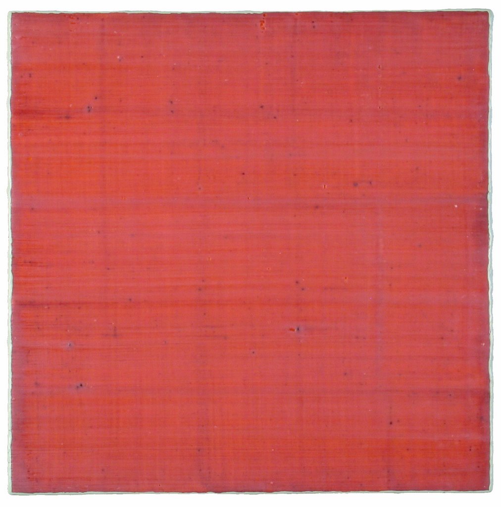 Back when I was in art school, a professor earnestly informed me that if I wanted to be taken seriously, I would have to "choose between being a woman and being an artist." He was onto something in terms of duality, but he had the specifics all wrong, and not just because his comment was so irredeemably
Silk Road 68, encaustic on panel, 12 x 12 inches, 2006
sexist. Creative jobs intertwine art and life. The idea is not to choose between the elements but to come to terms with the nature of the twist. I call my union with art a marriage only partly in irony because, for better or worse, it is the longest-running relationship of my life. Other artists with varying degrees of tongue in cheek, have described their art liaisons as "the other person in my marriage," "living with devil," and "a jones, plain and simple." Rarely is it simply a career.
The idea of art as an addiction, a jones, is not so far fetched, by the way. Sometimes when I’m painting and the endorphins are firing, there’s no "art," no "me." There’s just brush and brain in a euphoric vortex of energy, an ectoplasmic blob at one with the universe. It’s as good as sex. And I’ll do anything short of armed robbery to ensure that I have the means to experience it as often as I can. Do accountants have this kind of relationship to their careers? Do dentists?
Whatever you call it, each artist’s relationship to art is a unique combination of give and take, pain and pleasure, or any number of other antithetical concepts jostling for supremacy. Some of these emotional clashes are generated by the creative act itself. Unlike Sunday painting, which I’m told is a relaxing and enjoyable hobby, when it’s your life’s work, every brush stroke is charged not only with paint but with esthetic decisions, intuitive flow running smack up against intractable deadlines for the next show.
There’s also that tantalizing promise of a livelihood repeatedly extended and withdrawn. Working 80 hours a week without a steady income is not satisfying, no matter how ecstatic the work itself, so every little success—a big sale, an interested gallery, critical attention—sends you soaring until the trajectory of the arc sends you crashing back down.
The good news is that art means money these days. With the recent increase in the number of fairs, galleries, and collectors big and small, there are more emerging and mid-career artists than ever before able to sustain themselves with the sale of their work. I am one of them.
Art and I celebrate our 35th anniversary this year. It’s still an open marriage as flesh-and-blood lovers come and go, but we will 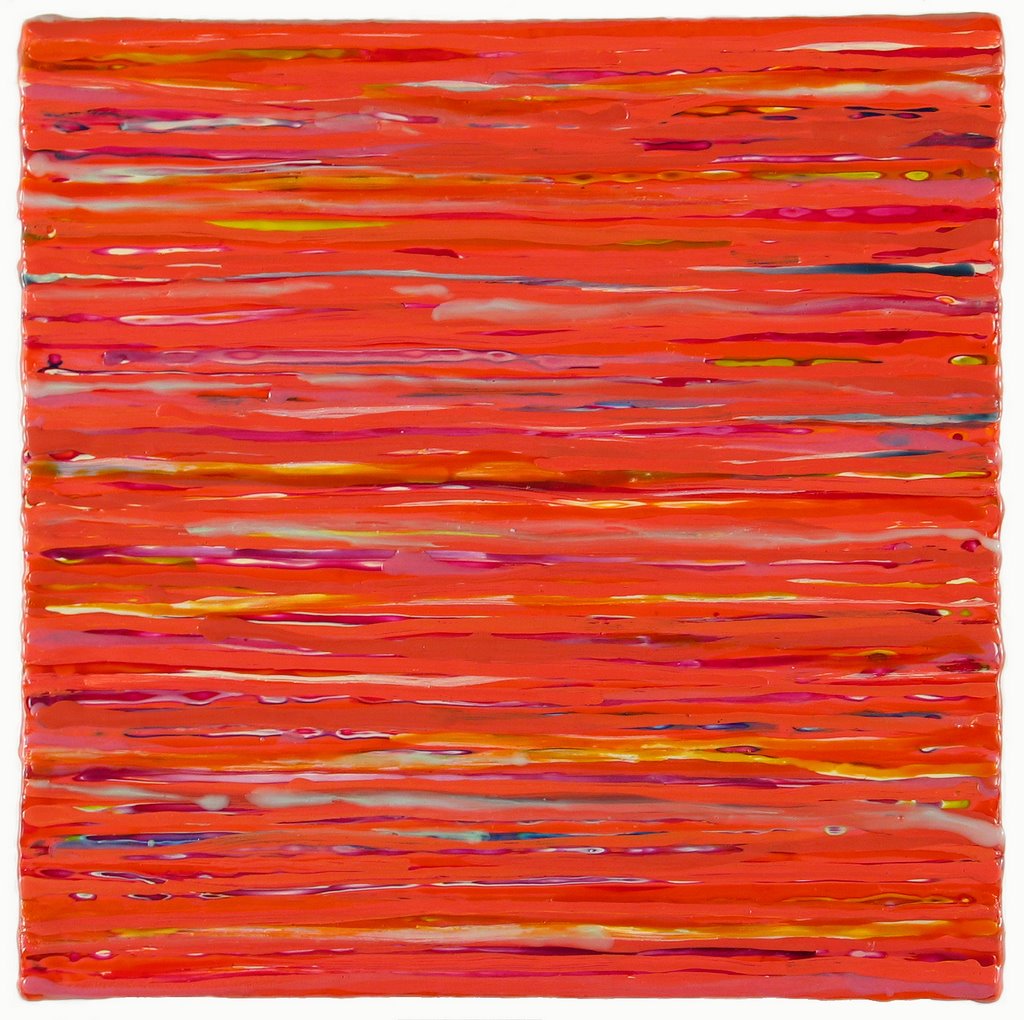 grow old together. The gift to mark 35 years together is coral. Please, no presents. I mention it only because I often use coral, the color, in my painting. Coral is a lovely mix of cadmium red light with a touch of spectrum yellow, and just enough titanium white to soften it to a blushing, roseate hue.
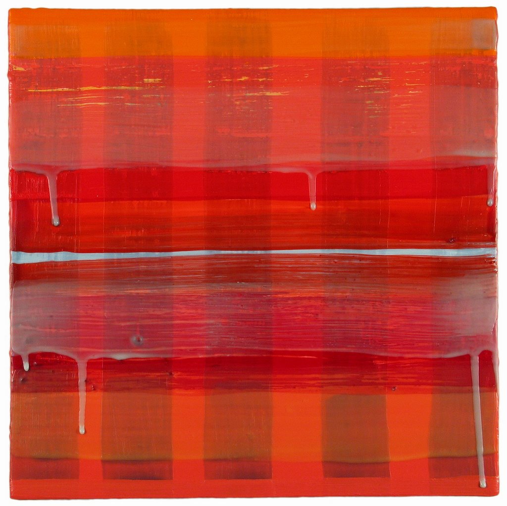
Vicolo 4, encaustic on panel, 12 x 12 inches, 2004
1.21.2008
Morris Louis at Paul Kasmin Gallery
See addendum at bottom of post

Ah, seeing these paintings at the Paul Kasmin Gallery (through January 19) made me feel like I was back in art school when everyone was stain painting and Morris Louis's arc was ascending. I didn't take notes, just pictures.
I've seen a lot of Louis paintings but nothing remotely like this one. Who needs a fireplace if you've got this on your wall? You could almost feel the heat. Made me think of those beautiful Siennese paintings depicting saints at the stake. Hellish. And heavenly.
Here's a detail. I love the rivulets of color. Look how the pigment migrated away from the edges in some places and to the edges in others.


In this painting the graphic elements are reversed, like apostrophes. And then the polished floor reflects and reverses the whole thing.

This is one of Louis's Veils. Up close (below) you can see just how much color it took to get those smoky hues. Looking at the painting for a while, I thought of Rodin's The Three Shades, a trio of nude male figures, bodies drawn together with their shoulders forming a strong horizontal line.
Time has not been kind to this painting. See how the canvas has sagged? And I was surprised to see the "starving artist" framing on this and the other paintings--lattice strips nailed all around. I asked the fellow behind the desk about it, but he didn't have an answer. I suppose it's to maintain the integrity of the work as it was originally shown.

.
Addendum (2.4.08): A painter friend e-mailed with this comment: "There are Morris Louis paintings that weren't supposed to be seen. In grad school I used to work at the Lawrence Rubin Gallery which showed all the Clement Greenberg people, Louis included, and there was always this idea: "Oh don't look at the 'failed ones'." Like the ones you highlight here. Time changes our eyes and our take on things so much, doesn't it?"
1.18.2008
The Business of Art
Back when I was in art school, talking about the business side of art would have gotten you branded as a careerist, a sellout. This kind of thinking has persisted in—and, frankly, hindered the careers of— many midcareer artists who still believe that financial struggle keeps you closer to integrity, and that selling well means selling out. Ha! Garrets don’t bring you closer to heaven, they just keep you cloistered in poverty a few stories above street level.
Sellout
Deborah Fisher’s brand-new blog, Sellout, addresses these ideas. Conceived as being by artists for artists, it encourages dialogue about every practical aspect of being a visual artist. Recent topics include suggestions on finding a way into the art world; the realities of who you know; news on a new book, The Artists’ Career Guide: Making a Living Doing What You Love; and a digital/cyber Q&A. It is more than a professional advice aggregator and hot-tip provider, says Fisher. " We want any information we provide to be fleshed out as anecdote or called out as bullshit. We depend on your insight, and welcome your ideas, comments and emails." (Disclaimer: Fisher has mentioned Art Bloggers @ , a project I do with Sharon Butler, whose Two Coats of Paint I have written about previously, and I’ve already put in my two cents on a few posts.)
Fisher is a sculptor and writer.
.
How’s My Dealing?
Also back in art school, when I was still dating men, I used to say, "Wouldn’t it be great if there were a National Asshole Directory? You could ask about a guy, and if his name showed up on the A-list, so to speak, you could save yourself the trouble and not get involved."
Now comes How’s My Dealing, a site for New York Galleries that does essentially the same thing for a particular slice of the art world.
Alas, there’s a lot of opportunity here for anonymous dealer bashing, despite the moderator’s entreaty for "Facts and first-hand accounts wanted, not opinions." The moderator, a smart, sincere artist posting anonymously as Buck Naked, has his/her work cut out for him/her. I’m not entirely comfortable recommending this blog, but it’s a great idea at the right time—hey, wouldn’t you want to know who pays on time and who doesn’t?—and if everyone uses it in an informative way, big IF, it could work. Take a look and make your own decision.
.
Edward Winkleman
Yes, I’ve noted Ed's blog before, but his business-of-art posts—he’s a respected Chelsea dealer—get scores, sometimes hundreds of responses. I teach here and there on the topic of building and sustaining a career in art, and I often used his posts about the art business as teaching tools.
Some interesting items from the archives: Gallery Contracts and Not a Cheap Affair (what it costs a dealer to participate in an art fair)--you need to scroll down the opened post for these-- and The Logic Behind the 50/50 Split . Spend some time clicking and linking in those archives; there's a graduate course worth of MFA advice there.
.
What Blogs Give you the Art Info You Need?
Consider this a forum to post your suggestions and commentary.
1.13.2008
On the Geometric Trail, Part Two: SoHo

Kay WalkingStick: Cataloochee, 2007, gold leaf, oil and wood, diptych; 24 x 48 inches
The geometric trail continues below Houston Street. I get around each month--uptown, Chelsea, downtown, the museums--and the amount of geometry I saw in December was far beyond what I normally see in a given month. And with Warren Isensee's show just opened at Danese, I'll have more geometry to report on later this month.
Here's some of what I saw and liked in SoHo in December: .
.
Kay WalkingStick: New Paintings
at the June Kelly Gallery
You might call WalkingStick a quasi abstractionist who is semi geometric. The larger picture is that she’s a landscape painter who introduces abstract elements into her work, typically via a diptych format that allows her to integrate the two disparate elements so that they are no longer disparate at all. The geometry in her new work is derived, I think, from Native American weave patterns (she is a member of the Cherokee Nation).
The installation shots are mine; the individual works are from the gallery's website. You can see more exhibition images at the gallery website and more on Kay's website.

At the June Kelly Gallery, above and below: opposite views of Kay WalkingStick's show


Above: Remember the Bitterroots, 2007, oil on wood panel, diptych, 36 x 72 inches; below: The Road to Santa Fe, 2007, oil on wood panel, diptych, 24 x 48 inches

.
Machine Learning
at The Painting Center
Matthew Deleget, a reductivist painter, put together a sharp show of four contemporary artists working in geometric abstraction. And sharp is the operative word here, as the paintings by Henry Brown, Terry Haggerty, Gilbert Hsaio and Douglas Melini are hard edge.
The title, Deleget writes in his catalog essay, comes from the field of artificial intelligence in the way computers are programmed with algorithms to allow them to recognize patterns within the volumes of cyber data they process (like the Google search engine, for instance) so that they continue to make new associations based on what they have done in the past. I didn’t get the connection between the artificial intelligence of the premise and the visual intelligence of the work itself, but I thought it was a smart show.

Two views of Machine Learning at the Painting Center
Above: paintings by Terry Haggerty, Gilbert Hsiao and Henry Brown; below: Brown again, two by Douglas Melini, and another by Haggerty

If you’re in Houston March 8 to May 3, you can catch the exhibition as it travels to Gallery Sonja Roesch. There’s more information on the Painting Center website and on Minus Space, the online curatorial project Deleget maintains with his partner and co-editor, with Rossana Martinez.
Below: Gilbert Hsiao, Encounter, 2006, acrylic on wood panel, 30 inches diameter

Impromptu Geometry
Sometimes the city is a gallery. I saw this geometric assemblage in an old garden lot at the corner of Houston and Elizabeth Streets.

1.08.2008
On the Geometric Trail in Chelsea
There was a wealth of geometric expression in Manhattan last month. I photographed some of it. Then I went to Miami for the fairs and spent the subsequent two weeks blogging about them. I was prepared to let this New York report go--one has only so much time, after all--but in reviewing the images, I realized the work was too interesting to ignore. I made time. If you don’t go to New York regularly, I suppose it doesn’t make all that much difference when you see these shows en blog; and if you did see the shows, well think of this post as a bit of 2007 déjà vu all over again.
.

.
Bridget Riley: Recent Paintings and Gouaches
at Pace Wildenstein
at Pace Wildenstein
.
Of course you know Riley’s work. She shot to fame in the 60s with eye-blazingly, undulatingly graphic paintings that practically created the genre of Op Art. She’s mellowed. The colors are Monet-esque and the geometry is larger, more sinuous than searing. As you would expect at this gallery, the work was big--but it was an invitation to see, not a challenge. A catalog is available. Click gallery website for more info.
.
Above: The central gallery at Pace Wildenstein. The work on the right is painted directly onto the wall. The painting visible through the doorway to the far gallery orients you to the installation below
.

.
.
.
Gail Gregg: Recent Paintings
at Luise Ross
at Luise Ross
.
Gregg has taken the lowly packing carton and turned it into geometric abstraction. Her symmetric shapes, reminiscent of totemic images, are from flayed carboard boxes, carton dividers, cup holders—the stuff of our throwaway culture—all coated with wax. Some works hang as relief sculptures; others are laid onto a wax ground. Technically these latter are more assemblage than painting, but painting embraces everything these days, and Gregg is a painter with a great sense of compostion and color.
You can see more at the gallery's website and at www.gailgregg.com

Installation view of Gail Gregg's show at Luise Ross
Below, a work from the show

.
.
Polished and Pressed: Bill Thompson and Peter Weber
at Thatcher Projects
at Thatcher Projects
.
First I liked the title, with its suggestion of neatness and order. Then I liked the work: relief sculptures that played shiny against matte, rounded edges against sharp, crease against smooth. Thompson has the polished work: geometric wall sculptures carved from urethane, many of which glisten with layers of, I’m guessing, automotive-type paint. Weber has the pressed work: felt objects that have been folded and formed into geometric order, like weave patterns under a microscope. See more at the gallery's website.
.
.
.

.
Polished and Pressed at Thatcher Projects: Bill Thompson, above, and Peter Weber, below
.
 .
.
.
The Geometry of Seeing: Elaine Lustig Cohen
at Pavel Zoubok Gallery
Although I knew of Cohen’s work, I hadn’t realized the breadth of it. Thanks to the show at Pavel Zoubok and the impressive catalog with it, I saw a range of Cohen's work in this 40-year retrospective. Painter, collagist, sculptor and graphic designer, she has worked within a hard-edge idiom that has traversed fluidly within her various modes of expression. See more on the gallery's website.
A second part of this exhibition was held at the Julie Saul Gallery. I didn't get there, but you can visit the website to see more work.

The Geometry of Seeing: Elaine Lustic Cohen at Pavel Zoubok Gallery. This view looks into the gallery from the entry
Below, a view behind the desk

.
Alberto Burri at Mitchell-Innes and Nash through January 19
When you hear arte povera, you think Merz or Kounellis. Burri? Who knew? The exhibition is a 40-year-plus survey of the artist, who died in 1996. The work is varied but the constants are the materials--commonplace stuff like plastic, Celotex wallboard, burlap, clay--and a geometric sensibility that threads its way through the material and the years. Not surprisingly, Rauschenberg cited Burri as an influence. Read more and see additional images at the gallery website.

Above: Alberto Burri installation view
Below: Oil and gold leaf on Celotex--a little ricca with the povera

Next post: The geometric trail continues below Houston
12.30.2007
(Un)Familiar Territory: Martin Puryear at MoMA
 .
.Atrium view of Martin Puryear at MoMA: Desire, 1981, with Ladder for Booker T. Washington in the background
.
Below: view of the sixth-floor installation at MoMA

Years ago, I had a dream in which I took an elevator to the top floor of a tall building. When the elevator opened, it was into a small square room with floor-to-ceiling windows on all four sides looking out to a pitch-black night dotted here and there with lights. Inside the room there were several raised pools of water that flowed into other pools, everything connected and flowing, serene and quiet. Upon waking, I recognized that the dream was a gift from my unconscious, a tranquil vessel in which to immerse myself whenever the waking world presses too crazily or stressfully against me.
I’m telling you this because walking into the sixth floor of MoMA during the Martin Puryear exhibition I experienced something similar. Instead of walking into my own personal dream, however, I felt as if I had just entered the collective unconscious of humanity. The forms were more or less recognizable—nests, wheels, vessels, tools, even animals and humans—and the materials, mostly vines and wood, were natural and familiar, but the formal relationships were unusual, dreamlike, otherworldly. I knew this place, but I didn't. Each seemingly recognizable object yielded something completely new and unknown. And the experience of being among the sculptures was reassuring, even if the work tugged uncomfortably from time to time at odd little strings in the unconscious.
.


.
..
..
.
.
.
.
.
.
.Above left and right: Brunhilde, 1998-2000, and Old Mole, 1985
.Below: Deadeye, 2002

.
In his blog In it For Life, my buddy Tim McFarlane describes his experience of the exhibition as "tantalizingly close to what we know in our world but just different enough to exist on another plane altogether." Yes, yes. I’m not alone in my perceptions.
I’d like to think that anyone from any culture could walk into that room and have a response similar to the ones Tim and I had. The work, after all, comes from an artist who has lived a fully engaged life on different parts of the planet and who, with academic training and a contemporary sensibility, connects to the preindustrial, even the tribal, with his handmade sculpture. His is craft grafted to art (or vice versa), the hand everywhere present, intuition stitched seamlessly to the idea of use, the unconscious made tangible.
Here are Puryear's own words from 2007 which appeared on a wall text in the atrium:
"I value the referential quality of art, the fact that a work can allude to things or states of being without in any way representing them. The ideas that give rise to a work can be quite diffuse, so I would describe my usual working process as a kind of distillation--trying to make coherence out of things that can seem contradictory. But coherence is not the same as resolution. The most interesting art for me retains a flickering quality, where opposed ideas can be held in tense coexistence."
are from the atrium, where photographhy was pe
Atrium view of Martin Puryear. The big wheel of Desire is in the foreground. And I love the poetry of how a sliver of Matisse's Danse is visible in the window above the work. (I never liked this atrium until now.)

Above and below: Ladder for Booker T. Washington. Specific information about each work is on the MoMa website, link at bottom

When you see this exhibition, certainly in person but even in pictures, it's clear that no recently minted 25-year-old MFA recipient could have created work with as much refined vision and raw power. These sculptures issue not from youth and accademia but from a lifetime of experience, where they were cultivated and constructed. So props to artists at midcareer, whether they're as celebrated as Puryear or appreciated by only a devoted few.
Happy New Year--and success to artists all.
Click onto the MoMA site for more images and excerpts from the catalog essays.
Click here for Jame Kalm's guerrilla video of the Puryear show (via Shark Forum)
12.11.2007
FAIR FACTOR: Report From Miami
My coverage of the fair is complete as of December 23, 2007
.
. Prologue
. Twin Peeks
. Basel Miami
. The Containers
. Aqua Art
. Flow
. Red Dot
. Art Now
. Bridge
. Feeling Flush
. Ink
. Twin Piques
. Pulse
. Scope
. Aqua Wynwood
. Art Miami
. Open Thread
This is a multipart report, one post per venue plus the prologue. I've posted sequentially and adjusted the dates accordingly so that this first post remains at the top. There is a narrative to my reporting, so I hope you'll follow it through to the end. For more reportage, business news, and other points of view, Google "Miami Art Fairs" and "The Art Newspaper," which published special daily editions focused solely on Miami and the fairs. Links to all my posts are in yellow, above.
You are welcome to use text and images. Please provide a link to this blog, http://www.joannemattera.blogspot.com/ , crediting it as the Joanne Mattera Art Blog and identifying me as the author. Thanks.
There is an Open Thread at the end for your comments and links.
12.10.2007
FAIR FACTOR: Prologue
 Reading over the dealer's shoulder at Pulse
The Mood and the Particulars
By all accounts the mood going into Miami was wary. Dealers in general were fearful that the bubble was about to burst, and the smaller dealers were concerned that the greater number of satellite fairs this year would dilute their sales. Apparently the big guns had no problems; Gagosian sold $10 million worth of art, according to Bloomberg News. Among the smaller galleries in the satellite fairs, the mood lifted as sales began to rack up. Many smaller galleries sold out, and most at least broke even. The mood going out was simply weary.
.
In an elevator conversation at my hotel, I listened in as an elegantly dressed Brazilian dealer explained the art of the sale to an interested shorts-clad tourist: "Before the fair, we send out J–pegs of the work we’re taking so our collectors know what we’ll have. Some have already made their choices before they get here." And you wondered how those red dots appeared in the first five minutes of opening.
.
By the end of the first day, the taxi drivers were so savvy that if you told them, "The Pulse Fair, please," they knew exactly where in the Wynwood section of Miami to drop you off. Hell, with 12 venues in Wynwood and an almost equal number along the Collins Avenue strip adjacent to the Convention Center, site of Basel Miami, those cabbies made a lot of trips back and forth over the causeways—and a lot of dough at $20-plus-tip a pop. Once I learned that Arden Gallery, showing at the Red Dot Fair, had sold one of my paintings, I splurged on the cabs. The idea of the fair-provided shuttles was good, but the waits could be long. Taxis got you there faster, and with 24 fairs to cover in four and a half days, faster was definitely the way to go.
.
Covering the Fairs
So how do you cover 24 fairs in four and a half days? You don’t. Well, I didn’t. I started by eliminating three categories—the photo fairs, the design fairs, and the under-the-radar venues—and then got selective about what remained on my list. I saw everything I wanted except the Containers, NADA and the three private collections that open their doors to the public this time of year: Cisneros, Margulies and Rubell. I just ran out of time. And being a Type-A type to the extreme (it’s a defect; it has to be), I was there when the doors opened in the morning and stayed until they closed every night, between 10 and 12 hours a day.
It sounds like work—and it is—but it’s also the most fun I have all year, equal parts reporting, schmoozing, and looking until my eyeballs ache. You could travel the world for a year and not see as much as what you see here in four or five days.
.
Some Particulars
You could see art in hotel rooms (Art Now, Aqua, Bridge, Flow, Ink, Red Dot) and shipping containers (Art Positions); under tents (Scope, Art Miami) and on a yacht (SeaFair); in a convention center (Basel Miami) and in warehouses (Aqua Wynwood, Pulse); even in a medical center (MASH) and the Miami Ballet (RAM). The spaces ranged from cheek-by-jowl claustrophobic (Bridge) to highway-wide aisles (the Convention Center), and from stifling (the AC was down on Saturday morning at Scope) to breezily open to the sky (Aqua, Ink, and the hammocks lining the entrance way to the Ice Palace, home of NADA).
 This installation by Walter Robinson is as good a metaphor as any for the five-day Miamapalooza. Seen at the Catharine Clark booth in Pulse
Some (random) numbers
Fairs: 24
Total number of galleries: between 1200 and 1300
Artists shown: about 12,000 (figuring 10 artists per gallery, more or less)
Individual artists showing: 153 in four fairs (Gesai, Pool, Ram, Zones)
Artworks: 60,000 is a conservative estimate; factor in small works, prints, and works on paper and the number can easily reach 100,000+
Total attendance at Basel/Miami: 43,000, and that provides a good estimate for the satellite fairs as well
Price per night for a beach-view corner room at the Day’s Inn, where many of the artists and smaller dealers stayed: $160
Price per night for a city-view standard room at the Setai next door, where many collectors stayed: $1250, with the last of the suites going for a reported $9000 a night
Pounds of printed matter acquired in four days: 49. I checked an empty bag on the way down just so that I could haul my stash of catalogs, press material, brochures and cards.
..
Good links:
. Overheard Conversations at Artworld Salon
. All the fair reporting on Artinfo
.
FAIR FACTOR: Twin Peeks
While I finish up the Basel Miami post, here's a little amuse oeil: the view from the Skywalk at the Convention Center. A wide, windowed corridor, the Skywalk spans the acres and acres that make up the exhibition hall and adjacent storage area. You take it to get to the press room. The shades are never open to the storage area. And this year, they were closed to the exhibition area as well. But your intrepid reporter jammed her lens into the uncovered space between window frame and window shade to bring you this little peek at the positive and negative views of the fair--just in case you wondered what the dealers did with all the crates and packing material the artwork came in..
.
A Skywalk-eye-view of the yin and yang of the fair
.


.
Next up: Basel Miami
FAIR FACTOR: Basel/Miami

Yinka Shonibare, Black Gold, wall painting with stretch fabric attachments, at Stephen Friedman Gallery, London
First stop on the FAIR FACTOR tour is ArtBasel/Miami Beach, which is only fitting since this is the event that started the December ritual known as Miamipalooza, The Fairs, or simply Miami. If you've been to the Miami Convention Center, home to Basel Miami, you know the place is huge: big booths, high ceilings, long stretches of wall. Big paintings are typically installed on the aisle-facing walls--part billboard, part preening, all fabulous show, like the installation above.
The most shocking thing about BaselMiami this year is that it wasn’t shocking. Oh, sure, there was the chocolate Santa carrying a giant chocolate butt plug, but the installation of neatly stacked figures on metal shelving, organized by size and placed against the matching Santa wallpaper was so clean and unrelentingly cheery that it could have been Macy’s Cellar. And that appliance? Its proportions made it look more like a lava lamp than a sex toy. The Santa was conceived by artist Paul McCarthy and presented by the Maccarone Gallery, which apparently has turned some of its West Village space into a chocolate factory.

It's beginning to look a lot like Christmas at Maccarone Gallery, but that's not a tree Santa's toting
.Below, the Santa wallpaper--different scale and background color--is the backdrop for Martin Creed's monochromatic pen-on-paper drawings at Hauser & Wirth, Zurich


An up-close look at Creed's drawings
Painting
Now, onto painting. There was more of it than I can recall in any previous outing (this was the sixth year of the fair). Moreover, it was painting that punched through the walls of drawing, collage, sculpture, quilting and carpentry. There was plenty of sculpture, some of which crossed the line into drawing and painting. There wasn’t much photography (which I assume found its way to the two big photo fairs in Wynwood) and even less video. Ah, my kind of fair!
There was so much of everything that you could make a strong case for whatever interested you: figuration, realism, pattern, expressionism. If you follow this blog, you know that I’m interested in geometry--from minimal to wildly configured--and in painting with a material sensibility. There was plenty to like.
Let’s start with the geometry . . .

Sarah Morris, Dragon (Origami), household gloss on canvas, 2007, at White Cube, London

Gary Hume, Jim (Little), enamel on aluminum, 1991, at Matthew Marks, New York

Delson Uchoa, Portal 1, acrylic on canvas, 2006-2007, at Brito Cimino, Sao Paulo

Mary Heilmann, Mode O'Day, oil on canvas, 1991, at 303 Gallery, New York

Dan Walsh at Paula Cooper, New York
By the way, I was practicing paperless journalism this time around--shooting the work, the wall ID, and then the gallery sign--in an attempt to eliminate the fumbling of camera, glasses, notebook and pen. It worked quite well, though not all dealers provided complete information on their wall text.

Rebecca Warren, Yes, Olga, painted clay, 2007; Bridget Riley, Red with Red 2, 2007; and Arturo Herrera, Loma, acrylic on felt, 2007, at Hetzler, Berlin
Material Abstraction . . .
Herrera's painted felt painting moves us seamlessly from geometric abstraction to what you might call material abstraction, paintings whose image, whose essence, is formed and informed by stuff—thick paint, gobs of medium, collaged fabric, stuffing and whatnot. Here I'm looking not only at geometry but at a broader kind of abstraction.

Jonathan Lasker, The Equality of Apples and Oranges, oil on linen, 2007, at Galerie Thomas Schulte, Berlin

Jacin Giordano, Untitled Quilt Painting (Weave Texture), acrylic on wood, 2007, with detail below, at Frederic Snitzer Gallery, Miami


Rodney Graham, Inverted Drip Painting #12, liquid acrylic on linen, 2007, with detail below, at Lisson Gallery, London


Tomma Abts at Galerie Daniel Buchholz, Cologne. No info on the wall ID, but this painting, which is easel size, maybe 20 x 24, looks to be metallic oil on canvas

Roxy Paine, PMU #33, acrylic on canvas, 2007, at James Cohan Gallery, New York

Jon Pylypchuk, Let Me Hold You in the Water For These Last Moments, mixed media on panel, 2007, with detail below; not sure of gallery 

Andre Butzer, Untitled 12, oil on canvas, 2007, at Hetzler Gallery, Berlin
Below, Arturo Herrero, Orfeo, 2007 (also visible in the image aboe). Medium is not given, but it's felt, so you can call it sculpture or painting. In either case it fits under the umbrella of Material Abstraction
(Herrero is represented by both Sikkema Jenkins and Hetzler, whose booths were adjacent and whose installations were so seamless I'm not sure whose wall this was on.)


Chris Martin, Mother Popcorn, acrylic and collage on canvas, 2007, at Mitchell-Innes & Nash, New York

Also at Lisson: Daniel Buren, Zigzag for Two Colours (Blue and Green), paint, fiberboard and tape, 2007, left; Jason Martin, Limbo, oil on aluminum, 1998, with detail below


Thomas Glassford, Portitura Multicolor, anodized aluminum, 2007, at OMR, Mexico
Sculpture
To my eye, the dimensional painting flows seamlessly into sculpture, like Glassford's ridged aluminum piece, above. The work that most appealed was planar, like Helio Oiticica’s and Imi Knobel’s, but I found equal pleasure in Sirous Namazi's dimensional grid and Petah Coyne’s baroque bouquet of wax flowers, which could have come straight from a Neapolitan wedding.
Other big likes: Louise Bourgeois’s cast bronzes and carved marbles; Franz West’s lumpy, painted organic form-on-a stick; Antony Gormley’s hanging metal sculpture, whose linear materials--and certainly its shadows-- functioned as drawings in space. There was even a massive digging tool, about six feet in diameter, that scribed a huge drawing as it clawed its way around the surface of a cement floor.
Here’s some of what I liked:

Imi Knoebel, Twins, acrylic on aluminum, 2007, at Galerie Lelong, New York (and elsewhere)
Below, Helio Oiticica, Relievo Espacial No. 20, painted wood construction, 1959, also at Lelong


Sirous Namazi, Untitled, iron and enamel paint, 2007, at Galerie Nordenhake, Stockholm

Antony Gormley works on paper and sculpture at Sean Kelly, New York

Franz West, untitled sculpture, at the Grasslin and Nagle booth, Frankfurt and Berlin

Louise Bourgeois bronze sculpture and Joan Mitchell painting at Cheim & Read, New York
(This gallery's installations here are always distinctive and they always showcase the work of the women they represent. Last year it was Benglis and Bourgeois. Their roster includes Lynda Benglis, Louise Fishman, Jenny Holzer, Monique Prieto, Pat Steir and others.)

Petah Coyne, Untitled # 1243 (The Secret Life of Words); cable, chicken wire, bolts, wax, silk flowers and other materials, 2007, at Galerie Lelong
Detail below

From beauty, courtesy of Coyne, we move to beast, courtesy of Galerie Nicola Von Senger, where that giant grappling claw was caroming off the walls like a Roomba on steroids.

Arcangelo Sassolino, Untitled, modified hydraulic steel grapple, 2007, at VonSenger, Zurich. Presumably the tool and the drawing on the poured cement floor comprise the work
Watching this giant machine claw its way around the poured cement floor, I hung around to see if perhaps I could overhear a cell conversation along the likes of, "Yes, a grappling hook that moves on it own power. . . .Oh, enormous, maybe six feet, but its claws open and close, so sometimes it's smaller than that. . .Well, yes, it's a sculpture, but it makes a drawing on the floor. . .Um, yes, I suppose we'd we'd have to pour a floor. . . . The mechanic? I'll ask." No such luck.
A Splendid Installation
Walking by the Lehmann Maupin booth, I was struck by the installation: Teresita Fernandez’s quietly beautiful wall stones, Jennifer Steinkamp's haunting tree of pixilated light; Shirazeh Houshiary’s meditative, almost mathematical grids; Mickalene Thomas’s bling-y nude that challenges your gaze; Lee Bul’s chain mail chandelier. It was one of the strongest curatorial efforts I’d seen at the fair.

Foreground, Teresita Fernanez wall installation; background, Jennifer Steincamp video at Lehmann Maupin

Lee Bull sculpture, Shirazeh Houshiary painting


Mickalene Thomas glittery nude, with Emin in the background
The wall text, in light gray, stopped me in my tracks: This year, Lehmann Maupin Gallery is pleased to present a selection of works by the female artists from the gallery.
Feminism lives! I hung around to gauge the response. "Do it but don’t advertise it," said one man to his male companion. "I don’t think this is necessary," said another.
Au contraire, my testicular friends. It’s exactly what’s necessary. Not to get too pedantic here, but the art schools are full of women, and the art world is full of men. (Notice how many male names are attached to the work I show in this post?) What’s wrong with that picture is what makes Lehmann Maupin’s elegantly kick-ass installation so necessary.
And just to prove the point: Check out the twinned piece on ArtNet in which two reporters were sent on a virtual shopping trip at the fair, Robert Ayers with $10,000 and Judd Tully with $10,000,000. Their articles show and describe what they "bought." There wasn’t the work of even one woman in their cache. You can make the case for personal taste (of course they were free to select what they wished). But what’s shown and critically praised helps inform personal taste. So kudos to Rachel Lehmann and David Maupin and your (female) gallery directors for your good taste and smart strategy, which I can only hope will help inform that of others. And I hope you sold the hell out of that show.
Supernova
First you walk though a tunnel to get to this new exhibition. Then the first thing you see are the storage racks. The booths are set along the perimeter, the same way the Art Nova booths are set around the perimeter of the large hall. Some of these galleries are heavy hitters, but this appendage felt like the kids table at holiday dinner.
And what’s the deal with the no-chairs-in the booth mandate sent down from management? I walked into one booth late one evening and the gallerist was slumped on the floor. "Are you OK?" I asked.
"Oh, yes, just tired," he responded. I offered to get him a chair. "They won’t let us have chairs in here," he said, stopping me as I went out the door in search of seating.
He wasn’t kidding. Another said wearily, "I came all the way from [a distant European location] for this?" He asked me not to name his city, because it would give him away, and he didn’t want the fair overseers to know he’d been lounging on the floor. OK. Why dim his chances to come back next year for another round of the same mistreatment?
By the way, according to today’s Miami Herald, 850 galleries vied for the 200 booths. Think about that next time you get a rejection letter. They know the feeling, too. Even the big ones.
What I liked--no, loved--here:

El Anatsui's aluminum and wire tapestry at Jack Shainman

Mindy Shapero’s fabulous material agglomerations, above and below, at Breeder Gallery, Athens. Shapero's shapes are organic and mysteriously familiar, like Martin Puryear's, but she's the anti Puryear: bright and shiny, with lots of buttons and trinkets making up the work

Next post: The Containers
Subscribe to:
Posts (Atom)


