Pages

9.29.2008

October Surprise


Michelle Obama is on the cover, and my painting, Stack, is on page 30. Check out the October issue of More magazine

Stack, 2005-2008, encaustic on panels (quadtych), 48 x 67 inches

.

9.26.2008

Separated at Rebirth?


Remember Anita Bryant, the 70's pop singer-slash-orange juice huckster who turned out to be a raving homophobe and nearly wiped out the citrus industry as a result of the backlash? I've been reminded of her lately. Substitute mayor for singer, anti-choice for homophobe (well, keep the homophobe in there, too, eh), and country for citrus industry, add a few accessories and and guess what?


+


+


=


"I'll take a question from the press now."

.

9.25.2008

Calculated Color on Cape Cod

.
Merged image of Calculated Color at the Higgins Gallery in the Tilden Art Center of Cape Cod Community College


When artist Jane Lincoln asked me to participate in Calculated Color, the exhibition she was curating on Cape Cod, I was interested. Color, as you know, is one of the things that moves me--personally as a painter, and visually as an art viewer. When she told me the roster, I said yes. The concept plus the artists make for a strong exhibition. While the group is geographically diverse--the Bay Area and the Bay State, plus me with one foot in Manhattan and the other in Massachusetts--conceptually it is cohesive. All of us are focused on color, geometry, abstraction and a more-or-less reductive sensibility.

"Color in its many contradictory, bold, and subtle forms is the focal point of the exhibition," writes Lincoln. "Calculated Color invites you to observe what may not be visible at first glance and to embrace how color defies description."

With that invitation, let me take you around the gallery. We start at the entrance, where my work is on the left. You can't see everything from the entry point, but the sequential pictures will take you into the smaller rooms and alcoves so that you'll get to see a bit of everyone's work.

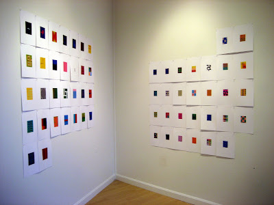
From the Entry: Ten paintings from my Uttar series, specifically those selected for their swatch-like combinations, each 12 x 12 inches, encaustic on panel. This is intuited color, its calculations springing from retinal response rather than theoretical planning
.


Jane Lincoln, four woodblock prints: Lincoln's grids explore hue, value, temperature and chroma. Each print is based on one selected color and then expanded in 36 one-inch squares. Within each print there is a pair of identical color squares. The two are positioned side by side, horizontally or vertically. The placement of the pair varies so as to invite the viewer to closely examine the differences between colors. Color interaction can make the pair surprisingly challenging to identify.

The white-line print was developed in nearby Provincetown in the early 1900s. Jane describes it on her website.
.


Nancy Simonds, gouache-on-paper paintings: Their Scully-esque blocks are juicy, bursting with beauty and visual energy as the hues rub up against one another as well as nestle into a colored field. The paint surface, which you can't see well from the image above, is sponged off selectively to reveal a visual texture that varies in density and intensity


At the end of the long, narrow gallery is a smaller exhibition space where the work of Chris Ashley and Rose Olson is installed. We'll enter there in a moment. Continuing clockwise around the main gallery are alcoves that contain the work of Susanne Ulrich, Nancy White and Mel Prest. We'll get to those, too.

From left, above: Nancy Simonds, Rose Olson, Suzanne Ulrich


Above, a peek into the smaller back gallery and Chris Ashley's digital prints. Chris creates images on the computer using HTML code, one a day. Each image is built up line by line--"not the result of software tricks," he says. The image is meant to be viewed on a monitor as pixels of light, but digital printing renders a crisp and luminous image which, in relation to the one on the screen, becomes an actual object. The installation reflects the calendar grid of the month in which the work was made

Below, the full installation


Rose Olson shares the same gallery room with Chris Ashley. Rose paints veils of color on a maple or birch ply surface using interference pigments, so the painting changes both as the light changes or as you move in relation to the painting. The wood grain, barely visible beneath the surface, challenges the strict horizontality of the image, yet the mood of the work is dialog--perhaps even contemplation--not confrontation.


Back in the main gallery, continuing clockwise around, we come to an alcove containing the collages of Suzanne Ulrich. Made of torn, cut and pasted papers, the work is both rational and romantic


Continuing clockwise in the next alcove is the sculpture of Nancy White. Nancy calls her small painted aluminum constructions "a personal conversation with the viewer," but there is also the conversation between the object and its shadow, which is an integral, and mutable, element of the work. The sculptures were difficult to photographs, so I have included an image from her website, below


Coming back around, the work of Mel Prest is contained both within an alcove and on the wall facing you as you enter the gallery. Working with a spectrum of achromatic hues, Mel uses small-scale elements in repeated geometric formation to focus your attention on the richness of the grays. The edges of the work are painted with fine parallel lines, so there's an optical energy that powers the work. A combination of natural light on one side and incandescent on the other creates a sense of disorientation--all the better to challenge your viewing

If you find yourself on Cape Cod, the exhibition is up through October 2. Be sure to pick up the small catalog, which is a gorgeous little color object on its own.

.

9.21.2008

The Interaction of Color: Albers’ Landmark Book


The slipcase and one of the portfolios from Josef Albers' The Interaction of Color

.
Remember those exercises with Color-Aid and gouache in art school? Chroma, value, saturation, tint, tone, simultaneous contrast? Remember mixing grays that couldn’t have been more different so that when you placed them on complementary colors they would look the same? God, I loved that class!

On Cape Cod for the opening of Calculated Color on Friday, I got to see an original edition of Josef Albers’ The Interaction of Color (Yale University Press, 1963), in which silkscreened studies show all of those things. Although a commercial version has been in print for some years, and a revised and expanded version was published last year, the volume I’m talking about is deluxe to the 10th power: a handscreened edition with portfolios contained in their own custom slipcase. The actual hand screening was likely left to the graduate students, butI like to think there's some of Albers' DNA on those pages.

Jane Lincoln, curator of Calculated Color, is the owner of the book. She hosted some of the artists for lunch at her home, and afterward we went up to her studio. Jane creates color studies using a white-line woodblock print, an artform invented and developed on the Cape. You’ll see more of her work, and everyone else’s in the show, in the next post. But in this post we’re going to view a few folios from The Interaction of Color. Here, take a look:


Simultaneous contrast as depicted by a portfolio in The Interaction of Color. (At rear, the box in which the portfolios are contained)


More contrasts, above

Below, warm and cool hues with their chromatic variations


.
FYI, below are a couple of page spreads from the updated editon of the commercially printed volume. If I can't have the big book, I can at least have the small version of The Interaction of Color. I’ve just ordered one for myself.


The original printed edition, above, out of print. Fabulous cover, no?
.
The cover of the revised edition, below (not so fabulous)
.

Amazon offered these pages for viewing. See the one above? There's a similar silkscreen page, off to the background, in the second image from the top of this post

Below it's the Illusion of Transparency

Next post: Calculated Color

Related posts: Homage to the Square and Geometric at MoMA, Part 4 with images of Albers' silkscreen squares

.

9.14.2008

CENTERING

.
Tadasky, untitled painting, at Sideshow Gallery, Brooklyn

.

As the new season's exhibition announcements arrive by e-mail and postcard, I’m seeing mandalas everywhere. I don’t know about you, but when I see a symmetrical radiating image, I slow down and focus. That’s the point of a mandala, of course, whether it’s meant as a device to aid in meditation or as a formally composed artwork offered for viewing.

Mandala is Sanskrit for sacred circle. Theologically speaking, it’s a map of the cosmos distilled to its essence, which just so happens to be a map to the very center of yourself. Artistically speaking, it’s geometric abstraction at its most concentrated (and often its most precise).

This post is not an exhaustive look at this powerful shape, but a peek as some of what’s going on right now.

On The Perceptual Observer blog, one of my new discoveries and essential reading for anyone with an interest in geometric abstraction, the current post announces that Tadasaky is showing at Sideshow, to my mind the best little gallery in Brooklyn. The show, 1965-2008 Tadasky features the brilliant acrylic-on-canvas paintings of Tadasuke Kuwayama.


Tadasky, untitled painting, at Sideshow Gallery, Brooklyn

______________________
.
.
From ClampArt gallery comes an announcement of Photo Mandalas: Bill Armstrong and Milan Fano Blatny, currently at the Philadelphia Museum of Art. Armstrong, who is represented by the gallery, creates collages which he then photographs with the focal point set on infinity. There’s a nice Zen twist here: What you see is an illusion.


Bill Armstrong, Mandala 452, 2003, C-print. Image from the ClampArt website

.________________________

.

Gilbert Hsiao, a painter of retinally invigorating canvases, many of them geometrically shaped, is one of a number of artists participating in the American Abstract Artists show at The Painting Center in SoHo this month, and at the big Minus Space show at PS1 that opens next month.


Gilbert Hsaio, Octagon, 2007, acrylic on wood panel, 34" x 34"Photo: Matthew Deleget

__________________


At Endicott College in Beverly, Massachusetts, The Modern Mandala features the work of four artists, including a friend, Marjorie Kaye, whose works in colored pencil I have long liked. Marjorie makes fractured mandalas that are at once wildly energetic and reflectively meditative. Talk about the coming together of yin and yang.


Marjorie Kaye, Lightship, colored pencil on paper

.
.

9.08.2008

Postmortem on an Ad Reinhardt Painting


Ad Reinhardt in his New York Studio in the 1960s. The artist worked flat, brushing and rebrushing the surface to remove all traces of the stroke. Image courtesy of the Guggenheim Museum
.

Ad Reinhardt was a New York painter of the mid-20th Century (born 1913; died 1967), who started as an abstract expressionist and ended up a minimalist. In a slow progression away from color and image, he distilled his work to a series of black paintings. On the face of it, they are pictures of nothing, these big black canvases. Viewed close up and in person, they reward the serious viewer with subtle geometries, squares and rectangles, in a range of velvety black hues from red to green. Read more here.


Abstract Painting, 1960-1966, oil on canvas, 60 x 60 inches. It’s impossible to appreciate the subtleties of a Reinhardt painting on line or in print. Still, look carefully and you can see a nine-block cross and nuances in black from red to green. Image courtesy of the Guggenheim Museum

.

9.05.2008

Palin' in Comparison

.
Boy, did she ever land a big one: the #2 spot.

A heartbeat away. Whatever this anti-choice/pro-creationism/PTA president/beauty queen/hunter/governor has done politically pales in comparison to the state and national work that pro-choice women like these have done in all areas of government:


U.S. Senator Hillary Clinton; U.S. Congresswoman Shirley Chisholm, both representing New York State, and both candidates for President, in 2008 and 1972 respectively

.


Michelle Obama, attorney, easily bringing as much experience to the White House as the Governor of Alaska; Nancy Pelosi, Speaker of the House
.

U.S. Senator Barbara Mikulsi of Maryland, above, and U.S. Congresswoman Maxine Waters of California


U.S. Senators Dianne Feinstein and Barbara Boxer, both of California
.
.
No McPain for the next four years--or ever
.
.

9.04.2008

Your Turn: Where are You Showing This Month?

.

The Chelsea galleries are having their first-of-the-season openings tonight. Are you in one of the shows here? Or are you in a show somewhere else in town? Or in a show somewhere else on the planet? Please use the Comments section to post your info. Don't forget to include links so that folks can learn more.
.