.
A peek at the hue and substance of Material Color at the Hunterdon Art Museum. Here, a detail from Wil Jansen's Untitled
.
.

The
Hunterdon Art Museum is located in a 19th Century stone building that began life as a grist mill. MoMa it’s not—but then MoMA doesn’t have a river and waterfall outside its front door, either. About an hour west of Manhattan in Clinton, New Jersey, this solid, four-story building provides an unlikely but lovely environment for contemporary art, specifically
Material Color, the subject of this post. The thick walls and shuttered windows remind you of its former life, as do the wooden floors, massive beams and solid staircases. Looking up you see the remains of what was once a chute that sent materials from one floor to another. Looking out, you see the Raritan river.
.
Inset: The facade of the museum
Below, a view across the Raritan to a historic mill

In this bucolic setting, the museum’s chief curator, Mary Birmingham, has assembled and installed a sophisticated international show.
“I had been thinking about the Material Color idea since Miami last December,” says Birmingham. After being introduced there to the work of Robert Sagerman—“at no fewer than four places in Miami,” she notes—her antannae tuned into the color frequency.
"I started to become more aware of other artwork that shared this material/surface quality, and by the end of my stay in Miami, I had seen enough to tease my thinking about a possible future exhibition,” she says, adding that the works she responded to “had a very visceral feeling about them.”
In subsequent trips to the Chelsea galleries, with references from artist friends, as well as visits to the various art fairs in town (and, artists take note: some Internet searches), the concept expanded to include material and process, and the roster was formed.
“I was especially interested in seeing how different artists found different ways to handle paint and color,” Birmingham says. “While it is not the entire story, the idea of paint as a substantial material is central in all of these works.”
.
The juicy details:
.

Above: Leslie Wayne's Mondo Mondo
.(All details represent works that are shown in full in this post)

Above: My Mudra 1
.
Below: Vadim Katznelson's Privalok


Above: Ivana Brenner's Sin Titulo (Bosque)
Below: Peter Fox's Royaume


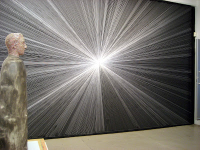
Above: Cecilia Biagini's Emanates From a Center Point
Below: Carlos Estrada Vega's Marcus

There are 20 artists in the show, all of whom work with mostly saturated color in a tangible, physical way. Nobody in this show just “paints.” As you can see, pigment is poured, pulled, rolled, slumped, sliced, dripped, swiped, squirted, pieced and scraped. Dan Bischoff, who reviewed the show for
The Newark Star Ledger, calls it “corporeal color.”
Many of the paintings are sufficiently built up to qualify as reliefs. This is certainly true of
Robert Sagerman’s painting,
15,356, a shimmering green rectanglar field comprised of thousands of dense brush strokes, well exactly 15, 356 dense brush strokes, pulled up into individual peaks. It’s true of
Leslie Wayne, who—I’m not sure how she does this—seems to assemble layers of still-plastic paint and then scrapes and pushes them into an over-the-top topography of lushness, like the elongated
Mondo Mondo. It’s true of
Carlos Estrada Vega, whose roughly four-foot-square grid of waxy color,
Marcus, consists of hundreds of individually painted tiny canvases adhered by means of magnets to a metal plate. It’s true of
Peter Fox, whose canvas,
Royaume, the largest in the exhibition, consists of multicolor drips that form an undulating, almost hypnotic field.

Installation view as you enter the second-floor gallery from the stairs. From left: Peter Fox, Royaume; Marcus Linennbrink, Lightenyourdark and Stehafmannchen; my Mudra 1, 3 and 6; Carlos Estrada Vega, Marcus
.
I’m not a critic. I think of myself as a reporter with opinions. This is the stance I take with all my writing, and I mention it here particularly because I am a participant in this show. Can I be objective enough to report on it? Well, these pictures show you what I saw, so whether or not you agree with my remarks, you can view the show and form your own opinions. Let me take you clockwise around the perimeter of the gallery showing you, as much as possible, both installation views and specific works. The light in the gallery was a combination of incandescent (or halogen) and daylight; my little hand-held camera worked valiantly to adjust.
My Mudra 6, Mudra 3 and Mudra 1, all encaustic on panel, 12 x 12 inches. Courtesy of Simon Gallery, Morristown, New Jersey
 From left: Wil Jansen, two by Linenbrink, Fox's Royaume (shown in detail at top of post)
Below: Wil Jansen, Untitled, oil on canvas, 12 x 12 inches (shown in detail at top of post). Courtesy of Brenda Taylor Gallery, New York

Formally, the issue for all of these works and many of the others you will see, is a single element repeated again and again to form a whole—a maximal result from minimal means. The grid is an obvious organizational motif in some of the work, but the pattern of repetition and regularity, however different from artist to artist, provides the overarching structure of the show. Technically, each artist is in formidable control of his or her medium—a peak that holds its shape, a smoosh that doesn’t slump, a drip that remains eternally at the point where surface tension, about to give way, defies gravity. If you think that’s easy, you haven’t done it.
The works with a relatively flat surface have a whole lot going on under the smooth exterior, like James Lecce’s Chambord, poured and rushed swirls that activate the eye from beneath a transparent layer of resin. This is true of Carolanna Parlato’s Lemon Streak, too. The poured abstraction is ostensibly sleek, but look closer: beneath the enamel-like surface (she uses acrylic), there’s a tangible network of drips and pools—forever-to-be-unseen paintings giving shape to the one before your eyes.
My own work in the exhibition consists of three small paintings from a 2004 series, Mudra, in which drops of wax paint build up into a modestly dimensional surface. “Oh, like a dripping candle on a chianti bottle,” I heard someone say. Well, something like that, except for the part about the candle and the chianti bottle. I’m also represented by a brand-new painting, Vicolo 35, from a body of work I’ll show at Arden Gallery in Boston in December. Here most of the color is under the surface, glimpsed through channels I have skived into the wax paint.
 As we move around the gallery, you can see James Lecce's Chambord and my Vicolo 35 through the plexi vitrines containing Linnenbrink's work. By the way, that bowling-pin shape of Linnenbrink's? Epoxy resin and pigment on a bowling pin
 James Lecce, Chambord, acrylic polymer emulsion on canvas on panel, 40 x 72 inches. Courtesy of McKenzie Fine Art, New York
.
Above and below: my Vicolo 35, carved encaustic on panel, 18 x 18 inches. Courtesy of Arden Gallery, Boston

 Continuing around the gallery: Alana Bograd, Chichi Charm School, oil on panel diptych (one panel visible), each 14 x 10 inches; Kathleen Kucka, Apparitions Hovering, acrylic on aluminum panels, diptych, 40 x 60 inches overall, courtesy of Brenda Taylor Gallery, New York. In the corner: two paintings by Leslie Wayne
 Below: Leslie Wayne, Mondo Mondo, oil on wood, 47 x 6 inches (detail at top of post). Courtesy of the Jack Shainman Gallery, New York


Leslie Wayne, One Big Love, 13, oil on panel, 13 x 10 inches. Courtesy of the Jack Shainman Gallery, New York. Detail below:


Above: With Wayne's One big Love in the corner you see Carolanna Parlato's Lemon Streak, acrylic on canvas, 48 x 45 inches, straight ahead. Courtesy of the Elizabeth Harris Gallery, New York
Below: With Parlato's Lemon Streak in the foreground, you see work by Louise P. Sloane, Cecilia Biagini, Gregg Hill, Robert Sagerman, and Carlos Estrada-Vega. (Specifics in the images that follow)

There are also sculptures, such as
Gregg Hill’s installation of slumped forms,
Beliefs. They look like vinyl but they’re painted steel—crushed helium cannisters, in fact. Touche, Gregg, for your neat
trompe l'oeil. Estrada-Vegas’s
Carlito is a physical extension into the third dimension of his gridded paintings. Then there’s
Cecilia Biagini’s
Emanates From a Center Point, a sinuous assemblage of painted wooden shims hanging on the wall. Is it flat sculpture or a dimensional painting? No matter, it’s formally rewarding and visually luscious, a satisfying paradigm of the exhibition theme.

Above, from left: Louise P. Sloane, Violet Aqua Violet, acrylic polymers and pigment on aluminum, 32 x 28 inches, courtesy of OK Harris Gallery; Cecilia Biagini; Gregg Hill

Above: Cecilia Biagini, Emanates From a Center Point, acrylic and flashe on wood, 47 x 36 x 7 inches. Courtesy of The Hogar Collection, Brooklyn
Below: Gregg Hill, Beliefs, painted steel, dimensions variable

 Swinging around to the face the gallery entrance: Gregg Hill, Beliefs; Robert Sagerman, 15,356, oil on canvas, 41 x 71 inches; Carlos Estrada-Vega, Carlitos, oleopasto, wax, pigment, oil and limestone on canvas, wood, and steel core, 13 x 13 x 13 inches. Sagerman and Estrada-Vega courtesy of Margaret Thatcher Projects, New York. (My big disappointment here: the details I shot of Sagerman's painting are too blurry to post.)

Another view toward the front of the gallery, from left to right: Lori Kirkbride, Untitled, acrylic polymer and resin on panel, app. 21 x 21 inches; two by Vincent Hamel (see view below); Ivana Brenner (see second view below); Linnenbrink's sculptures in the center; Vadim Katznelson, Privalok (shown in detail at top of post), polymer acrylic resin on canvas app. 13 x 13 inches; and two by Omar Chacon: Untitled #177, acrylic on canvas, app. 7 x 11 inches, and Untitled #103, acrylic on canvas, 42 x 54 inches, courtesy of Greene Contemporary, New York

Above: Vincent Hamel, Structure in Green, oil on wood, 14 x 19 x 2.5 inches. Courtesy of the Howard Scott Gallery, New York
.
Below: Ivana Brenner, Miami, solidified oil paint on acrylic base, courtesy of CTS Creative Thriftshop. In distance, Paul Russo, Dr. Weeks


View into the right side of the gallery. Foreground: Paul Russo, Dr. Weeks, latex caulk and acrylic on canvas, 24 x 18 inches
.Birmingham’s statement ends this way: “Each of the artists in Material Color engages in a conversation with paint. Using different processes, each creates a unique visual language with a diverse vocabulary of marks, always giving color an active voice. The hope in assembling this wide range of individual works is to provide the opportunity for a larger and more meaningful conversation.”
To which I would add: The show is up through February 1. If you’re in the area, head on over and “listen in.”
.

The curator in conversation: Mary Birminghan talking with exhibition visitors. Behind her right shoulder, James Lecce's Chambord; behind her left, my Vicolo 35
.
.