Pages

10.31.2012

"Making Room" in New Haven

 .
Making Room, an exhibition with Richard Bottwin, Melanie Carr, Kevin Daly, Robert Gregson, Adam Lister, Faber Lorne, Debra Ramsay, Karen Schifano, Paul Theriault, Jill Vasileff; curated by Suzan Shutan, at The Institute Library
 
 
As one who sees a lot of art I am habituated to the white cube, so I was intrigued by the concept of Making Room, the exhibition in New Haven curated by Suzan Shutan. The Connecticut sculptor gathered 10 artists working in a largely geometric and reductive manner to respond to and interact with the architecture of a room nearly two centuries old, and to the work each artist has installed in it.  
 
See that diagonal bisecting the two sets of windows on the third floor? We'll see it from the other side in a bit


The room is on the third floor—a  south-facing space with four large windows, which you see from the outside in the image above—in The Institute Library in downtown New Haven. This really is a library, founded in 1826 and one of the last remaining membership libraries in the U.S. What’s interesting (and wonderful) is that an exhibition space should exist in a place like this.  Let me take you on a tour of the exhibition.

Inside the library: The stacks on the second floor,  above, with a poster for the exhibition, below


We proceed to the third floor
 
 
To get to the third floor you climb up from the street and then ascend a fabulous green staircase with glass insets in the risers (a 19th Century way to get daylight into the stairwell below, apparently). Halfway up there's a landing and set of doors. We go through and keep climbing.
 
We’re met at the top of the stairs by a Richard Bottwin sculpture.  The act of climbing the stairs offers an angular and shifting perspective of a work that has its own shifting angles. What you see is what you see—until you see something else. Nice. I also liked how the "positive" of Bottwin's work is countered by the "negative" of the blue-limned rectangle set into the door. And whose work is that? Ah, a little gift from the universe; it comes with the room.

Richard Bottwin, Hinge #1, 2012; white oak, birch plywood, acrylic color
 
 
Standing in the middle of the room, I have moved my camera clockwise around, allowing one work to lead into the next, sometimes leaning in to see a work more closely. I want you to see the space fully, and also to see it as I did. 
 
We  start at the north wall. The spare and almost Shaker-like lines of the space are a perfect complement to the geometry of the work. From  the Bottwin sculpture at the top of the stairs we move past the blue-outlined window to a sculptural intervention in white tape by Karen Schifano and then to a quiet explosion of neon-colored lath by Faber Lorne.
 

From left: Richard Bottwin, Karen Schifano, Faber Lorne
 

Karen Schifano, Tape Section #4, 2012
With white tape Schifano defines a section of wall and floor, conceptual preservation you might call it, as she identifies and claims a piece of the room

 
Continuing clockwise around the room, we see the full view of Lorne’s installation and come to Jill Vasileff’s construction (painted sculpture? sculptural painting?). The relation of Lorne’s geometry to Vasileff's, with their chromatic symmetry and compatible angles, has me wondering: How did the space get allotted? Was it assigned or did each artist show up to claim a spot? And did each successive arrival claim a space adjacent to a kindred expression? I don’t know, but the relationships here are compelling.

In the northeast corner: Faber Lorne installation in the corner, Jill Vasileff construction; closer views of both below

Faber Lorne,  Erratum #15, 2012, neon color on wood lath and clear liners
 
Lorne’s colors vibrate so intensely that your sense of where they are in relation to the corner of the room is slightly altered. You want to move in closer, but you're not sure if you'll get tangled in the installation


  Jill Vasileff, Open/Close Derivative, 2012, balsa wood and acrylic
 
There’s an nice-through-the-looking glass quality to this installation, the fanciful idea that one could enter either portal to transport into another space. Formally there's a planar shift from rectangle to rhomboid, and a lovely play of the room's ornate grillework against the spare geometry of Vasileff's painted construction. Again I have questions: Was this piece made specifically for the room? Or was it a sublime coincidence that its size and height allowed the artist to pair it so perfectly with the grille? Either answer is fine with me.

 
Just to orient you: With Melanie Carr's light-dappled sculpture in the foreground, we look back to where we have just been
 
Below, we see Carr's  sculpture in relation to the south-facing side of the room: work by Paul Theriault, Debra Ramsay, Robert Gregson, Kevin Daly, Adam Lister, Karen Schifano
(I know, it's a badly collaged panorama but it gives you the sweeping view)


As we continue clockwise from Vasileff’s work, we come to Paul Theriault’s dark rectangle high on the wall above the what was once a fireplace. I’ll be honest, I didn’t see it at first, my brain connecting it structurally to the heater below. Then I realized how it was installed: away from the wall so that it appears to float, aligned with the architecture but not of it, its mottled surface illuminated both from front and back.  

Continuing our view of that wall, we come to a grid of nine Tyvek rectangles by Debra Ramsay. Ramsay’s work is as conceptual as it is material. Here she has cut a square out of the rectangle, and a rectangle out of the cut square. The integrity of the nine larger rectangles is altered, but it is not violated. Indeed, in the way Ramsay has allowed positive to arise from negative, and vice versa, the whole is equal to more than the sum of its parts. 

On the floor before the work by Theriault and Ramsay is a sculpture by Melanie Carr: a low ramp made of wood. I almost didn’t see it at first, bathed as it was in the intense light from the window. But it asserted its presence via a roseate glow that pervaded the entire corner of the room. This is one of several works that engage the floor—activate it, really—and allow the viewer to interact with it.
 

Southeast corner of the room with work by Theriault, Ramsay, Carr and Robert Gregson
 
Below: Paul Theriault, Ozz, 2008, archival inkjet print on plexiglass 
 
 
Debra Ramsay, Love_5, _6, _7, 2012, Tyvek sheet and acrylic paint
 
Detail below 
 
 
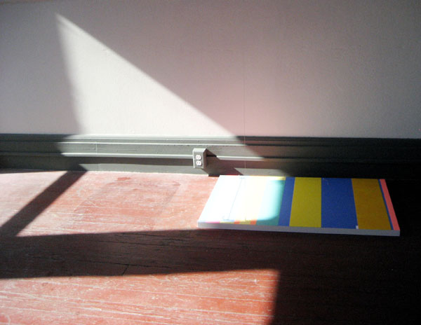
Melanie Carr, Pink Ramp, 2012, painted wood construction
This view looks across the room toward the southwest corner
 

The full-on view of the front of the room below shows you just how much the sun imposed its own strong presence on the installation. (It would be interesting to see this exhibition on an overcast day, or at night.) The changing angles of the sunlight work with and in counterpoint to the fixed geometry of the exhibition. One exception to fixed geometry: In the center of the window bank is a moveable sculpture by Robert Gregson. You can turn it carefully so that its “arms” cut into the rectangles of the adjacent windows and, more interesting to me, slice through the rectangular pools of light on the floor. This is the diagonal line you saw in the window as you viewed the building from the street.

 
Looking toward the south, with sunlight an active element of the installation
 
Below: Robert Gregson, Window Treatment, 2012, acrylic on wood 
 

To the right of Gregson’s “windmill” is a chromatic corner in which Kevin Daly has exposed a plumbing riser and some brick, Plumber’s Crack with Kickstand, he calls it. The cheeriness of the palette is at odds with the destruction of the wall, the painted surface overlaid onto the innards of the corner. It is marveously unsettling. The perfect touch? The “kickstand,” a stripe-painted board leaning provisionally against the wall, was provisionally acted upon by the sun, which appeared to have bleached the color out of the bottom half of the board.
 

Southwest corner: Gregson, Daley, Lister, Schifano

 
Kevin Daly, Plumber’s Crack with Kickstand, 2012, acrylic on canvas, latex, vinyl
 
 
Details above and below

Continuing along the west wall toward the stairwell are two works. The first is a two-part work by Adam Lister. A painting on the floor is mirrored by one on the ceiling. These paintings are tethered by a string (nearly invisible in the photo below) which, according to the information provided, is two strings—one from the top, the other from the bottom—held taught by magnets. For me the thrill was in seeing a “diptych” in an entirely unexpected orientation, defying gravity while at the same time anchored firmly to the floor.

Adam Lister, Everything You Ever Wanted, 2012; magnets, string, hooks, wood, paint
 
The angles of concentrated sunlight meet their match in a taped work by Karen Schifano, which engages ten wooden spindles of the banister and extends at an angle onto the floor. However you read this work—as shadow or light, drawing or sculpture—you respond to the formal beauty of the utilitatian banister, the cleverness of the work, the pristine geometry of the room—even the angular Bottwin sculpture on the wall behind it.

Karen Schifano, Bending Some Rules,2012, white tape


Before we head down the stairs . . .
 

Even after an hour in the space, watching the sun drag its light across the floor and thus interact with the work in ever-changing ways, I kept finding new things to see. Specifically thrilling were the conceptual interstices, the places where geometric elements, including the sunlight, overlapped visually with one another throughout the room. For instance: 

Adam Lister and shadows . . .
 

. . . Karen Schifano and floor . . .
 

. . . Debra Ramsay angles in relation to . . .
 
 
. . . Richard Bottwin angles . . .

. . in relation to Melissa Carr's acutely angled ramp (bracketed by Ramsay's Tyvek grid behind it and Schifano's tape work in the foreground) 
 

Faber Lorne's installation as viewed through the spindles of the Windsor chair at the top of the stairs
 

  And a full view of  Lister's ceiling-hung painting
 

I think you can tell that I was taken with this exhibition. While some of the work in it is exquisitely crafted, such as the sculptures by Richard Bottwin and Robert Gregson, much is provisional and site specific, like Karen Schifano’s taped interventions, Faber Lorne’s fluorescent bars, and Kevin Daly’s festive slice of deconstruction. Sure, you can see big and bluechip at Gagosian, Pace or Boone, or small and white-boxed on the LES, but this exhibition probably couldn't have taken place in New York City. In Making Room the artists made a room (and provided an experience) that was by turns intimate and expansive, intelligent, coolly animated, amusing, minimally invasive, maximally impactful and exquisitely curated.

Kudos to curator Suzan Shutan and all 10 artists for a splendid exhibition!

Making Room is up through November 3, this Saturday. While weekday hours are 10:00 to 6:00, the hours for Saturday, the last day of the show, are 11:00 to 2:00. This is a show worth seeing.

Update: A call to the Library this morning confrms that no damage was sustained in the storm and that the exhibition is open for viewing.
 

# # # #

And if you’re driving, no more than two miles away is the Giampietro Gallery where Susan Carr and Elizabeth Gourlay have solo shows through November 10.


10.29.2012

Marketing Mondays: The Mentor

.

Athena, Greek goddess of wisdom, takes the guise of Mentor, the elder who guided Odysseus's son, Telemachus
Image from the Internet

A friend mentioned recently that her work had been profoundly affected by a well-respected art professional who, looking at her paintings, said, “Make them larger.” Inspired to see where scale would take the work, she created a series of large paintings; they in turn led her into a series of small to mid-size sculptures and prints that have brought her increasing critical notice.

Hearing my friend’s story prompts me to note that our mentors come in all forms. Some are there for the long haul—a former teacher, a trusted dealer, perhaps an older or more professionally experienced artist who takes an interest in our work and dispenses encouragement and wisdom when we seek it or need it. Others appear more fleetingly in our lives, perhaps with only a comment.

It turns out that the person who “mentored” my friend with that fleeting remark has been a longtime friend and mentor to me. What we receive, and what we perceive can have a huge impact on our work, even if the contact is brief. Of course, we don’t accept advice blindly but sift through and keep or act on what is important to us, and it is up to us to evaluate the result of the advice.

My friend’s fleeting mentorship is a good lesson for those of us who are in a position to make a difference, for what we say—even if it is one comment—could utterly change another artist's life (and we might never know). Indeed, my friend is now in a position where her own words are now enormously influential on others.

My mentor has not focused on my art so much as on the art world, helping me understand how the various parts work and how they fit together. A mentorship is not static; you build on what you learn, connecting the dots to make informational structures of your own. In part, that's why I am able to bring Marketing Mondays to you.
 
Mentoring is an act of generosity. Repay your mentor with respect. Return the generosity of a mentor by paying it forward; you'll understand what that respect means when you receive it from someone you have mentored. Don't use what you have learned to try to usurp your mentor's positon; that's being selfish and insecure. If you've learned well, you will understand how to create the work you need to make and how to create a place for yourself so that it may be seen. When you are feeling secure enough to assume the role of mentor yourself, consider your words and advice carefully.
 
Please add to this conversation.
. Have you been mentored?
. If so, how has mentoring helped you?
. Have you returned the generosity of a mentor by paying it forward?

. Have you had a bad experience as a mentor or protégé?

 
If you have found this or any other post useful, please consider a voluntary annual donation of $20 to support this blog. Scroll down the sidebar from the top to find the Paypal link. Thank you. And big, big thanks to all the readers who have done so already!
 

10.26.2012

Dear 20- and 30-Something Sisters,


You have had access to contraception and the
.
oppportunity to control of your own bodies for as
.
long as you have been alive.

The stories of back-alley deaths from illegal and unsafe abortions are just "stories" to you, fortunately not reality. There has been some real progress made in wage parity, a pushing back of the glass ceiling, job options, and attention paid to sexual harrassment in the workplace. And, men--you good guys--you have wives, sisters, mothers, cousins, friends and girlfriends whose lives are better now. (Your own lives are better now, too. It's not just women who end up responsible for an unplanned child.)

To any sane person, rape is a physical violation that is a punishable crime. There are no "degrees" of rape. There is no "legitimate rape." Let's make sure right-wing male legislators don't try to institute their Medieval ideas.

You have options that previous generations of women worked (and some died) to achieve. The struggle, la lucha, does not stop with you. Pick up the relay baton already and do your part. Agitate, demonstrate and vote Democrat down the line.


Want to honor the legacy of Ted Kennedy in the U.S. Senate? If you're in Massachusetts, vote for Elizabeth Warren.
.

Want to support a lesbian for U.S. Senate, and help maintain the majority there? In Wisconsin, Tammy Baldwin is your woman. Here are her priorities: jobs, families, workers, small businesses..

Not sure whom to vote for? Emily's List has a great website that allows you to see the pro-choice, pro-equality candidates in every state.

And if you'd like to know more about women of color in politics or about women already serving, click on the boldfaced phrases for information from Rutgers University.

As for the economy, stick with the presidential candidate who pulled us back from collapse, not the one from the party that got us there in the first place (and whose "five-point plan" is a D: defer, denigrate, destroy, digress, and disregard).

Please vote to give our president, Barack Obama, four more years with a Congress that will work with him to work for us.

10.24.2012

A Review for Textility

.
Textility,  the painting and sculpture show I curated with Mary Birmingham at the New Jersey Center for Visual Arts in Summit, where Birmingham is curator, is long over (January 13-April 1, 2012), but a review has just come out in the Fall issue of Surface Design Journal.
 
In the panorama above: Work by Lael Marshall and Elana Herzog
 
 
"The show . . . was not about textile as a visual arts discipline with a historical and cultural frame of reference. Rather, it focused on the current visibility of cloth and other pliable materials in sculptures, paintings, drawings, prints, collages and architectural installations," writes Patricia Malarcher, a studio artist who is former editor of the magazine and now a contributor to it. If she was disappointed she did not let on. She considered the exhibition "on its own terms" and went on to write appreciatively of about 15 artists in the 28-artist exhibition, and to show two works specifically as well as a panorama.

If you click on the individual pages above and below, they will enlarge for legibility. But let me close with Malarcher's closing words: "Textility was a fascinating and ambitious, provocative show. The curators made a lively contribution to the current discussion on the place of fiber in the larger art world."


Above: Second half of the panorama in the large first-floor gallery (work from left by Susanna Starr, Leslie Wayne, Nava Lubelski, Susan Still Scott, Peter Weber, Arlene Shechet, Barbara Ellmann, Derek Melander); with insets of work by Lubelski and Carly Glovinski

10.22.2012

Marketing Mondays: Grants

.
Today's MM was spurred by this recent email from a friend: "Here's a juicy topic for you: artists who are famous, show at blue chip galleries, get museum shows, and are generally successful in every way imaginable who still apply for and receive grants. I'm not talking about life achievement grants like a Guggenheim or a Joan Mitchell, which are conferred, but the small state-supported grants that help supplement artists and open some doors for future advancement."

So subtitle this post The Thrill of Victory, The Agony of Defeat, But Mostly the Annoyance at Seeing Famous Names Receive the Small-Potatoes Grants Other Artists Really Need.

Let me say that I'm not a sour grapes-er. I rarely apply for grants. I don't like the odds or the hoops, and I particularly don't like having to ask people to write reference letters for me. (Disclaimer: Last year I did apply, unsuccessfully, for a Creative Capitol/Warhol grant for this blog, one of the readers I ask my readers to help me support it.)

But when the friend who sent the email noted some of the the names of artists listed as recipients for need-based grants, I did a little looking. It is surprising to see tenured professors and big-name artists on the lists of recipients for state-sponsored grants. For artists in academia, I suspect the grant getting is like the publish-or-perish mandate; it's something they have to do to get tenure and maintain faculty respect. And it doesn't hurt that they can use office hours to polish the application. For studio artists, I suspect that even the newly well-to-do retain the "povery mindset." When you've been indigent for so long, poverty becomes part of your persona.

I notice that academics seem to be habituated to applying for grants for everything--travel, conferences, additional study, exhibitions. Power to them if it's a professional development grant through their institution; that's what those grants are for. But I have heard $80,000-a-year, benefits-package, summers-off artists tell me, "I can't afford to participate if I don't get a grant." Everything's relative, I guess.

I don't have any answers here. But I do have questions:
. Do you have any qualms applying for need-based grants if you're not actually indigent?
. And what is indigent, anyway? Is it Qualifies-for-Welfare-indigent? Is it Working-Poor indigent? Is it I-Own-My-Own-Home-But-I'd-Like-A-Residency-In-Italy indigent? Is it I'm-Doing-OK-But-I'm-Not-As-Rich-As-Damien indigent?)

Use the Comments section to reply or vent.

10.21.2012

No More Binders, Blinders or Boundaries

 
Barbara Kruger, Your Body is a Battleground, 1989

 
Barbara Kruger created this poster in 1989 to support and promote a march on Washington opposing the overthrow of  Roe v. Wade. Now the battle is raging anew by repugnicans in Congress who seek smaller government (except when it interferes with their own narrow view of how things should be).
 
The image below is not by Kruger--it's a project of the Pro-Choice Public Education Project, designed by the Devito/Verdi advertising agency, so I feel a little uncomfortable using it--yet it so perfectly bookends the issue 25 years later that I've put it in.
 
Vote Yes for women: Vote for Barack Obama. Vote to keep the Democratic majority in the Senate. Vote to regain the House. You don't want to have to be doing this (again)  25 years from now.


10.17.2012

Gerhard Richter's Frigid Digitals

.
Panorama of the front gallery


I felt a drop in temperature the moment I walked into the Marian Goodman Gallery on 57th Street. It was the paintings, not the A/C. Painting 2012 is the title of the show that just closed, and "strip paintings" the term for these frigid digital prints by Gerhard Richter. Any painter enamored of Richter’s sensuous squeeged canvases, which quicken the pulse and heat up the space around them, may have a harder time with these. Well, I did. These are ink, not paint. And they are the very opposite of the opulent goo he has worked to such dramatic effect, the subject of the recent documentary, Gerhard Richter Painting.*
.
And yet.
.
Something interesting happens when you are surrounded by the horizontally striped prints, something the images on this blog post cannot convey. The prints, some multipanel, are so large that you feel enveloped by them. That optical vibration is so strong that it changes the perceived distance between you and the print, so much so that it’s possible to bump into the plexi surface before you even realize you are that close.
Resisting the siren hum of the stripes
 
.
Did I love them? Like a one-night stand, you love them for the moment. The color is gloriously saturated, and the experience is trippy, but then it's over. I’m glad I saw them up close before they end up in an institutional setting which is where they seem destined for.
.
Come with me down the hallway
 
 
Down the hallway in the south gallery, surrounded by more of the prints, is a sculpture with six glass panels held in tension within a cubic frame. This room was so sterile, like an OR with pictures, that I had the uneasy feeling I should have scrubbed before entering. One lovely touch--and "lovely" is not a word you normally use to discuss Richter's work--was the way afternoon sunlight pouring through the window was reflected six times in the panes of the sculpture. Finally some warmth.  
 
 
A panorama of the glass cube and two walls of prints, with the entrance to the gallery at left
.
Below, light from a south-facing window reflected in the sculpture

The gallery website has a good set of images, which will have to do until you see one in a museum. Which I’m sure you will soon.
 

*Want Richter's sensuous squeege paintings? There's a whole documentary about the making of them 
 

10.15.2012

Marketing Mondays: Speak Up. It's Your Career

.
 Image from Urban Cowboy


A couple of months ago I posted about The Difficult Artist. Today I’m posting about the other end of the scale: The artist who doesn’t take enough control. Whether out of fear of ruffling the feathers of colleagues or a gallery, or not being aware of their own power as artists, these are the folks who just don’t speak up.
.
Item #1: A Midwest artist told me that his local dealer pressed him to enter a juried show because of the caliber of the juror—not an unreasonable request (though, frankly, the dealer should be cultivating those curator connections). Knowing things the dealer didn’t about the organization hosting the exhibition, the artist had reservations about entering. Against his better judgment he capitulated to the dealer’s request. The show was "a solid average," according to the artist, and the juror was not in attendance. Both artist and gallery gained nothing from the experience.
.
“Why didn’t you tell your dealer you didn’t wish to participate in this show?” I asked.
.
He replied, “I didn’t want to piss him off.”
.
.
Item #2: A West Coast artist curated a show with a great concept and wonderful artists and secured a regionally prestigious not-for-profit venue. Sounds good, right? The problem is that the opening date conflicted with an established annual event in another city. This might sound like apples and oranges except that the curated show sprang directly from the original event in terms of mentorship and artists involved. Even the artist/curator was conflicted. Why didn’t she tell the gallery director that the date squared with the other event?
.
“I suggested it, but the director wanted it on the date she wanted it,” replied the artist.
.
“But it’s your show,” I countered. “ You have every right to say, ‘I cannot make the opening of this show. We need to reschedule,’”
.
“I didn’t know I could do that.” This from a person whose chutzpah level is normally over the moon.
.
.
Item #3: An artist organized a show with a prestigious curator as juror. Curiously, when the postcard was printed, the name of the juror—the most prestigious aspect of the event—was omitted, while the artist organizer, unknown to all but a small circle of friends, was prominently noted.
.
When asked why the juror was omitted from a show she’d organized, this artist placed the responsibility in the lap of the hosting institution, demurring, "I didn’t necessarily agree with their decision.”
.
Well for godsake, if you don’t agree with their decision, make an issue of it. Do something about it! It’s your show!
.

The list goes on:
. An artist/curator ceded installation to the non-profit gallery staff. He was mortified to find that a painting was placed in a space with storage racks that doubles (badly) as an adjunct exhibition space. When he asked the director to move the painting, he was told, “We always place work there." Translation: "We're not moving it."  He was mortified but didn't press the issue because he didn't want to “rock the boat.” Dude, that ship has hit the rocks. 

. An artist arrived at the opening of a group show in a small-town commercial gallery only to find that her triptych had been separated and its panels placed around the gallery among the other artists’ works. “That way we can sell them separately,” she was told. The artist was aghast, crushed, furious . . . and silent. Because she didn't want to be "difficult,” she said nothing.
. 
But there are success stories in this mix, too.
. When I arrived to see the installation of my solo show at a gallery I work with, I found a large sculpture by another gallery artist in the same space. It is not unusual for that gallery to place an occasional sculpture by a gallery artist in a solo painting show, and in fact I like the way a dimensional work can charge the energy between and among the paintings. However, since my paintings in that room were small, I felt the particular sculpture overpowered them. There was some discomfort on both sides when I asked the dealer to move it, but mutual respect carried the situation. The dealer accommodated my request, relocating it to a second gallery where I had large horizontal painting. The vertical sculpture was an effective counterpoint. 

. When B, a savvy new York City artist, received no response from a consultant after almost six months of waiting for money from the sale of her work, she did some research and found out that the consultant had been paid almost immediately upon placement. She left this phone message with the errant consultant, “I know you have already been paid, even while you continue to stretch out the payment time to me. I am prepared to let the acquisitions committee [of the corporation that had purchased her work] know exactly how you have been treating the artists you work with.” A check was Fed Exed overnight. (I know this is an effective strategy because one of my dealers did pretty much the same thing with an errant consultant she'd been working with--and, it turns out, the consultant was one and the same.)
.
. Jhina Alvarado, a San Francisco artist, talks in a blog post about When it’s Time to Jump Ship. Alvarado learned, rather quickly, that if it isn’t working for you—if the gallery requests are unreasonable, if their treatment is less than respectful, if they cancel the opening even after they know you’re planning to drive seven hours to attend it—it’s time to commandeer a lifeboat. She spoke up. And then she  found another gallery. That is how you rock the boat.
.
Finding your voice
I know it's not easy for some artists to speak up. You think that by doing so, the opportunity you've worked so hard to attain will be taken away. But if it's not worth having, as Alvarado's story underscores, you have nothing nothing to lose.

Speaking up is an acquired skill. No one would call me reticent, but I've learned to articulate what I need. That story about the artist whose triptych was separated? I was that artist, a long time ago.

Over to you: Are there times you wish you'd spoken up? What was the situation? Have you spoken up? What did you say?

10.10.2012

Building Geometry: Steven Alexander,

Warren Isensee, Chris Johanson, Christian Maychack
.
 Steven Alexander, Recent Paintings at David Findlay Gallery, September 5-29
 
 
These four artists (two painters, two painter/sculptors) are building geometry, whether layer by layer, line by line, or piece by piece. There's a strong sense of materiality that runs through much of the work. I'm going to keep my comments short so that I can show you a lot of installation shots.
 
The view coming out of the elevator, with Luna #2
 
We start with Steven Alexander, whose show at David Findlay Jr. Gallery on Fifth Avenue in Midtown was in an intimate, dark-walled room. I might have preferred to see these paintings in a more spacious white gallery so that their colors could expand beyond the parameters of the frame, but it turns out that the room, chapel-like in size and low light, created an opportunity to experience these paintings intimately. The way Alexander constructs his compositions, with layers of acrylic color and tinted medium, each painting emits a kind of  stained-glass luminosity. But make no mistake, these paintings are not transported on the wings of angels. They are built, block by block, color by color with chromatic logic and intuition.

Turning left into the gallery
 

On the foreground wall, Rosetta, 2011, acrylic on linen
 
Detail below
Alexander uses acrylic is a way that reads more like wax than plastic, with saturated richness and exquisite chromatic surprises


Moving into the gallery, with the appropriately titled yellow Interior, and a painting, shown  closer below, for which I don't have a title

You can see Alexander's own installation shots of the exhibition here.
 
 
Warren Isensee, New Work at Danese, September 7-October 8
 
 
Luminosity is the hallmark of Warren Isensee's work, too. Here the light is the result of hues vibrating against hues, as if tubes of neon have been bent into architectural compositions. It's paint, of course
--oil--which has been applied freehand to canvas with rigorous precision. By diminishing the thickness of the painted line as the concentric shapes become smaller, Isensee creates perspective in the work. Doorways, hallways and passageways are suggested to my eye, bathed in radiant mystery. 

Let me take you clockwise around the large main gallery, with Outer Limits, left, and Palomine
 

Continuing around the main gallery (the doorway leads to a small gallery with small works on paper) we come to Les Halles, which you see in larger view below


The main gallery, illuminated with a skylight, jogs into a  more conventionally illuminated section, where In Dreams, also shown below, hangs

 
Foreground, Sunshine Souvenier, 20 x 28 inches, with much of the power and electricity of the larger paintings
 
There's more behind the foreground wall, and you can see the gallery's installation shots here, which include views of the artist's small works on paper in a side gallery. There's also a beautiful e-catalog available for viewing on the website, here. (I also want to mention that having seen the gallery's physical catalogs printed by Blurb, I have revised my thinking about on-demand publishing. If Danese can do it, so can we.)
 
 
Chris Johanson, Windows at Mitchell-Innes and Nash, up through October 20
 
 
Continuing with the idea of portals, Chris Johanson's constructions, made from found wood and other materials, are windows into places where it seems that joy and poetry reside. Polor opposites to the precision of Isensee, these rather indelicately built works nonetheless offer a peek into another plane at the same time that the physical installation and a saturated palette have them radiating into the space of the gallery. The chairs have an anthropomorphic quality; perhaps there's a metaphor there, for they are reconstituted from myriad parts. I'm assuming they are not meant for functional use--no one was seated when I was there--but they are positioned in a way that invites sitting and viewing. In any case, through their material and process they dialogue actively with the work on the wall. 
 
View into the gallery with long view of the wheel-like sculpture--or is it a flattened cube?--on the back wall, shown in closer view below


This work, Window Painting #1, is visible at an extreme angle in the opening images
 
Detail below

 
Moving clockwise around the gallery we come to Window Painting #2, acrylic and latex paint on found wood
 
Closer view below


 Christian Maychack, Flats at Jeff Bailey, September 7-October 6
 
I'm not sure how Christian Maychack would identify himself, painter or sculptor, but like Johanson, he's doing double duty in an interesting way. Maychack's work reads as abstract painting with dimension, so the title of the show, Flats, tantalizes with ambiguity. I like how the artist takes charge of the picture plane, punching into a third dimension or creating holes so that the viewer can perforate it visually. I also like the way he fractures the grid. He's doing this with epoxy clay pressed and manipulated in a way that gives the surface a wildly energetic quality. Epoxy clay is a crafty medium if ever there was one, but he transcends it handily. (Yes, pun intended.)
 
 
Detail of Blue Through (CF 23),  epoxy clay, pigment and wood
Full view top
 
Panoramic view of the gallery with Floater, left; Blue Through (CF23) in back wall; and Double Flat #1, the tall sculpture at the center
 

Additional views of Floater, Blue Through and Double Flat #1
 
Detail below of Double Flat #1, with the finger impressions in the surface of the clay


Pair Apart (CF 20), 19 x 26.5 inches
 
The gallery's website offers good images of both the installation and individual works here. There's a lot I didn't show you. If you're intrigued by this work, click on over to the gallery's website to see more.
 
. . . . .

As always, If you have enjoyed this or any other post, please consider a voluntary annual donation of $20 to support this blog. Scroll down the sidebar from the top to find the Paypal link. Thank you. And big, big thanks to all the readers who have done so already!