

From the Entry: Ten paintings from my Uttar series, specifically those selected for their swatch-like combinations, each 12 x 12 inches, encaustic on panel. This is intuited color, its calculations springing from retinal response rather than theoretical planning
.

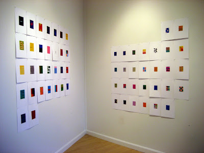
Jane Lincoln, four woodblock prints: Lincoln's grids explore hue, value, temperature and chroma. Each print is based on one selected color and then expanded in 36 one-inch squares. Within each print there is a pair of identical color squares. The two are positioned side by side, horizontally or vertically. The placement of the pair varies so as to invite the viewer to closely examine the differences between colors. Color interaction can make the pair surprisingly challenging to identify.
The white-line print was developed in nearby Provincetown in the early 1900s. Jane describes it on her website.
.

Nancy Simonds, gouache-on-paper paintings: Their Scully-esque blocks are juicy, bursting with beauty and visual energy as the hues rub up against one another as well as nestle into a colored field. The paint surface, which you can't see well from the image above, is sponged off selectively to reveal a visual texture that varies in density and intensity

At the end of the long, narrow gallery is a smaller exhibition space where the work of Chris Ashley and Rose Olson is installed. We'll enter there in a moment. Continuing clockwise around the main gallery are alcoves that contain the work of Susanne Ulrich, Nancy White and Mel Prest. We'll get to those, too.
From left, above: Nancy Simonds, Rose Olson, Suzanne Ulrich

Above, a peek into the smaller back gallery and Chris Ashley's digital prints. Chris creates images on the computer using HTML code, one a day. Each image is built up line by line--"not the result of software tricks," he says. The image is meant to be viewed on a monitor as pixels of light, but digital printing renders a crisp and luminous image which, in relation to the one on the screen, becomes an actual object. The installation reflects the calendar grid of the month in which the work was made
Below, the full installation
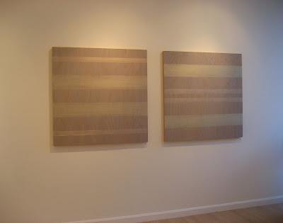
Rose Olson shares the same gallery room with Chris Ashley. Rose paints veils of color on a maple or birch ply surface using interference pigments, so the painting changes both as the light changes or as you move in relation to the painting. The wood grain, barely visible beneath the surface, challenges the strict horizontality of the image, yet the mood of the work is dialog--perhaps even contemplation--not confrontation.

Back in the main gallery, continuing clockwise around, we come to an alcove containing the collages of Suzanne Ulrich. Made of torn, cut and pasted papers, the work is both rational and romantic


Continuing clockwise in the next alcove is the sculpture of Nancy White. Nancy calls her small painted aluminum constructions "a personal conversation with the viewer," but there is also the conversation between the object and its shadow, which is an integral, and mutable, element of the work. The sculptures were difficult to photographs, so I have included an image from her website, below


Coming back around, the work of Mel Prest is contained both within an alcove and on the wall facing you as you enter the gallery. Working with a spectrum of achromatic hues, Mel uses small-scale elements in repeated geometric formation to focus your attention on the richness of the grays. The edges of the work are painted with fine parallel lines, so there's an optical energy that powers the work. A combination of natural light on one side and incandescent on the other creates a sense of disorientation--all the better to challenge your viewing
If you find yourself on Cape Cod, the exhibition is up through October 2. Be sure to pick up the small catalog, which is a gorgeous little color object on its own.
.


9 comments:
Nice show! On a related note...
Consequences of Geometry
September 2 – October 16, 2008
Reception: Thursday, September 11, 2–4 pm
Gallery Hours: Monday–Friday 9–5
McCoy Gallery
Rogers Center for the Arts
Merrimack College
315 Turnpike Street
North Andover, MA
978.837.5000
www.merrimack.edu
Thanks for mentioning that show, Donna. It's a beauty.
Here's the link directly to the gallery: http://www.merrimack.edu/community/Rogers/McCoyGallery/Pages/default.aspx
Definitely know a few here.
Joanne your work always seems to come up good in 'snap' - bling-bling.
I have a small piece of Nancy's ]lookin at it right now as I type] here in Tokyo, as I do a small piece by Mel [each on loan, not returned yet, actually]. Each has their own chorus, both hum to it out loud dispite the impressioned quiet or diminutive scale. And, of course, that one guy in the show, look see 'Chris' every day for three years or more [ yet to be introduced to the physical html].
Suzanne Ulrich looks good too, from what I can see.
All of it does!
Hey, thanks, Brent. Glad you like. Jane Lincoln did a great curatorial job.
Readers, "c.p." is Brent Hallard, author of several blogs, including the Persimmon blogs (see blogroll) and www.concretephone.blogspot.com
Love the exhibit pics. I've been meaning to ask you... do you do link exchanges? My email should be on my blogger profile if you are interested.
Thanks Joanne, Yeah Jane did a fine job!
Trying too bring all blogs unto one roll as 'themes' on that other blog carrying some-thing-or-other, wordpr... --a slow road to speed.
c.p.
Hi Joanne,
Very nice blog!
I am creating a blog for CCCC's art department and just added a link to your site...
http://connectart-cccc.jimdo.com/higgins-gallery/
Hi,Philippe--
Thanks for the link. Very nice video, too.
(For the video record, though, I am not an "encaustic artist." I am a painter who often works in encaustic. Also, I am not from Boston, but it's the "encaustic artist" moniker that pushes my buttons.
göz makyajı
Post a Comment