Pages

8.30.2008

Spider Woman

.
In the classic Mapplethorpe image of Louise Bourgeois, the artist is holding a giant plaster-and-latex penis under her arm like a baguette. The irony is that if she had an actual penis, if she were Louis Bourgeois, she’d be bigger than Picasso. Bourgeois is an immense talent who has been making art for over 70 years. Her arc spans Surrealism, Modernism, Post-Minimalism, Feminism and Installation Art, and her oeuvre—essentially organic and increasingly narrative—includes work in wood, stone, metal, wax, resin, fabric and found (or chosen) objects.

Robert Mapplethorpe, Louise Bourgeois in 1982 with Fillette (1968, latex over plaster)
.

Given the penile propensities of the art world, Bourgeois was ignored in the early years of her career while her male contemporaries went on to acclaim and success. But championed by the feminists of the New York art world in the 1970s, and then embraced by such curatorial powerhouses as Robert Storr, she became well known as she entered her seventies. She’s the most contemporary near-centenarian, and certainly the most productive, we have ever seen. (And her late-in-life fame makes her something of a patron saint for midcareer artists who have yet to receive their own recognition.)

Like Picasso, she has embraced and mastered a staggering number of mediums, each in service to a wide-ranging vision. But where Picasso’s work was about suffering on a large scale (Guernica) and sex at an intimate level (just about everything else), Bourgeois’s art is about personal pain and a sexuality that is less about personal intimacy and more about eroticism on a grand scale.


Installation view of Spider Couple, Untitled, and Untitled at Solomon R. Guggenheim Museum, New York, 2008; © Solomon R. Guggenheim Foundation New York . Photo: David Heald

.

For the artist's spectacular career retrospective at the Guggenheim Museum of Art in New York City, simply titled "Louise Bourgeois," the rotunda is dominated by two spiders locked in a pas de deux—though it’s unclear if it’s a dance of love or hate, life or death. Actually, you're not really sure there are two spiders until you see them from the top of the ramp.

There are two enormous cast aluminum sculptures suspended from the oculus whose knotted forms are informed by a spiral and whose reflections are of the spiral ramp, which in the several times I visited the exhibition was always crammed with people. (Most of the images in this post are courtesy of the museum, which shows the exhibition mercifully free of the actual hordes in attendance.)

Above, installation view of Spider Couple, Untitled, and Untitled at Solomon R. Guggenheim Museum, New York, 2008© Solomon R. Guggenheim Foundation New York. Photo: David Heald

Below, the cast aluminaum spirals, suspended from the oculus


The exhibition starts with her earliest work on the lower level, and as you move up the ramp, the work gets more autobiographical, so it helps to know a few facts about Louise Bourgeois:

. She was born in 1911 in Paris

. Her mother was a tapestry weaver

. Her parents ran a tapestry repair business out of their large home in the provincial town of Choisy, south of Paris

. The child Louise would help out when small hands were required

. Pere carried on with the live-in nanny under the roof of the home he shared with his family

. She has been angry at him all these years for what she sees as a betrayal of herself and her mother, and the pain of that betrayal has been something of a muse

. She visited Brancusi's studio when she was a girl. Here's part of the "Brancusi" entry in the catalog: "His room was full of wood beams, and I can tell you where he got them. The big boats would come from Dakaar, Africa, and those beams were the ballast. . . The beams were often left on the banks of the River Seine."

. She studied art in Paris from 1933-1938;Fernand Leger was one of her teachers

. She married the American art historian Robert Goldwater in Paris in 1938 and moved with him that year to New York City

. She raised three sons and made art in domestic spaces, working in the basement and storing her art in the dumbwaiter of her Chelsea brownstone

. Some early work, which consists of scraps of wood, was made on the roof of her building, which the artist used as a studio. Indeed, bits of cedar from an old water tower are incorporated into that early work

. Her first solo, of 12 paintings, show took place in New York City in 1945

. "Until the late 1970s, offers of exhibitons were few and far between," writes Frances Morris in the opening essay to the catalog that accompanies the show. She was embraced by the feminist artists of that period, after which, notes Robert Storr, she became more vocal about the specific source of her pain

. She moved into a large studio in Brooklyn in 1980, which allowed her work to get larger

. Her longtime studio assistant (30 years and counting) is Jerry Gorovoy, himself an artist

. In 1982 MoMA gave her a retrospective

. She's represented by Cheim & Read in New York City, where her work is regularly exhibited in solo and thematic group shows, and at the various international art fairs

. Her work is in collections at major museums internationally

. If the films about her are any indication, she's ornery and impatient. At the same time, the legendary Sunday Salons at her Chelsea brownstown are a model of generosity to artists

. She’s 97 and still at it. Indeed you can sometimes walk by that brownstone on 20th Street, between 8th and 9th Avenues and see her, through the window, working at a table in the front room

Let’s walk up the ramp, shall we?

Femme Maison, 1947, ink on paper, 36 x 14 inches


Bourgeois's earliest works were paintings and drawings, so this is what's installed at the beginning of the ramp. Several works show the combined image of woman and house. I remember Femme Maison as a strong feminist image in the 1970s. Given that home and work were intertwined from the artist's earliest days, and that this drawing was probably created in her home studio, Femme Maison (literally Woman House) very likely has much more in common with Womanhouse, the Judy Chicago/Miriam Schapiro project at Cal Arts than with housewife, another meaning of Femme Maison. (Though apparently the task of raising the children fell to her.)


Above and below, installation view of Personages at Solomon R. Guggenheim Museum, New York, 2008© Solomon R. Guggenheim Foundation New York
Photos: David Heald

Below, in the far corner, The Blind Leading the Blind


Louise Bourgeois, The Blind Leading the Blind, 1947-1949, painted wood; 70 3/8 x 96 7/8 x 17 3/8 inches
Hirshhorn Museum and Sculpture Garden, Washington, D.C.
© Louise Bourgeois. Image courtesy of the Guggenheim Museum


Installation view of "Louise Bourgeois" at Solomon R. Guggenheim Museum, New York, 2008; © Solomon R. Guggenheim Foundation New York
Photo: David Heald

Below, the artist with Femme Volage (the sculpture above that's farthest away on the ramp) The photograph, from the Louise Bourgeois Archive, is from the mid-1960s. The work, 1951, is in the collection of the Guggenheim


The sculptures from the series directly above were made when Bourgeois used the roof of her building as an alfresco studio. She incorporated scraps of the wood she found up there, including castoff cedar shingles from the water tower, a feature of most city buildings, which she painted. I love these works for their scale and materiality, and for their straightforward construction: strung like beads, except vertically on a metal or wood spindle.

The Blind Leading the Blind, the most minimalist of the work from this period, is one of my favorites. (It is not stacked but the construction is also straightforward.) There are other sculptures, totemic stacks of geometric shapes, that I love equally, but the Guggenheim did not include them as part of their press materials, and no photography was allowed (I tried).


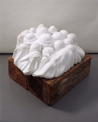
Cumul I, 1968, marble, wood plinth, 20 1/16 x 50 x 48 1/16 inches. Attribution au Musée national d’art moderne, Centre Pompidou, Paris. © Louise Bourgeois, courtesy of the Guggenheim Museum
.
Below, Louise Bourgeois in 1990 with her marble sculpture Eye to Eye, 1970. Photo: Raimon Ramis, © Louise Bourgeois, courtesy of the Guggenheim Museum


As we walk up the ramp, the shapes become more biomorphic. Materials are marble and metal, as well as favorites of that time, like latex. Travel and politics were most certainly an influence on her work. Bourgeois took her first trip to the quarries in Pietrasanta, Italy, in 1967-68. Her biomorphic work became more overtly sexual as she aligned more closely with the Women's Movement in the 1970s.

.

Arch of Hysteria, 1993, bronze, lifesize. Image taken from Internet


The lean, angular frame of Bourgeois's longtime assistant, Jerry Gorovoy, provided the form for Arch of Hysteria, the exquisitely graceful (or painful, depending on how you look at it) bronze sculpture of a naked male figure bent backward and hanging by a thread. Hysteria was long thought to be a "women's malady," so there's a lovely irony in the use of a male body. Equally lovely: the pose is very likely a calming dhanurasana, yoga bow pose, anything but hysterical.

Two installation shots: with the hanging spirals above, and with a view of Bourgeois's cells and fabric sculptures below. Both images courtesy of the Guggenheim Museum


Bourgeois in her Chelsea home with the same three pink cloth figures visible on the upper left ramp of the installation image above


Above, Cell (Choisy), 1990-1993, pink marble, metal and glass; 120 1/2 x 67 x 95 inches. Photo: Peter Bellamy, © Louise Bourgeois, courtesy of the Guggenheim Museum


Below, Red Room (Child), 1994, mixed media, 83 x 139 x 108 inches. Photo: Marcus Schneider, © Louise Bourgeois, courtesy of the Guggenheim Museum


With the artist's advancing age, childhood has become more literal, sometimes frighteningly so. The Choisy installation, with its guillotine blade poised menacingly above the pink marble model of her childhood home, is painful to look at, but I suppose that's the point. Other autobiographical “cells,” or enclosed installations Bourgeois made in the 1990s, are more nuanced.

Red Room (Child) is dreamlike and surreal, with fact and metaphor interwoven in ways that are entirely known only to the artist. The two pairs of hands on the pedestal in the center of the image are carved from red casting wax, as are what appear to be viscera at the right of the frame. Hands and fingers are, of course, intimately involved with warp and weft, the manipulation of which was the family business. But given the artist’s pain at her father’s affair, those hands suggest not just work but a tender touch and its absence. Red is blood, life, heart, love, heartbreak. Those cones and spools of thread simply reinforce that tangled emotional web.
.
That brings us to the spider, as iconic an image for Bourgeois's late period as the woman house was to an earlier one. "I come from a family of repairers. The spider is a repairer. If you bash into the web of a spider, she doesn't get mad. She weaves and repairs it," says the artist in the catalog entry under "Spider."
.
It's just too obvious to think that this figure, enormous as Bourgeois has rendered it in bronze over and over again, is a metaphorical means to reweave the fabric of her life story. Isn't it?
.
Formally, these bronze arachnids are compelling. They're beautiful, horrible, formidable. They claim a lot of space. And they're virtually indestructible. There's nothing metaphorical about that.
.
Louise Bourgeois will be at the Guggenheim Museum of Art in New York City through September 12. Thereafter it will be at the Museum of Contemporary Art in Los Angeles from October 26 through January 25, 2009. It will then travel back east to the Hirshhorn Museum and Sculpture Garden in Washington, D.C., where it will remain from February 26 through May 17, 2009.


Louise Bourgeois in the studio of her apartment at 142 East 18th Street in New York, circa 1946. Photo: Louise Bourgeois Archive, courtesy of the Guggenheim Museum


The exhibition has a number of resonant corollaries, some of which may be seen independently of the museum show:

See the Pictures
A concurrent show, A Life in Pictures: Louise Bourgeois, in the Sackler Center at the Guggenheim, consists of dozens of photographs selected from the artist’s archives, such as the one above. I assume these will travel with the show.

Read the Book
The exhibition is accompanied by a beautifully illustrated catalog, Louise Bourgeois, which is set up like a glossary (Dreams, Guilt, Old Age, Religion, Spider are a few of its numerous entries). It’s essential reading for any one with an interest in a towering talent whose life is nowhere as neatly arranged as this book.

See the Movies
. The exhibition features selections from the 1978 film, Confrontation, as well as several other films of Bourgeois at home and in her studio in which she talks about her work and reveals some quirky habits (something of a germophobe, she irons each section of The New York Times before she reads it). You also get to hear from her longtime assistant Jerry Gorovoy. (Man, everyone needs an assistant like him!)
. Louise Bourgeois: The Spider, The Mistress and the Tangerine, a film showing independently of the exhibition, directed by Marion Cajori and Amei Wallach. I don't imagine it will turn up at your local mall, but it should have an arthouse run.

And More
This link to PBS offers several slide shows
# # # # #

The images for this post come primarily from the Guggenheim Museum, with a few taken from the Internet. I intend no disrespect in reproducing copyrighted images taken from the Internet. This is a non-profit blog. The information come from wall texts, my own observations, and in a few noted instances, from the catalog. .

8.27.2008

Homage to the Square . . . .


El Lissitzky, Of Two Squares: A Suprematist Tale in Six Constructions, one page of an illustrated book with seven letterpress illustration, 1922, page 10 15/16 x 8 7/8


Here's one last look at the Geo/Metric show. As you might expect in a show on geometric abstraction, the square was a leitmotif that floated throughout the galleries (the rectilinear version of "follow the bouncing ball"). This is a strictly subjective selection.

.


Josef Albers, two from Homage to the Square: Ten Works by Josef Albers, 1962, each 16 1/2 x 16 1/2.

Above: Full; below: Tenuous

.


.


Ellsworth Kelly, Purple and Orange from the series Line Form Color, 1951, gouache on paper, 7 1/2 x 8 inches


.

Mary Heilmann, Davis Sliding Square, 1978, synthetic polymer paint on paper, 29 7/8 x 22 1/2. I love how the two Jo Baer gouaches are reflected in this work


OK, I have really finished with this series now. I'm moving on to Louise Bourgeois in the next post.

..

8.23.2008

Geo/Metric at MoMA, Part 4

.


Buren to McLaughlin: view from Gallery 3 to Gallery 4
.

We are in Gallery 4, where the walls have again become gray. The glimpse of Daniel Buren’s work in the previous gallery should orient you somewhat. As I noted earlier, this space is the mirror image to Gallery 2; so where the dividing wall held Mary Heilmann’s work in Gallery 2, here it holds four prints by Blinky Palermo, which you will see shortly.

Above, and below, with our back to the Palermos, we’re looking at two lithographs by John McLaughlin. Being a lifelong East Coaster, Northeaster specifically, and New Yorker most specifically, I am not familiar with the oeuvre of this California-based painter. Minimalism is certainly his focus, though color does not seem to be a strong point.


John McLaughin, two untitled lithographs, 1963; at left, 18 x 21 7/16 inches; at right, 18 x 21 1/2 inches
.
.
Now we turn around to face the Palermos, which face Gallery 3. My own camera didn’t get the vertical shot I wanted, so I have pulled the four images from MoMA’s website and arranged them as they were installed. These four, oriented vertically, are not so much narrative as declarative The shapes are what they are. I don’t know the artist’s intent, but I find these works almost playful and related to the Ellsworth Kellys in Gallery 1.
.


Installation view of Blinky Palermo screenprints in foreground; Josef Albers screenprints on the far wall

..


Four prints by Blinky Palermo, 4 Prototypen, 1970, each 23 5/8 x 23 5/8 inches. Images from the MoMA exhibition website

.

.
With the Palermos still in our view, we look to the left to see 10 Josef Albers screenprints. These works are in a mirror-image installation to the Kelly drawings and collages on the mirror-image wall in Gallery 2. The symmetry of the spaces and of the Albers and Kelly installations underscore the geometry of the exhibition in a fundamental and deeply satisfying way.


Josef Albers, Homage to the Square: Ten Works by Josef Albers, 1962, a portfolio of 10 screenprints, 16 1/2 x 16 1/2 inches
..
.
This series, Homage to the Square, is classic Albers. How do I love it? Let me count the ways: the color, the order, the variation, the simplicity, their systematic and intellectual study of something as sensuous and subjective as color. Whether or not you’re interested in the physics and relativity of color—and if you’re a painter, how can you not be?—or in the empirical studies that resulted, you can simply bask in the refulgence of the hues, or thrill to the formality of the installation: a grid of square-framed work of squares within squares.


Squares to more squares: Albers to Stella

.

To maintain that thrill a little longer, we move around to the Frank Stella screenprint, Double Gray Scramble, which alternates and and opposes tonalities of color and gray. The maze-like, but in fact concentric, progression pulls you deeply into its depths. This work, to me, is the abstract version of those Russian nesting dolls set into a hall of mirrors. Call me old fashioned, but I prefer this early work of Stella’s, before it exploded into dimensional frenzy. (I don’t dislike the new work, which I wrote about last year, I just like these flat geometries better.)

.

Frank Stella, Double Gray Scramble, 1973, screenprint, 29 x 50 3/4 inches
.
.
The Stella print is to the left of the doorway that takes you back into Gallery 1. To the right of the doorway is this celestial Sol Lewitt, below. The artist’s title is the dry Lines from Corners, Sides & The Center, To Points on a Grid, but it suggests to me nothing so much as a star map for a cubic universe. (I know, bad minimalist, reading poetry into the work.)


Sol Lewitt, Lines from Corners, Sides and the Center, to Points on a Grid, 1977, etching and aquatint, 34 5/8 x 34 13/16 inches
.

Sol Lewitt at left. Francois Morrellet, 8 Wefts 0 Degrees 90 Degrees, 1974, eight screenprints, each 23 5/8 x 23 5/8 inches

.

To the right of the Lewitt is a series of eight screenprints by Francois Morellett. The proportional order of the works seems a minimalist cliche to my eyes in 2008; still, there’s no denying the graphic power of these eight works as they move from white to black, maintaining the simplest geometric expression into a compressed infinity of blackness. Its placement after the Lewitt is graphically brilliant.

An enormous Richard Serra punctuates the dividing wall, and the gallery, with a muscular sweep of black oil stick and graphite. This work predates by about three decades the mighty steel sculptures shown at MoMA last year, but in this work you can certainly see where he was headed. And let me express awe for the framing job as well. How many of us have either the financial werewithall or the museum support to get a frame like this?


Richard Serra, Heir, 1973, paint stick and graphite on paper, 114 5/8 x 42 1/4 inches


These last three images are meant to give you an overview of the exhibition:

Here we're standing with our backs to the Stella print so that we see Gallery 4 as it flows from Gallery 3
.


Here we're in Gallery 1 by the vitrine looking into Gallery 4, with a view of Serra and the Morrellets
.
Below, we're back at the entrance, peeking at the Albers in Gallery 4


.

It has taken us four posts, but we have traveled a circle within a square, so our geometric journey has in fact been geometric itself.

.

8.21.2008

Orange

Kate Beck has posted an interesting new piece on her blog, which begins: It is high summer and my eyes are filled with all manner of blue and green, but it is to Orange I am drawn. From Tilman's very personal grasp for the potential of color as light to Joanne Mattera's iridescent geometric surfaces described as 'lush minimalism', the aesthetics of these artists challenge, stimulate, move and satisfy. Read more.

8.14.2008

Geo/Metric at MoMa, Part 3

Geo/Metric at MoMA, Part 1
Geo/Metric at MoMa, Part 2
Geo/Metric at MoMa, Part 4


With Mary Heilmann’s cadmium yellow and ultramarine painting at your back, you're facing Gallery 3. This large space is the mirror twin to Gallery 1 (just as Gallery 4 is the mirror twin to Gallery 2). The walls are creamy white rather than gray, and the space at this end is dominated by color and geometry on a large scale.


.

Left: Gabriel Orozco, Samurai's Tree Invariant, 2006, series of 672 digital prints with digital files, composition and sheet, each 21 7/16 x 21 7/16. Right: Martin Creed, Work No. 341, 2008, felt-tip pen and ink on seven pieces of paper, each 11 1/2 x 8 1/4 inches

.

Let’s enter. To your left, at the far wall, is an installation of digital print “wallpaper” by Gabriel Orozco. To your right, image below, Olaf Nikolai has the dividing wall that faces you; it’s covered with long rectangular sheets of commercially printed glossy paper arranged in a vertical “brick” pattern. On the other side of the Nikolai wall is a Daniel Buren installation, which you will see as we progress through the gallery. And at the far right wall is a large modular Robert Ryman, which you can just glimpse in the image below, but we’ll get to a better picture of it in a bit. All of these works are composed of smaller elements amassed and ordered to form a whole. The curatorial concept is beautifully thought out, as is the color: brilliant hues on the Orozco/Nikolai side of the room; a more muted palette—mostly white—on the other.


Olaf Nikolai, 30 Farben (30 Colors), 2000-2005, portfolio of 90 offset prints, each app. 40 x 12 inches. To the left of the Nikolai wall, Dorothea Rockburne's folded prints; behind it, Robert Ryman's modular painting on paper

.

Now the particulars. I’d seen the wall of Orozco’s work at one of the fairs (Basel Miami, I think). It initially caught my eye, but to be honest, it seemed more suited for a home show and I kept walking. I looked more closely this time, and while there are some interesting variations in the composition and in the colorways of blue, gold, white and red, it still looks and feels like wallpaper.

Martin Creed provided a nice counterpoint in scale. So, it’s not always about size. His seven small works are tiny color fields—color plots?—executed for the most part in day-glo felt-tip pen, each a different color. Any one might not make you stop, but the group of them holds the wall and your attention. This is the guy who won the Turner Prize for his [in]famous piece in which the lights in a gallery are switched on and off, so he understands how to get your attention. (Sorry I don't have closeups to show you; my images came out blurry and the museum's site doesn't have pics of them.)


One module from the Orozco installation

.

Continuing our turn around this half of the gallery, we come upon the central dividing wall on which Olaf Nikolai’s work is displayed. I wrote about Nikolai in a recent post about color. Carolina Nitsch, the gallery that showed his work, is the publisher of these prints. The piece is 30 Farben (30 Colors), a portfolio of long rectangular sheets of offset-printed paper, each a commercially available hue selected from the Pantone palette. According to the wall placard, the artist encourages his collectors to arrange the portfolio to their own preference. If the curators devised this arrangement, kudos. I can’t imagine a better arrangement for the wall, or a better placement than on this wall. To me, the whole is greater than its parts.

Mark Grotjahn’s paintings are to the right, just out of view. We’ll get to them in a bit, but for now, let’s look beyond the Olaf wall into the the other half of the gallery. To the left: Dorothea Rockburne’s series of creased paper; to the right, on the far wall, Robert Ryman’s 12-segment print.

Here’s Rockburne’s wall, below, with closeups of two works below that. I love the quiet and subtlety of these work. And it’s no small feat that in a room of demanding color, this wall—indeed, each work within it— holds its own. The placard identified the work as an acquatint. I would have ascribed the tonal differences to the light hitting the various planes of the folded paper. Not bring a print person, I’m not sure when and how during the process they were folded.


Dorothea Rockburne, Locus, 1972, a series of six relief etchings and aquatints on folded paper, each 39 3.4 x 30 1/16 inches.


Below, two pieces from the series. Images from the MoMa website


Continuing around the second half of the gallery, below: Robert Ryman, Classico 5, 1968, synthetic polymer paint on paper, 12 units overall 93 1/4 x 88 1/2 inches. Three drawings from Agnes Martin are to the right


.

The interplay of elements between and among the work of Rockburne, Ryman and Martin is captivating: Rockburne’s fractured planes, modulated so that they read as positive and negative space, vis a vis the Ryman panels, where a whiter rectangle is placed within the larger elements. It’s also fractured, but in the most formally organized way. Agnes Martin’s three small ink-on-paper drawings engage in a call-and-response with Rockburne and Ryman—well, make that a whispered exchange: her small individual grids vis a vis Ryman’s giant grid installation; her trapezoid drawing vis a vis Rockburne’s angles. Metaphorically, it’s like the grownups conversing quietly in the living room about art, math and music while the kids party at full volume in the the basement.


Agnes Martin, above and below


Above, Trapezoid, 1960, ink and pencil on paper, 9 3/8 x 11 7/8 inches unframed. Below, Tremolo, 1962, ink on paper, 10 x 11 inches unframed


.

While we’re talking party, let’s swing around to the right of the Nikolai wall so that you can see Mark Grotjahn’s four framed colored-pencil-on paper drawings. Wildly energetic, their palette has everything in common with Nikolai, yet their crystalline compositions have much in common graphically with Riley and formally with Rockburne. How I wish there were a catalog for this show. I’d love to know what precipitated these particular acquisitions, and if they were made with one another in mind, and how the show was selected from MoMA’s stash.


Back in the chromatically assertive half of the gallery, we see four high-energy drawings by Mark Grotjahn. (Barely visible in Gallery 4 is a wall of Albers's prints. We'll get to them in the next and final post)

Below, Grotjahn's Untitled (blue and yellowish cream), 2002, colored pencil on paper, each 24 x 19 inches unframed


.

To reorient you, below is a view of where we entered--from the doorway on the left. Ryman is to our back, Rockburne unseen on the right, Martin on the left. Ahead of us is Daniel Buren’s installation. Grotjahn is visible to the left, Creed to the right. Orozco is out of view at the far wall.


Daniel Buren, Framed/Exploded/Defaced, 1978-79, aquatint cut into 25 squares


What is the sequence here in Buren’s installation? Is there a message? Trying to “decipher” a meaning from this installation of stripes and spaces is like trying to read a newspaper in, say, German. I recognized the elements, but I just didn't know what it was telling me until I went onto the exhibition website. In fact the work is about expansion and contraction and your perceptions of space. This is an aquatint that the artist cut into 25 equal squares that must expand to fit whatever wall is chosen for them. So this wall, both sides, is heavily weighted with curatorial decisions. (If only there had been an essay!)

Despite the "explosion" of the title, the energy of the work is contained securely within each module. That's an interesting push/pull. Formally I love the relationship of this work to Grotjahn's angularities and Creed's more-or-less deadpan drawings.


We're about to enter Gallery 4, whose entrance is just to the left of the Grotjahns

Next and last post: Gallery 4.

..