Best. Gallery. Name. Ever.
Pulse
Art? Or Not Art?
Lean Times
Black is the New Black. Again
Art Miami
 I have not always loved NADA. Previous incarnations at the
 Image from the NADA website
the Convention Center, I was so physically depleted from four previous days of 12-hour-looking that I couldn’t focus on what I was seeing. But this year I was rested and eager to take it in. And I can confidently say that this fair, newly enlarged to fit a third function room, was fabulous.
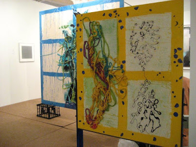
At Thomas Erben Gallery, New York: Dona Nelson
.
.
For one thing, unlike at many of the other fairs, I saw a lot of artists and galleries I hadn’t seen before. For another, it was funkier. NADA, an acronym for the New Art Dealers Alliance, seems to attract emerging galleries with a Lower East Side esthetic. Not everyone is from the LES, of course, but the esthetic is on materiality, rough-hewn construction, often smaller work, newer (read: younger) artists, and a strong sense of esthetic independence. I saw a lot of work with fabric, wood and clay, as well as seriously material paintings. Because this post is coming later in my series, a number of good works have already been posted—in Lean Times, Black is the New Black and, yes, Art? or Not Art?. Still, there's a lot to show you.
NADA was one of the few fairs that had free entry, a big draw for artists and young collectors.
Lobby of the Deauville Hotel, home of NADA
The Deauville Hotel, where the fair takes place, contains three ballrooms off a large lobby. The fair took place in all three ballrooms. I’m describing them by size, largest first. The Napoleon room (straight ahead in the picture above), recognizable by it’s ginormous chandeliers, contains the greatest number of booths. Here are some pics:
Above and below
Views of the fair in the Napoleon Ballroom. The crowds were pretty sparse, which meant ease of looking for me, but not great for selling art
Below: One more general view, this of Studio Voltaire, London. When you have a small booth, it's life in a fishbowl--conversations, lunch, phone call all take place in public view
Next: The Richelieu Room. Recognizable by its warm wood flooring, it gives way to one of the most grotesque carpets known to humankind. The reedeming feature of the carpeted section is that it overlooks the ocean. Here are some pics:
Above: On the floor looking up toward the entrance
Below: On the raised section looking into the large expanse of exhibition
Above: Some of the booths are larger here in "carpetland"
Below: A glimpse of ocean
Next: The Jardin Room—pardonnez moi, Le Jardin. It's the smallest, with some booths the size of a closet. Those petite spaces are not necessarily a bad thing, as they give a small emerging gallery the opportunity to be part of a good fair (I’m guessing these small booths are priced well). There also seemed to be a strong sense of community among the dealers and artists. In this space there were also a few larger spaces to anchor the room.
The view when you walk into Le Jardin. The ceiling is lower; small booths are to the right
A few spaces here are larger, and they range from coolly elegant to funky
Above: Silverman Gallery, San Francisco
Below: Kate Werble Gallery, New York
Here's some of what I saw, arranged not by section but in a visual narrative:
Rachel Uffner Gallery, New York: Sam Moyer, Virginia Poundstone
Rotwand Gallery, Zurich: Clare Goodwin paintings
Nicelle Beauchene, New York: Sarah Crowner fabric paintings
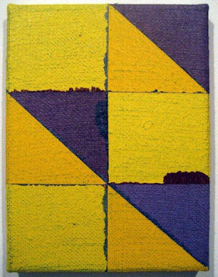
James Fuentes Gallery, New York: Joshua Abelow geometries on wall
Below: My favorite of the group
Rawson Projects, Brooklyn: Sam Martineau
See what I mean about there being a lot of small work? I liked being able to see more than one work by an artist
KS Art, New York: Chip Hughes
Below: Closer view of painting on right
At Jacky Strenz, Frankfurt: Raimer Jochims
Above: Individual work
Below: The Installation
I loved that the Lower East Side gallery, Canada, had set up its space like a viewing room. You can barely see the small work by Michael Mahalchick on the wall in the corner
Below: Here's a better view. It's Crest Whitestrips on glass. Ah, today's art will keep a generation of conservators with plenty to do. No matter, I liked it
Corbett vs. Dempsey, Chicago: Rebecca Shore paintings
Closer view on one below
Studio Voltaire, London: Laura Aldridge watercolor-painted pillows
American Contemporary Gallery, Annapolis
Ltd., Los Angeles: Maha Saab painting
Detail below
Essex Street Gallery, New York: Valerie Snobeck
As you can see, a strong textile sensibility is very much in evidence. This pleases me immensely, as I not only love the use of or reference to blankets, rugs, tarps, nets, banners and dishcloths (and more) in painting, I have co-curated a show, Textility, with Mary Birmingham for her institution, the Visual Art Center of New Jersey. The exhibition opens in Summit on January 13. Preliminary info and a few pics are on my blog. I'll have more to show and tell once the Miami coverage is over.
Mihai Nicodim Gallery, Los Angeles: Oscar Murillo
Feature Inc., New York: Todd Knopke
Altman Siegel Gallery, San Francisco: Liam Everett
(You saw one of his sheer paintings in the Lean Times post)
Location, location, location: Sometimes the difference between "art" and "craft" is simply the context. Had this booth been at a craft fair, it would have been the most sophisticated and "artiest" booth there. Here, it's still sophisticated, and it fits right in. And may I say that I think installation of sweater patterns and sweaters as scupture is fab.u.lous.
Amback and Rice, Los Angeles
Above: Ellen Lesperance, gouache paintings and knitted sweater
Below: Booth installation with Jeffry Mitchell ceramic sculptures
Nicole Klagsbrun, New York: Sean Bluechel installation of ceramic objects
Eleven Rivington Gallery, New York: Michael DeLucia painted and routered plywood
Detail below
The indefatigable Martha Wilson, founder of Franklin Furnace. Wilson, who has a long career as an artist, founded this non-profit to provide a place for artists to show performances, periodicals and other "time-based visual art." Historical importance aside, I love how her two-tone hair is echoed by the two-tone geometries behind her
Read more about Franklin Furnace here.
Read more about Franklin Furnace here.
Next up: Materiality


4 comments:
Thank gawd, I would have been so disappointed not to have seen a shot of the carpet.
Awesome coverage Joanne. It's not as cold as it should be here in Toronto, but I'm still envious over the trip to warmth and art.
As usual, a very rich and inspiring post. Thanks for introducing me to the work of Michael DeLucia, which is absolutely stunning. I'm throughly looking forward to the next post. Thanks!
This gave a great overview of what was going on. Thanks so much for your perspective on it all!
Hudson of Feature, inc. was a long hold-out on art fairs. That he decided to be in it goes to show how much influence the fairs have on the art world and collectors.
The painted-pillows looks like an art-not art contender. Personally, I find I often (though not always) like the art when its closest to not looking like what is commonly accepted as art.
Post a Comment