The posts so far:
Fair Enough: And I'm Off Fair Enough: Traveling Incognita?
Fair Enough: All Over But the Posting
Fair Enough: Art or Trash? Post updated with captions and a Winner
Fair Enough: Prologue to the Report
Fair Enough: Art Basel Miami Beach, Part 1
Fair Enough: Art Basel Miami Beach, Part 2
Fair Enough: Aqua Art
Above and below: views of the Ice Palace film studio, home to Pulse
Every year Pulse hosts outdoor sculpture. This year's offering is the best so far: Orly Genger's scuptures splayed on the lawn. The hammocks, which you can see below, are another regular feature of the venue; by midafternoon there's not an empty one in sight
Pulse is across the causeways from the beach, located just to the south of a cluster of fair venues (Art Miami, Red Dot, Scope, Seven, and the collections of the Rubell Family and Martin Margulies). I got to Pulse at 10:00 am when the doors opened to the press. Like Aqua, the venue shows a variety of art from a variety of galleries, but its location accommodates larger booths and consequently larger work. The fair is more international in scope.
I don’t love everything I’m showing you, but I do think it’s representative of the offerings. You’ll notice I’m not showing you a lot of painting. I didn’t see a lot of painting. Or maybe I saw it and blocked it out. There was a good deal of Glop Art—impasto with an extra-big schmear. To my minimalist-leaning sensibility, it’s just not appealing, but I have included a few images so that you can see for yourself.
There were a lot of references to money at this fair, some glitter and shine, some textile-related work and the paintings of several artists working in the miniature style. I’ve included a taste here. You’ll see more of all of these in the dedicated posts to come.
Above and below: Two views of the setup
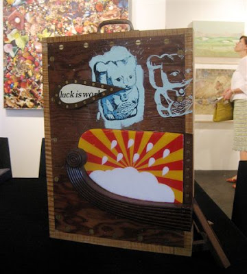
Words to live by? Subtitles for fair week? Random messages?
Above: Mac Premo at Pavel Zoubok Gallery, New York
Below: Steve Lambert at Charlie James Gallery, Los Angeles
Morgan Lehman Gallery, New York
The best installation of form and content. The narrative, The Wolf and Hawk War, 1782-1790, by Frohawk Two Feathers
Pavel Zoubok Gallery, New York
Every year the gallery, which shows collage and assemblage, puts together a booth whose assemblage-like installation enhances every piece of work
Gallery Joe, Philadelphia
That's Becky Kerlin in the foreground. Wherever her gallery's booth is located, it's a tranquil oasis of formalism and minimalism. Gouache-on-paper grids by Sabine Friesicke; graphite on paper circles by Dean Smith
Julia Mangold at Elizabeth Leach, Portland, Oregon
Below: Could this surface be any more gorgeous? It's graphite and wax (on MDF)
Schroeder Romero & Shredder, New York
The polar opposite of minimal. I'll have names for you on Tuesday
Gallery Diet, Miami
Above and below: I saw Fabienne Lasserre's sculptures at Sikkema Jenkins a couple of months ago and didn't get a chance to show them to you. Reprieve!
Patrick Heide Contemporary, London
Every year this gallery brings a selection of interesting work.
Above: View of a corner
Below: Thomas Muller drawings from a closer perspective
Above and below, Also at Patrick Heide:
Susan Stockwell money map. Currency was everywhere in the fairs
Jonathan Ferrara Gallery, New Orleans
See what I mean about the money? These are Dan Tague photographs of manipulated bills, each with a (usually) ominous message
Below: State of Fear
Nina Menocal Gallery, Mexico City
Humberto Diaz maquette for Tsunami; you can see a full-size sculpture in the photo
Catharine Clark Gallery, San Francisco
Al Farrow sculptures of mosques, temples and churches made from guns, gun parts and bullets
Black and White Gallery, Brooklyn
Alicia Ross cross-stitched portraits.
Below: The Phrenology of Lady Gaga
Danziger Projects, New York
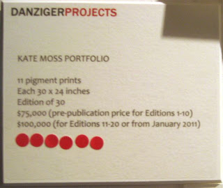
Why am I showing you this Bruce Weber portrait of Kate Moss?
Below: That's why
(See artist/blogger Nancy Natale's thoughts on art, fashion and money)
Elizabeth Leach Gallery, Portland, Oregon
To a soundtrack of mooing, we watch holsteins at a salt lick. The licks are in the shape of a female breast, shown in detail below. Pervy and fabulous in equal measure.
Artist name coming
Margaret Thatcher Projects, New York
There's an odd symmetry to breasts in salt that look like marble to marble that looks like dairy. These are by the sculpting duo of Julia Venske and Gregor Spanle
Diana Lowenstein Gallery, Miami
Daniel Gonzalez unites sequins and op
Gallery unknown to me (if anyone can identify it, please email me)
David Jien drawing in the miniature tradition, Collector, Dog and Several Gold Objects; color pencil, graphite and gold leaf on paper; 11x17 inches
Mark Moore Gallery, Culver City
Above and below: paintings by Alison Schulnik. There's a lot of paint on these canvases. I'm not a fan of this artist's work, but apparently I'm in the minority; her galleries sell out every show. And, indeed, there were red dots aplenty here
Freight and Volume, New York
Tube and trowel? Ali Smith painting with detail, below
Galerie Bacelos, Spain
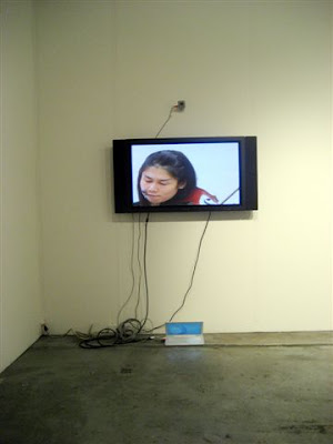
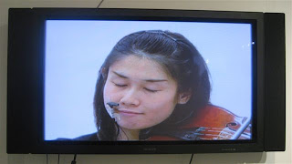
Angel Nunez video. I rarely stop for videos, but the simplicity of the installation pulled me in. In my art-fair-induced stupor, I thought at first that I was seeing a paraplegic woman trying to communicate. All I heard was breathing. Then I realized she was a violinist, wired so that we heard only her breathing and the sound of her heartbeat. She was communicating! I'm told the music, a Bach cello suite for violin, was eventually heard but I didn't hear it when I was there
Below, below and below: Shots from the video
Bryce Wolkowitz Gallery, New York
Airan Kang's electronic book of William Blake's writing
Charlie James Gallery, Los Angeles
In her New Publications Series, which consists of 52 archival pigment prints, Daniella Comani has taken classic titles and flipped the genders
Below and almost to the end of this post: I'm showing you images that my camera photographed well, but it's not all just men to women; there's a Mr. Dalloway in there somewhere
David B. Smith Gallery, Denver
Best use of packing material. This tower of crates shipped the Gregory Euclide sculptures installed on the wall. Not only that, one of the crates contained a miniature landscape by the artist. I thought it was a great idea (but I hope it doesn't spark a trend)
Next up: Seven


9 comments:
Wonderful post! It seems on an earlier post you said book arts, where way out in front? It doesn't seems you have post much about books, or book arts? Have I missed it? Thanks
Annell: Not necessarily "book arts," but books in all forms: paintings and sculptures of and with books, as well as altered books. Less on handmade books as books. The post is coming. I'm trying to get through the venue posts first. It's about six hours of work per post.
Thanks for linking to my post on the commodification of art, Joanne. It was so appropo to the image of the six red dots beneath the Kate Moss $75,000 portfolio. Oh, yes - fashion, art and real estate. Of course celebrity is a big component.
This fair has such a different feel from Aqua Art - much more formal and gallerylike. My favorite is Pavel Zouboc. The arrangement is so well done and the black and white very effective. (I know there was color on the other side of the booth, but the side you show is so understated but perfectly placed. Just great!)
I am intrigued by the Alicia Ross cross-stitched portraits and I liked the Daniel Gonzalez op art with sequins. The close up of the Ali Smith painting is tres repulsive. Yuck! And I bet that the stack of packing crates with a painting/drawing will start a trend. It seems like a good use of the packing material - besides appearing in your art/trash quiz.
Thanks for another great post!
My favorite of all the fairs so far is Julia Mangold's sculptures. Thanks for introducing it to me.
David Jien shows at Richard Heller in LA - that was the booth he was in at Pulse
I love this post! The images are great. I missed Pulse at ABMB when I was in FL - 2 days only. Seeing all your images makes up for this. I wrote about Art Basel @ www.artofcollage.com - mostly about the 2 big fairs and INK (my favorite satellite show). I included a link to your blog, in a response to a comment - because you did a stellar job covering the shows. Did you really take 500 pictures? Bravo!
Thanks, everyone, for your kind words.
Nancy, add another zero. I took 5000 pics. Got a 16 GB flash drive to hold them all, too. (To be fair, some were of the identifying wall label and the gallery sign, but I've been going through thousands of art images.)
Thanks Joanne for info on how you took 5000 images and collected them on a 16 GB flash drive. I was wondering how you stored them all, and am so impressed with the quality of the images you took. Thanks again for sharing and all the hard work.
Fabienne Lasserre's work is impressive, that work truly stuck out as different and innovative.
Post a Comment