Day 1.
Day 2
.
The Participants
Tim McDowell, master printmaker and painter
Marcia Wood, gallerist and all around muse and support
Kim Anno, Kate Javens, Don Pollack, Katherine Taylor and me, the artists making prints
Brown Sanders and Clara Euam, technical assistance
Ellen Barnard and Lucas McDowell, producer and cameraman, respectively

After taking what seemed like 5 hours and 15 lbs of ink, I'd mixed my green. But I'm getting ahead of the narrative . . .
Photo: Brown Sanders
.
I got in early on Day 3 to work on colors for my print. The two plates I’d proofed the previous day were not working—partly, I think, because I was still thinking like a painter—but also because I wanted a density of line that those first plates were not giving me. The second set of plates, both heavily incised, are meant to print at 90-degree angles to one another, like the weave of a fabric, which is where the image came from—my Silk Road series, which was in turn inspired by the grain and iridescence of douppioni silk.
.
The Cummings Art Center was built with a serrated roof to take advantage of the north light
.
.
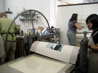
The process we are using is intaglio. The plates are not copper but steel-backed polymer, with the registered name of Solar Plate. The process is safer than the conventional copper-plate etching, because instead of using acid to etch the image, we use UV light on the polymer plate.
Tim and Clara had burned my second set of plates at the very end of the previous day and I hadn’t yet proofed them. I was thinking about the palette I wanted. On the way from the dorms to the print studio I spotted orange construction netting with the grass visible through it. That was exactly the kind of transparency and overlay I was looking for, just not in orange and green. I wanted to keep the colors more analogous—warm with warm, or cool with cool. Madder over a cadmium yellow/orange hadn’t given me what I wanted the day before. So this morning I'm thinking green over green. I printed a few proofs, making no attempt to register them, just to see what the color would be like. A yellow-green, overprinted with a transparentized pthalo viridian (which is pretty transparent to begin with) seemed right.
Tim and Clara had burned my second set of plates at the very end of the previous day and I hadn’t yet proofed them. I was thinking about the palette I wanted. On the way from the dorms to the print studio I spotted orange construction netting with the grass visible through it. That was exactly the kind of transparency and overlay I was looking for, just not in orange and green. I wanted to keep the colors more analogous—warm with warm, or cool with cool. Madder over a cadmium yellow/orange hadn’t given me what I wanted the day before. So this morning I'm thinking green over green. I printed a few proofs, making no attempt to register them, just to see what the color would be like. A yellow-green, overprinted with a transparentized pthalo viridian (which is pretty transparent to begin with) seemed right.
.

The kind of transparency and linearity I saw on campus, via this construction screen, is what I was aiming for in my print
.
Below, a proof in madder over cadmium yellow/orange from the previous day; two unregistered proofs from this morning. I'm liking this blue/green over yellow/green
.  .
.
 .
..
Below, my inked plate ready to be placed on the press
Both photos: Marcia Wood
.
 .
. How I gained a few extra inches to see the press bed from a sufficient height. Photo: Marcia Wood
.
..
When he was burning the plates, Tim suggested turning the square on its point. I’m so oriented to the horizontal and vertical I might never have thought of it. Since my new approach was to not think like a painter, I went for it. I liked it. And that’s how we did the prints. Working with Brown Sanders and Clara Euam, we printed an edition of 30 on Wednesday afternoon and all day Thursday. Tim offered assistance and advice as requested, but mostly it was the three of us, working slowly. Clara and I prepared each plate for printing, with Brown helping me align the second plate, and Marcia stepping in occasionally to lay paper or to rack. Everyone took turns at the crank.
 One of the first prints in the edition. I'm a happy camper.
The emerald hue and the diagonal orientation give this image a gemlike quality, no?
..
 Marcia racking the print
.
.  Katherine Taylor's palette . . .
. . . for the print Clara is pulling
 .
.
 Katherine's print on the rack . . .
. . . with Katherine, another happy camper
.
 .
.
 Kate Javens's image of a ram was made with one plate followed by an overprint with two partial plates, which Tim placed onto the initial printed image. (Sorry, I don't know the correct print terms.) What you're seeing above are the partial plates for the blue horns, which you can just make out, below
.
 ..
..
On Thursday, Katherine Taylor and Kate Javens, working with Tim, printed their editions. I was printing while they were printing, but I did manage to take a few photos. Take a look:
.
.
 Katherine Taylor's palette . . .
. . . for the print Clara is pulling
 .
. Katherine's print on the rack . . .
. . . with Katherine, another happy camper
.
 .
. Kate Javens's image of a ram was made with one plate followed by an overprint with two partial plates, which Tim placed onto the initial printed image. (Sorry, I don't know the correct print terms.) What you're seeing above are the partial plates for the blue horns, which you can just make out, below
.
 ..
..Coming later this week: On Day 5 Don Pollack's print gets editioned, Katherine and Kim sign their prints, Tim makes two more prints for his edition, and we decide on a name for the project. On Day 6, you get to see the finished prints. Stay tuned . . .
.


