Pages

8.31.2009

Marketing Mondays: The Negative Review

.
Don't Jump! Image from The Digerati Life


A while back Hrag Vartanian posted a short item and link, Art Critics Can Kill, about the Russian-French painter Nicholas deStael, who jumped out a window after receiving a negative review. OK, that's an extreme reaction (the artist suffered from depression) but if you've ever gotten a bad review, you understand the impulse.

The pain or disappointment caused by a less-than-positive response to your work can be great, especially after the effort in creating, delivering and installing a show. Especially after the press release and postcards you or your dealer may have sent to critics with high hopes and fingers crossed. Especially after the euphoria of the opening, when you're surrounded by enthusiasm and kind words.
.
So how do you deal with a negative review?

Ignore It
What negative review? Someone didn't respond favorably to your work. They didn't see it as you intended it, so they didn't get it or appreciate it. Their loss.

Focus on the Best Part
Sometimes you get so freaked by one negative element that you can't appreciate the positive response shown elsewhere in the review. Actually, a good review often mixes a little negative with the positive. It might be an editorial mandate for balance, or simply the way the critic approaches the subject. (One may start off negatively and then build to a positive denouement, while another may write all good things and then stick in a barb at the end. These are writing styles as much as critical opinions.) Besides, even you have favorite pieces in a show as well as the one you secretly consider a dog. So maybe the critic is just giving voice to something that you might actually agree with if you could be a bit more objective.

Spin It
This is what film companies do all the time in their PR. One critic's "What a monumental piece of crap!" becomes "Monumental!" in the ad. I'm not suggesting you do this, but it's a good lesson in resilience and damage control.

Get Over it
This is not the only show you'll ever have in your life. Savor the success of having created an exhibition you're proud of. You like it. Your dealer/gallery director/curator likes it. Your collectors like it. Now get over it and move on. Is there an image of your work in this negative review? Lucky you!

List it On the Resume
So what if it's not the kindest commentary on your work? You know the saying, Just spell the name right. On a resume only the critic and the publication are noted, not the qualitative particulars about your work. Negative attention is better than no attention at all.
.
Learn From It--Or Not
If you look at the work objectively--and that may not be possible for some time--maybe you'll find the critic saw something you didn't. If that's the case, learn from it. Otherwise, ignore it.

Is it ever worth writing to the editor to complain about a bad review? My instinct is to say that unless a critic attacks you personally, let it go. We've all read defensive letters by writers, architects and artists. They just sound whiny. A review is one person's opinion, after all.

Over to You
Have you had a negative review? How have you dealt with it emotionally? Do you feel it has affected your career? Did it affect the specific exhibition or sales? Did it affect the relationship with your dealer?

8.27.2009

What I Saw This Summer, Part 3: More Exhibitions


The two shows here are from Chelsea and Dumbo, viewed in late May and mid July respectively: Dannielle Tegeder at Priska C. Juschka Fine Art and the postcard group show, Wish You Were Here 8, at the A.I.R. Gallery.
.

Dannielle Tegeder at Priska C. Juschka Fine Art


I saw Dannielle Tegeder's solo show, Arrangements to Ward Off Accidents, at Priska C. Juschka Fine Art in Chelsea in late May. Although I was not sure how the work could live up to the title of the exhibition, I liked it and expected to do a full post on it, but then I took advantage of those cool days in June to work in the studio. Then I started posting on other topics and, well, you know the story. So this "Summer" series gives me a chance to show you some of what I saw and liked there.

Tegeder has a Kandinsky-esque sensibility that is channeled and transformed through the eye and hand of a 21st-Century artist. Her flat abstractions--angular geometry achieved with a fairly neutral palette of gray and ochery tones--held the gray-painted walls of the gallery. The paintings and works on paper articulate a fairly deep and active space, and their relatively large size pulls you visually into that space. I've seen her work before (notably at the GregoryLind Gallery in San Francisco) so it was a pleasant surprise to find a new element here: suspended sculptures that explode her compositions into three dimensions. The installation thus effectively places you within her work.


Dannielle Tegeder: Installation view of a painting and work on paper with three sculptures; image from the gallery website

.
In a smaller space, I entered and found myself enveloped by 130 small framed Modernist-style geometries on paper. This installation, The Library of Abstract Sound, connected a sonic swatch to each particular image. A video outside the small room projected the sight and sound. Personally, I found the art-and-music thing too contrived, but the intimate space allowed for the close-up viewing of each framed work. Even without the related sounds the work resonated for me. The show ran May 31-July 31.
.
Below: Tegeder's The Library of Abstract Sound, 130 framed drawings displayed on shelves in a small room inside the larger gallery space; image from the gallery website


. . . . . . . .
.
In June, on the same day I visited Richard Bottwin's studio in Dumbo, I stopped in to see Wish You Were Here 8, the annual postcard show at the A.I.R. Gallery. Though I have participated in this fundraising show in the past, I did not do so this time. I would have been in excellent company.
.
Below you can see two installation shots, along with some of the postcards. Alas, I was not in town on opening night so I didn't get to be part of the acquisition frenzy. Most of the postcards--and all of the ones I really liked, see below--were red-dotted by the time I got to the gallery.
.
.


.At the A.I.R. Gallery: Wish You Were Here 8, a fundraising exhibition with four-by-six-inch work
Below: Nancy Azara
.
.


Above: Another view of the postcard show
Below: Paula Overbay and below that, Don Voisine


.


Above: Geometries from Barbara Page and Joan Mastrangelo
Below: Molly Heron
.
.


 Above: Nancy White
Below: Howardena Pindell, an original A.I.R. member in 1972


Above: Darla Bjork
Below: Dorothea Rockburne


.
I'm not a fan of art auctions, but I think that postcard shows such as these are a great way to help an institution or cause, to exhibit with artists whose work you like (and for emerging artists, to exhibit with artists you might not otherwise have the opportunity to exhibit with yet), and perhaps even add to your own collection. It's the ultimate in equality: everyone's work sells for the same price, which means there's no undermining of your regular gallery prices. At this show the price was $40 or 50, I think (the gallery's website does not have info posted, and the gallery was closed for the summer when I was preparing this post).
.
Next "What I Saw" installment: Studio Visits in New Jersey and Pennsylvania

8.24.2009

Marketing Mondays: Here Today, But What About Tomorrow? Who's Thinking Archivally?

.
The iconic Flag has been well cared for. Here it is included in Focus: Jasper Johns in the second floor galleries at MoMA, February 2009


Jasper Johns is said to have remarked: "If I were the conservator of my paintings instead of the painter, I would be a far richer man."

While he's either understating his wealth or overstating the amount of work his paintings have needed, it's no secret that his early paintings have undergone significant conservational intervention.
.
As a young artist, Johns adopted encaustic without knowing fully how to use it. Gluing newsprint to canvas and then painting on it with wax is not the most archival way to use any of those materials. Newsprint starts to disintegrate as soon as it comes off the press, wax is relatively brittle, and canvas has a boing factor—nice if you want that particular resistance against the brush, but not so good if your medium needs the stiffness of a panel. With each boing, the newsprint and wax vibrated. Cracks ensued. Then whole sections dis-attached from the canvas.
.
Fortunately Johns became famous at a young age, so those early paintings have been restored in the best possible way by conservators at the best museums. Most artists will never get this kind of treatment.

Detail of Flag, above: Field of blue, cracks in the wax (in the "torso" of the star)

.
The more materials you employ in one work, each with its own reaction to heat, humidity and various stresses, the greater the archival load. Here's an almost verbatim description of one artist's process, as told to me by the artist: " I build up the painting with acrylic and then switch to oil. Then I add tar and cold wax [not to be confused with encaustic]. When I think it's ready for the last step, I throw some turp on it and torch it."
.
I asked if she had good health insurance for herself and fire coverage for her studio. As for the paintings themselves, big question mark, but I wouldn't be surprised at a worst-case scenario.

Mondrian's classic grids are riddled with cracks, some of which you can begin to discern on the (presumably conserved) Broadway Boogie Woogie, a detail of which is shown left. The blockbuster Mondrian show at MoMA in 1995-1996 included a surprising number of works in which the helter skelter net of hairline cracks vied with the rectilinearity and rhythm of the composition. Given the artist's singlemindedness with geometric precision, those cracks were surely not meant to be in the picture. Indeed, it was likely the artist's obsession with painting and repainting the composition--all those successive layers--that likely caused the crazing.
.
Visit any exhibition by Anselm Keifer and you'll see mud, straw, seeds and other organic materials on the floor in front of his enormous paintings, ephemeral ghost works created as the paintings disintegrate. In a quiet gallery you can even hear the seeds drop, as I did at the San Francisco Museum of Art a couple of years ago.
.
And of course there are the latex sculptures of Eva Hesse. Once so translucent and pliable, they are now yellowed and brittle some 40 years later, a fact all too apparent at the show of her work, Eva Hesse: Sculpture, at the Jewish Museum in 2006. In an audio accompaniment to the show—poignant because we hear her voice in almost every entry—she expresses little concern for how the materials will age. I don’t have notes, but my recollection is that she was not concerned with deterioriation, that it was part of her work. (Of course, one might ask if it was youth rather than prescience that prompted the sentiment.)
.

Above: Hesse standing in front of Expanded Expansion in the late 60s, in which the resin she used for the work was creamy white and translucent
.
Below,a more recent shot of the work, which has yellowed and become brittle over time. The was the condition of the work I saw at The Jewish Museum in November 2006

.
The work in museum collections can be conserved and then stored in perfectly archival conditions. There's a budget for this kind of care. Pity the artists and the collectors of modest means who don't have those options at their disposal.
.
In a recent post on this blog, I referred to articles that reported on the alarming disintegration of relatively recent artworks made from some early plastics. In response to those stories, reader Matthew Beall asked, "Who is responsible when a piece of art falls apart. Is it the artist? Is it the maker of the products/materials? Is it the gallery that sold the work? Does it even matter?"
.
With Beall's questions in mind, I'm elaborating a bit to noodge you into telling all. Here are a few prompts:
. Are you working archivally?
. Do you employ classic materials and methods properly? If you’re using new materials, do you research them before you use them?
. Has a work changed significantly? How have you dealt with it?
. Who is responsible when a work of yours that is sold has fallen apart? Is it you? Or is it, as Beall asks, the responsibility of the gallery or the product manufacturer? Is it the collector?
.
Does it matter to you?

Recent related links:
. Ed Winkleman on Artwork Health Care
. Hrag Vartanian on Swoon
. C-Monster's Ask the Art Nurse

8.22.2009

What I Saw This Summer, Part 2: Exhibitions

This post features exhibitions in Boston and Maine, territory I covered in July.
.
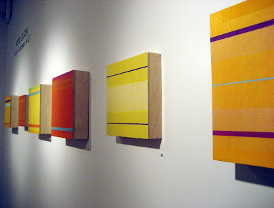
BOSTON: At the Kingston Gallery I saw the small, deliciously hued and color-banded paintings of Rose Olson, who has a studio just a few blocks from the gallery. Both studio and gallery are in Boston's South End--the Chelsea of Boston. Click here for a previous post about Olson's work, where I talk about the yin and yang of substantial box-panels tethering those luminous veils of color


Rose Olson: Installation wall of the exhibition Ju Ju Summer 4G at Kingston Gallery, Boston

Below: Ju Ju Summer 4G, 2009, acrylic on birch, 12 x 12 x 3 inches; this image courtest of the gallery website


A few doors down at Carroll and Sons, I saw the drawings of Jacqueline Ott. The gallery houses The Boston Drawing Project, a Pierogi-style setup of flat files in a small back room, which features the work of New England-based artists. Joseph Carroll runs both the gallery and the Project. Ott is a painter who also makes meticulously drafted drawings, based on a triangular grid, using a compass and different hardnesses of graphite pencil. While they're mandala like in shape, they engage the eye actively. Click here to see a four-minute video of the artist talking about and making these drawings.


Jacqueline Ott in The Boston Drawing Project space at Carroll and Sons. Ott's drawings are installed just above the flat file. I don't have good individual pics of the work, but you can get a sense of the visual complexity of her graphite-on-paper geometry by clicking onto the aforementioned video
. . . . . . . . . .

MAINE: About 20 miles north of Portland is Brunswick, home of the legendary Icon Gallery. Run by Duane Paluska, Icon is located in a small farmhouse-turned-exhibition-space where two floors are given over to art. Here Kate Beck was having her first solo show, Whitespot: Drawings and Paintings. Beck achieves extraordinary lushness and depth from a repeated graphite line. The upper right corner of her blog features a slideshow of the exhibition, so here I'll just show you a few pics, including one of the artist with her work.


The gallery sign
Kate Beck standing in front of her work--the largest piece, and only painting, in the show


One of Beck's large graphite drawings, with a small, rich detail below

Next "What I Saw" installment: Dannielle Tegeder at Priska Juschka Fine Art; the Postcard show at A.I.R. Gallery

8.19.2009

What I Saw This Summer, Part 1: Studio Visits with Grace DeGennaro, Richard Bottwin, Sharon Butler

.
Three recent paintings and a wall of paper templates in Grace De Gennaro's studio, Brunswick, Maine

.
.
One of the pleasures of being an artist is looking, constantly looking, at art. One of the frustrations of being an artist who blogs is that there's never enough time and space to blog about everything I've seen.

But I do want to show you as much as possible of what I've been seeing this summer, so I'm putting together a few roundup posts under the rubric of "What I Saw This Summer." It's an ongoing project that will encompass studios as far southwest as Dalton, Pennsylvania; as far northeast as Brunswick, Maine; and straight up the Northway all the way to Montreal.

In Part One: Studio Visits we stop in to see Richard Bottwin, Sharon Butler and Grace DeGennaro.
.
.
Richard Bottwin's Studio, Dumbo
.
Is Richard Bottwin a painter who works dimensionally, or a sculptor whose planar work is anchored to the wall? Either way, he's doing beautiful and impeccably crafted work that resolves issues of angles and edges, color and form, dimension and surface, solidity and shadow.
.
Bottwin's studio is on the fifth floor of an old industrial building in Dumbo. The cramped workspace, filled with a bandsaw and other woodworking equipment, as well as maquettes, sketches and a fully loaded work table, nevertheless makes room for a generous and well-lit viewing wall.
.
This is the view of the viewing wall from the entrance to the studio
.
Once inside I shot his scuptures from the opposite angle. For instance, the triangular wood-grain shape you see in the foreground, above, reveals itself as the brilliant cadmium-painted sculpture you see below:


Lush and edgy
The woodgrain is a veneer on birch ply. I love the interaction of the laminate grain, like the curly pattern above, against the laminate lines of the plywood, and the smooth lushness of the paint. By the way, see those angles? I don't have the right words, but they're angled and beveled. And they're perfectly joined. Even as someone who has no math or carpentry skills, I can see what a conceptual and constructional feat that is.
Wikipedia, is Dutch for little town in the woods. Things sure have changed since the 17th Century. Over the past few years without anyone (well, OK, me) realizing it, this gritty area of Brooklyn has become the new location for artists, what Williamsburg used to be. Farther out on the L-train line, it's still raggedly urban, a far cry from that bosky Dutch description, but the real estate prices have allowed artists to rent studios and even buy lofts.
Below: You're seeing it here first--planar and fully freestanding
. . . . . . . . . . . . . . .
.
Sharon Butler's Studio Residency at Pocket Utopia, Bushwick
.
Bushwick, according to
.
This is where Pocket Utopia lived for a few years. On the last month of its existence in July, Sharon Butler settled in for a studio residency. Butler is a painter, art professor, and author of the blog, Two Coats of Paint. When I arrived she had been filling a series of sketchbooks with collages and graphite drawings. It was all very low tech and hands on, but an effective means of visual thinking. I'm eager to see how this month's work will affect her painting.
.
I stood over her shoulder and photographed as she showed me what she'd been up to:

Above: Butler paging through one of her notebooks
.
In the four images below: more pages


.
,

Below: You can see some of her raw materials: magazine pages and a copy of The New York Times. I'm hoping she'll post pages from these new sketchbooks as she has done with some others.

. . . . . . . . . . . . . . . . .
Grace De Gennaro's Studio, Brunswick, Maine
About 20 miles north of Portland you come to Brunswick and what is probably its largest complex, the Fort Andross industrial building. It's an old mill that has evolved into one of those great mixed-use buldings: warehouse, light manufacturing, small businesses, a few medical offices, a restaurant--and artists' studios. Grace DeGennaro's studio is on the second floor, a generously proportioned rectangular space whose far end overlooks the rushing Androscoggin River.
The day I arrived DeGennaro was in the middle of a major work-on-paper project. (I wrote about an earlier body of work, Wellspring.) The series I was seeing in the studio consists of collaged and painted elements on a black ground. DeGennaro works with sacred geometry and elements that tap into the collective unconscious; that black ground creates a kind of mystical space in which the images float.
Two views of DeGennaro's large studio, illuminated this day entirely by the daylight flooding through a wall of windows overlooking the river. I love the simplicity of her plywood-on-sawhorses working setup, though there's a lovely old dining room table, below, which holds her oil paints. The dining table, set along the long axis of the space, has roughly the same proportions, a formal arrangement not unlike DeGennaro's own work

That's DeGennaro contemplating her work, above. Cut paper provides some of the compositional elements

.
Above: Bottwin in the hallway that's so ample, he can show his new work.

8.17.2009

Marketing Mondays: "Isms" and "Phobias"

.
"Feminism changed the way I wrote about art history and what goes into museums, and offered new ways of thinking about exhibitions. It provided possibilities for different readings of art history and a broad social context for individual interpretations."
.
--Marcia Tucker, founder of The New Museum and all-around bad girl, in A Short Life of Trouble: Forty Years in the New York Art World


Back when SoHo was the center of the universe, I used to have a buddy who constantly complained about the art world numbers. "Women are getting all the shows," he'd whine, after one exhibition got a couple of reviews. Or, "Artists of color are getting all the attention," when one African-American or Hispanic artist (usually male) would rise to prominence. And yet, when we visited exhibitions together, the numbers remained overwhelmingly in favor of men like himself--what Robert Hughes described sarcastically as "the pale penis people."

Thanks to the efforts of people like Marcia Tucker, Thelma Golden, Judy Chicago, the Guerrilla Girls, and every thinking artist's favorite pale penis person, Jerry Saltz, some things have changed. But not fast enough or big enough for a culture whose residents--that would be us--are supposed to be thinking outside the box. While there's no denying that making a career is difficult for most artists, it's harder still for artists who are not white, male and young. In this post I'd like to hear from you--whoever you are, and however you identify.

And guys, I'm not picking on you. Many of you have your own isms and phobias to deal with.

So here's my Marketing Mondays question today: Do you feel that isms and phobias have made your career progress more difficult? I also have a few specific questions, which you're welcome to pick and choose from--or add to, or disregard.

. Men: Do you make the most of your defacto entitlement to open the doors to others once you're in? As you've matured have you found ageism to be an issue?

. Women: Do you prop the doors open once you're in? Younger women, do you acknowledge that one, maybe two, generations of women artists before you battered those doors so you could walk through somewhat more easily? As you've matured how has ageism added to the load?

. Artists of color and ethnicity: Not that it's to easy to disentangle sexism or ageism or homophobia or xenophobia from racism, but is there a way to quantify which ism has been the most blatant? Has it shifted over the course of your career?

. Lesbian and gay artists: is homophobia a career issue for you? Or are the other isms a bigger issue?

. Curators, dealers and critics: Is it "all about the art" or do you consciously try for inclusivity in your exhibitions and reviews--thereby stretching the definition of what art is, in fact, all about? And have you found your sex or ethnicity or age an issue in your own career?

. Educators: There are more female students in art school, yet more male artists go on to achieve prominence in the art world. Who gets the prizes? The encouragement? The mentoring? Do you address the issue of sexism with your students?

. Students, especially female students: Do you think sexism is no longer an issue?

Anecdotes, opinions, rants and links are welcome. .

Update: Link to The Art Newspaper: America is Changing--But Are its Art Museums? The gist of the article: "You do not have to look at major US art museums for long to realise that most of the senior management is white." Says Johnnetta Cole, director of the National Museum of African Art at the Smithsonian Institution: "There is a moral imperitive for making a workforce diverse.” Read more. . .

8.12.2009

Three Walls

.
Forrest Myers Wall, photographed from the NYU campus just north of Houston and west of Broadway, above and below
.
.
One day in mid June, on one of those many overcast days we had in the city, I photographed two minimalist walls in Manhattan. The Forrest Myers Wall , recently restored to its original spot at the corner of Houston and Broadway, is clean and new--a literal bright spot on a gray day.

A few blocks away, there's a repainted wall at the corner of Houston and Wooster. I don't remember seeing that black rectangle before. I assume it's a prepared backdrop for an ad, but its proportions are so perfect for the building that it could be art.
.
Then a few weeks ago I was in DUMBO for a studio visit with Richard Bottwin ( post to come) and photographed the long gridded mural under the bridge, a community-supported project by an artist named Tattfoo Tan, called NMS-Nature Matching System, which was inspired by the color of fresh fruits and vegetables.


Your ad here? Until then, I love this black wall at the corner of Houston and Wooster


DUMBO is the acronym for Down Under the Manhattan Bridge Overpass, a quaint but incredibly noisy area in Brooklyn that looks across to lower Manhattan. This mural is about as down under the overpass as you can get


Above: A closer view, with green-market hues

.

8.10.2009

Marketing Mondays: Five Queries that Got Dumped (and Why)

.
I have a dealer friend who forwards me some of the artists' e-mail inquiries she receives. She does this partly, I think, because she has to share them with someone (you can't make this stuff up), and partly because she knew that eventually they would make their way into a Marketing Mondays post as a cautionary tale.

The dealer deletes all the names, so all I'm seeing is the message. Unfamiliarity with the submission process is painfully evident in these letters, but also it seems that fear (and in one instance, arrogance) got in the way of basic communication. I don't think any dealer is expecting a formal missive, but a short paragraph with a few informative sentences is not an unreasonable expectation. Take a look at five queries that didn't have what it takes:


1) Hello there,
My boyfriend and I are looking to submit artwork (acrylic paintings) and wanted to know if you would be able to provide us with the fees, how long it can be displayed for, insurance, what percent the gallery takes when a piece is sold, rules and regulations ... etc ... of having our art in your gallery, after being reviewed and accepted of course.
Thank you for your time!
Sincerely,
Artist Name and Boyfriend Name w/ URLs
. The dealer was not addressed personally
. The artist included no description of the work and no j-pegs
. The artist did not look at the submission information online
. Says the dealer: "The artist is so clearly inexperienced that I wouldn't consider talking to her because of the work it would take to educate her, or any artist, at this point in their career"

2) Dealer name,
Thanks for the invite, but I'll pass. You actually call this stuff art? You must be desperate to find real talent. By the way, I'm available.
Artist Name
. While the artist did provide a link to his work, no dealer wants to work with a pompous A-hole. Here's what the dealer said: "Who asked for his opinion? The email invite wasn't a request for criticism, it was an invitation. Do I go to his website and say, 'Hey, your art sucks'?"

3) No salutation
I would like to introduce you to my latest work. I paint the colorful souls of dogs! Here's a link to my website. Browse to your hearts content and let me know if you are interested in these joyful spirits captured on canvas. I am currently represented in [artist names five cities]. I am interested in having a gallery in [your city] and this is why I thought of you.
Artist Name
. Not your gallery specifically, just a gallery in your city, any gallery; that makes a dealer feel special. Woof

4) Dear Dealer name,
Attached please find 4 pages of black and white drawings, CV and artist statement. Thank you and I look forward to hearing from you.
Sincerely,
Artist Name
. This artist was trying to keep it professional in this physical package, but s/he made the query too short. Say something about your work in less formal terms than an artist statement, at least so the dealer knows you have something to say about it, and at best so that you pique the dealer's interest
. Why was s/he contacting that particular gallery? Dealers like to know you’re familiar with the program, ideally that you've visited the gallery.

.5) Greetings.
No, you don’t know me and yes, I’m a painter. Painting is a joy, a real great vocation and, certainly, a tough way to try to make a living. Yes; I live off it, not a great life but a decorous one. I manage to sell my work every now and then and I’ve even been selling some in the internet. Still, just enough. I write this letter on the very simple assumption that as a professional in the world of art you just might be interested in knowing some different way of painting. I don’t want to burden you with my own opinion of my art work or a bunch of resume data so, how about visiting my site? It won’t cost you, hopefully it won’t bore you and, of course, you are free to log off any time you feel like it. Maybe then you can let me know your opinion and, who knows, perhaps establish a working relationship.
Regards,
Artist Name
. Too much non-useful information, the opposite of #4
. Give the dealers something to make them look!
. It really does help when the dealer knows, or is at least familiar with, the artist. This is why it's so important to visit the gallery regularly and to be familiar with the dealer's program

My point in sharing these e-mails is simply to remind artists to do their homework in selecting galleries to target. When you write, keep it short, informative and professional. Remind yourself that you're writing to another human being with a very busy workday and a huge overhead, not some all-powerful being who is the one and only entity in the universe to hold the keys to your successful future. Include basic information--describe the work with a phrase about it or about why you're involved with that particular theme--and, ideally, an embedded picture (along with a couple of Jpegs). Then if you get turned down, it will be because the work didn't resonate for the dealer, not because you sounded like an idiot. I don't mean you personally, of course.

8.07.2009

Still Powerful After All These Years

.
Lynda Benglis is a Material Girl, employing mediums to suit her message, whether it's latex, wax, glass, fabric, collage, or video. You might have seen her poured latex floor pieces? Or perhaps her sculptural wax paintings? Or her metal wall sculptures cast from pleated fabric?

Benglis also has a strong political streak, and her early work questioned gender roles. Her video of two women making out, included in
The Female Gaze, is tame by today's standards, but back then it was transgressive.

And then there was the giant dildo.

In 1974 a lean and buff Benglis had herself photographed wearing nothing but sunglasses, holding a giant latex phallus between her thighs. The photograph was meant to be part of an Artforum feature on the artist in November that year, but the editor John Coplans (who, excuse me, spent a good portion of his career photographing and exhibiting his own little weenie) and a few of the editors, balked. Benglis and her then dealer, Paula Cooper, placed it as an ad in the same issue. Touche.

Power grab: Lynda Benglis in the November 1974 issue of Artforum

.

Benglis's now iconic image was the keystone of a recent show at Susan Inglett Gallery, along with one of Robert Morris, bare chested and wrapped with chains, right. The show, Lynda Benglis/Robert Morris: 1973-1974, examined the two images and the art world's strong reaction to them, especially Benglis's. The two artists were friends, and the thesis of the exhibition is that each artist's transgressions help informed the other's.

We, of course, have 35 years of objectivity in reconsidering these images: He was in chains; she could not be more unfettered.

Robert Morris in a 1974 poster for his exhibition at Castelli-Sonnabend Gallery

I remember the ad when it came out. I was horrified and thrilled at the same time. It was a feminist act. And the issue is still relevant. A man with fake breasts would never have caused the same brouhaha. But a woman with a penis? She was assuming power, baby. And her power was the biggest on the block.

.

Letter to the editor: Can you read it?

"It's about time 'Artforum' had an identity crisis. Lynda Benglis has created some problems. She got a lot more than $2000 worth of advertising, tested the limits of 'good taste' and, in my humble opinion, made the strongest feminist statement you've ever printed."


Pages from the Artform article on Benglis. The ad appeared up front; this article by Robert Pincus-Witten was in the "well" where the features are

Read more:
. Press release from Susan Inglett Gallery
. Roberta Smith's July 24
review in the New York Times
See more:
. Benglis's work at the Cheim & Read Gallery

.