Pages

10.02.2006

The Centered Eye

Devorah Sperber, After Van Eyck

5,024 spools of thread, stainless steel ball chain and hanging apparatus, clear acrylic viewing sphere and metal stand; 104 x 100 x 60"

.

At the 212 Fair this past weekend, I spent time at the Marcia Wood Gallery booth which showed some of my Silk Road paintings. The hit of the booth was the wall-size installation by Devorah Sperber, who creates large-scale pixilated portraits. The "pixels" are spools of thread suspended in vertical rows with the wall as a backdrop. The image is so diffuse because of its scale and inverted orientation (and your proximity to it) that it doesn’t register visually until you peer into a small acrylic sphere centered about 5 feet in front of the installation. The sphere is perfectly aligned with the central eye of the portrait, which is perfectly aligned with the central axis of the work. There a clear and beautifully nuanced right-side-up portrait appears.

I mention the centered-eye portraits—that is, three-quarter-view portraits in which one of the eyes falls at the central axis of the portrait --because after spending part of the weekend looking at portraits, indeed it appears to be true. Another thing you never learned in art school. A recent study of the portraits of 282 artists--drawn from diverse cultures over five centuries--finds that the eye is central to the vertical axis of a painting to within an eye width in virtually every instance. You can read the study for yourself: http://www.ski.org/cwt/CWTyler/PrePublications/ARVO/1998/Portraits/ and http://www.ski.org/cwt/CWTyler/PrePublications/ARVO/1998/Portraits/

On her website, Sperber talks about both the physiology of seeing and the theory of centered-eye portraits. You can see more of her brilliantly conceived and beautifully executed work there as well. I've posted a few examples here:


Michelangelo Self Portrait; Sofonisba Anguissola Self Portrait, 1554; Tiziano's portrait of Cardinale Pietro Bembo, 1540

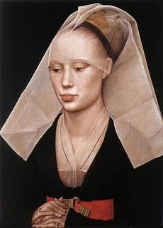
Rogier van der Weyden, Portrait of a Lady, 1554

There's also Leonardo's Mona Lisa, Vermeer's Girl with a Pearl Earring, and many of the Fayums. On Friday, while visiting the Met’s early Renaissance paintings with my friend, the painter Kay WalkingStick, I mentioned this centered-eye theory, and as we looked, portrait after portrait followed this form. Perhaps it is simply a visually intuitive way of creating an image that looks you in the eye, whether or not the sitter is actually looking back at you, satisfying a human need for equilibrium and harmony.

Or perhaps it was a trade secret passed along from painter to painter. Talk about a Da Vinci code: "Sfumato schfumato, Leonardo. The secret to making a haunting portrait is to make sure one of her eyes aligns directly with the central axis of the portrait. Pass it along."

Leonardo Da Vinci, Mona Lisa, 1505

Even Picasso, who broke with the conventions of painting, didn't stray far from this one:

Picasso, Weeping Woman, 1937

9.14.2006

"Luminosity and Emotional Juiciness"

Above, from left: Uttar 294, 36 x 36 inches; two paintings from Vicolo, each 12 x 12 inches; and an installation of Silk Road paintings, each 12 x 12 inches
Below, from left: Uttar 295, 36 x 36 inches; Uttar 298 and Uttar 296, each 24 x 24 inches; all paintings encaustic on panel, 2006

While the actual painting for an exhibition is finished by the time the exhibition is installed (though sometimes just barely), there is much to be done after the fact. On Saturday, a few hours before I gave a talk about my work to a nice turnout of artists and collectors, I shot the installation. Yesterday I edited and Photoshopped the pictures, and today Cate McQuaid's review, "A Clever Pairing," appeared in The Boston Globe. I've excerpted her review below:

"Wax and rubber have certain things in common--a tactile similarity, a translucence--that make the two solo shows by Joanne Mattera and Niho Kozuru at Arden Gallery a clever pairing.

"Mattera's encaustic paintings involve pouring layers of pigmented wax one over the next, building up and scraping away to create pieces of brilliant color that catch the light in surprising ways. She lays her emotive tones over grids, bringing order to the expressiveness. Her understated, lovely "Silk Road" series features several foot-square panels, each monochrome, and each bearing the texture and luminosity of silk.

"In her "Uttar" series, she borrows tones from Indian miniature paintings. "Uttar 295" sports a checkerboard of blues with an occasional watery rose. The squares drip, leaning into one another like keening women at a funeral.

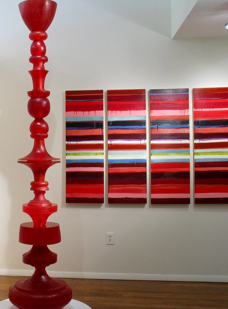
" Mattera's stacked lipstick reds appear in columns in "Uttar 295 (Ciel Rouge)." It hangs beside Kozuru's "The Rising Column," made of cast red rubber; the two make a gorgeous installation. "The Rising Column"... shares not only the soft texture of Mattera's work but the wonderful conflation of crisp, traditional form with luminosity and emotional juiciness."


.

.

.

.

.

.

.

Uttar 294 (Ciel Rouge), 48 x 67 inches; foreground: Niho Kozuru, Rising Column, cast rubber

Uttar 295, encaustic on panel, 36 x 36 inches, 2006

9.09.2006

Acrylic as a Second Language

Pressed with the need to create a painting for the big front window of Arden Gallery for my September

Installation: Quadrate 1 in the window of Arden Gallery on Newbury Street, Boston

solo, I pulled out some old acrylic paints and brushes, purchased two gallons and several large tubs of gel, set up the easel, and immersed myself in a medium I hadn’t touched in over a decade.

Normally I paint in encaustic, but I didn’t want to put a wax painting in the gallery's window because I wasn’t sure what the trajectory of the sun would be in late summer and thus how hot the window area would get. (Wax + intense heat = puddle.)

I've been involved with encaustic for so long that the wide variety of gels are a new (to me) development in acrylic painting. I had the idea that by mixing acrylic paint with polymer medium--the way I mix encaustic paint with wax medium--and by applying clear layers of the polymer medium to create physical and optical depth, I might achieve something of the substance and luminosity of encaustic.

Well, I did. And I didn't.


Quadrate 1, acrylic on canvas, 48 x 48 inches, 2006

Once I got over trying to make an "encaustic painting" in plastic and gave into the idea that I was making an acrylic painting, I got into the process. There are some similarities between what I'm doing in the two mediums. The acrylic paint dries almost as fast as the wax paint cools, and by using combinations of no gel, some gel or a lot of gel--mostly semigloss--with various paints that are by nature opaque or semi-transparent, I can create some of the same play of opaque, translucent and transparent hues that I do with wax, with something of the same built-up texture. And, of course, I'm still making the same kinds of paintings: repetitive geometric compositions whose focus is color.

But there are differences. Unlike molten wax, which literally flows off the brush, acrylic paint mixed with gel is slippery; it needs to be pushed, pulled or dragged across the canvas. Since I normally work on panel, I’d forgotten about the "boing" of the canvas; I feel as if I’m painting on a trampoline. While I can wipe or scrape the acrylic while it’s in a plastic state, working it after it has begun to polymerize is messy and gooey. The paint was not meant to be worked that way. Yes, it’s always interesting to push a medium into new places, but scraping a semi-polymerized surface is literally ripping the skin off the painting. It doesn’t yield the way wax does. In fact the yielding surface is one of the reasons I turned to encaustic.

I’m not about to give up encaustic any time soon. Wax is an extension of my hand. But working in a second medium is like speaking a second language. Your ability to get around in the world, and certainly to communicate, increases immensely. Particularly with regard to larger-scale painting, acrylic lets me "speak" upright at the easel with fluency and to transport the work with relative ease. So we’ll see where this goes.

I certainly have enough gel left.

9.07.2006

Post-partum Abstraction

I have just delivered a show, and I'm recovering from post-partum abstraction.

It happens just after the work leaves my studio. It’s the huge emotional, psychic and physical depletion that follows the long preparation of a show. After working 12-hour days for months--a steady, though not necessarily painful labor--I am in an empty studio completely drained. I’m not moving fast enough, but at the same time, I can barely catch up to myself.

Artists of all sexes know what I’m talking about. It takes a huge amount of energy to go into the studio to paint every day. A delivery date looms. And then, in the exhausting weeks just before the show when most of the work is finished, you want to do just one more painting because there’s a surge of energy and inspiration yet to emerge. I don’t have children, but I’d guess it’s like pushing out 15 babies and then, wait, there’s one more—no, I think it’s two—ready to slide.

While the eighth child is crowning, there are a dozen little (and not so little) administrative things that must be done. I’m fortunate to work with galleries that install beautifully and take care of all the details. Still, the work needs to be shot and Photoshopped before it leaves the studio. There are postcards to send out, personal notes to write, and an inventory list to make. Did you get my "Joanne’s Art News?" I sent that out late last week.

Today I clean the studio and work out the palettes for the next couple of paintings. I said that yesterday. I’ll probably say it tomorrow.

Next week I’ll be back to my regular self and the maternal metaphors will be shelved until the next delivery—which will be in March.

9.05.2006

Unexpected Commonalities

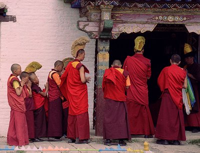
On one of my periodic image surfs of the web, I came across this picture of Buddhist monks in Bhutan (or maybe it was Tibet). It's a lovely picture, but what shocked me was the palette. On the easel in my studio was the painting you see below. Not only does it have an almost exact palette, the color relationships are in almost the same proportion, too. If you scroll the window so that you see the bottom of the photograph and the top of my painting, you'll see just how proportionate those relationships are. Perhaps I was a Buddhist monk in a previous life?


Quadrate 2, acrylic on canvas, 48" x 48", 2006


I made this painting in acrylic. That's a change for me. In a subsequent post, I'll talk about working in a different medium.

9.02.2006

Heat of the Moment


Uttar 298, encaustic on panel, 24x24 inches, 2006


For years I’ve described my painting as lush minimalism. Occasionally I think about coming up with another description, just to keep the signifier as current as the work, but nothing resonates as well as those two little words. The thesaurus is no help. "Succulent reduction" sounds like a sauce de cuisine; "drunk negligibility," like grounds for arrest. And "voluptuous insignificance" just reeks of a bad Internet translation. Geometric abstraction is a good umbrella term for what I do, but it lacks the specificity to describe my particular version of it, which is a sensuous surface married to the austerity of the grid. Fortunately, my visual explorations have yielded more satisfying results than the thesaurus. Tilling a formalist field, I’ve produced three series over the past six years. Uttar, inspired by the brilliant palette of Indian miniatures and the small paintings of Renaissance Siena, continues apace motivated by some force within me that keeps finding new reasons to combine blocks and stacks of color. There are almost 300 paintings in this series—the most recent of them in this exhibition. You might think, "How much can you do with those simple geometric elements?" It’s no longer a matter of the broad gesture—if it ever was at all—but of the variations, painting to painting, within the series. Working serially lets me explore the subtleties of an idea. Inevitably there are changes along the way. I’m not totally in control; things happen in the heat of the moment.


I like how Uttar, while retaining its own identity, has shown me the way to two other series: Vicolo and Silk Road. Italian for "narrow passage," Vicolo exists for

Vicolo 25, encaustic on panel, 18 x 18 inches, 2006

its skived and riven layers. Much of each painting is hidden in layers, and only the act of dragging a metal tool across its surface exposes some of what is beneath. Sometimes I float new color into the channels I have created, and I may then scrape those back. I’ve often referred to my work as a controlled version of the unexpected, and nowhere is that more true than here, for despite my concentration and planning, the painting reveals itself as I work.

Silk Road, my newest body of work, is the most reductive series I’ve ever done. Each painting is a luminous monochrome achieved by applying layers of translucent paint at right angles. Actually it’s not quite the monochrome it appears. Each painting has about 20 layers and five or six different hues. Working in encaustic, pigmented wax, I apply the paint when it is molten. I could mix colors on a hot palette—the Teflon griddle that holds my paints—and sometimes I do; but mostly the color mixing takes place in your eye as the layers of color, sometimes as disparate as yellow and purple, coalesce into one hue. While you’re up close, you’ll see that the subtlest of grids is formed by the trail of brushmarks and intentionally grainy elements within the paint. The suggestion of iridescence and fabric came after the first few paintings were done. The series just named itself. What else to call it but Silk Road? I’ve limned each painting to charge the intensity of its color field and intensify the square shape of each painting. The paintings are typically installed in a grid.

Silk Road 82, encaustic on panel, 18 x 18 inches, 2006

It would be disingenuous to say that a show titled "Heat of the Moment" is just about the fleeting moments of creative ecstasy in the studio. It’s about the way I work. I paint primarily in encaustic, and encaustic requires elevated temperatures—hotplates to melt the wax, a heatgun to fuse the layers of paint once they are laid down. Painting in encaustic permits but a tiny window of opportunity to get a paint-laden brush from the heat source to the surface of the painting before the wax cools and the brush gets stuck. I didn’t choose encaustic because I wanted to make an already difficult calling even more difficult by adopting a process-intensive medium with unyielding parameters. I was drawn by the materiality of the paint, the lushness of it. And by the luminosity. Like a moth to a flame.


8.19.2006

In the Bay of Naples: Ischia and Procida

In this post we head out to two islands in the Bay of Naples. From the port you can see Capri, a soft gray lopsided rock straight ahead in the distance. Everyone goes there, so we’re not.

We’re going to Ischia and Procida (www.ischiaonline.it and www.procida.net if you know Italian; http://en.wikipedia.org/wiki/Ischia and http://en.wikipedia.org/wiki/Procida if you don’t). The islands aren’t far from shore, but to get to them you need to take a ferry (90 minutes) or hydrofoil (35 minutes) and head about 12 miles north-ish. You arrive at tiny Procida first, make a brief stop to drop off or pick up passengers and then make the 10-minute hop to Ischia.
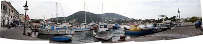
A digital panorama of Ischia Porto, the port, with Monte Epomeo in the distance

Ischia

Ischia is first. It’s lopsided like Capri, but bigger--and thankfully free of boldface names--with Monte Epomeo dominating both the profile of the island and the island itself. There’s a thriving tourist and spa life ringing the island—every town, commune, along the water has its own port and its hotels with thermal waters.

But up the mountain there’s life as it’s always been lived, with modest homes, each with a backyard vegetable garden, lemon trees, and a rabbit pen—rabbits, coniglie, being the chickens of the island. I know this because some 15 years ago I went up the mountain to Serrara Fontana to visit Zio Mario and Zia Maria, my father’s uncle and aunt, in their modest house with a wood cookstove and a semi-outhouse (you walked through the courtyard to get to it, but it had running water). Zia Maria kept a big vegetable garden and raised rabbits. I’m a vegetarian, but I ate her pasta with rabbit sauce because you can’t refuse food at an Italian meal (no actual rabbit though; I've been vegetarian for too long). Despite their 19th- (or 18th- or 17th- or 16th-) century way of life, they were very much connected to life in the late 20-th century. They received CNN on the tube, which they accessed via telecomando, the remote. Their adult kids had jobs in Pisa and in Belgium, and their grandson, also named Mario, who drove his motociclo all over the island, had a late-20th-century American vocabulary: Winston, playboy, Levi’s 501 jeans. (When I set up my scanner, I’ll post some images from this trip.)

The homes are modest, but the color schemes are not. This house is in Serrara, up the mountain. The road to Monte Epomeo is at right.

At sea level, the Island is ringed by lovely towns: Ischia Porto (the port), Casamicciola Terme and Lacco Ameno (site of many thermal spas) , Forio, Sant’Angelo, and Ischia Ponte, whose pedestrian causeway links it to a 12th century fortress, the Castello Aragonese, on a rock of an island. You won't find too many Americans without family ties to the island, because few residents speak English, but those intrepid spa-going German tourists are out in force, and just about everyone on the island has learned German to be able to cater to them. Tourism appears to have made the whole island wealthier—there’s a better dock, new buses that connect the island efficiently and on time, and renovations on even the smallest homes and shops. But it pisses me off when I'm given a menu in German. Italiano, per favore.


The authentic and the touristic: A cobbler's shop, closed for the afternoon break, above; Sapori d'Ischia, Flavors of Ischia, open for the tourists all day (the food is authentic, though)


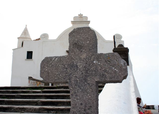
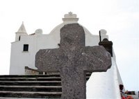
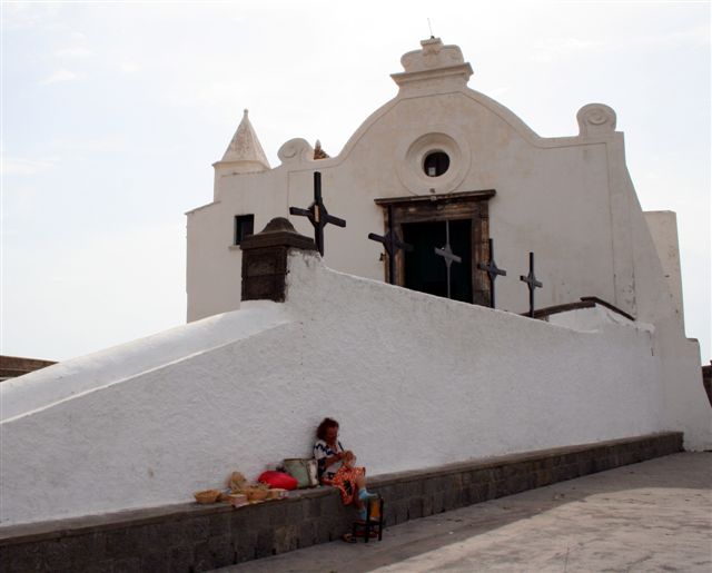
Forio is my favorite commune. The town is modestly scaled, and while it has all the conveniences of modern life (I bought a chemical ice pack for a sprained knee at a clean, modern farmacia ) it also has the beautiful fourteenth-century Chiesa del Soccorso, where seagoers and their families prayed to Santa Maria of the Ships for a voyage’s safe return. The church is nothing like those big baroque marble-and gilded structures you find in Napoli. It's a modest whitewashed building decorated on the outside with a wall of tiles and on the inside by models of ships, ex votos, offered in thanks for those safe voyages. The church is constructed on an immense and solid rampart of a foundation, all the better to withstand the force of the sea, which it overlooks. It appears Greek in style because its builders--the founders of Ischia--were Greek. And just as Napoli has an original Greek name, Neopolis, so does Ischia: Pithecusa.

The facade of the Chiesa Del Soccorso is plain except for the formally patterned tiles accenting its stairway. The tiles on the facade of the house, below, are the polar opposite--an asymmetric, wildly vernacular expression of pattern and color. The last time I was here, the woman of the house was standing in the doorway wearing a geometrically patterned dress. It couldn't have been more perfect

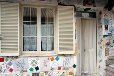
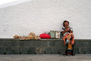
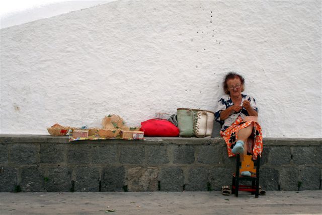
Working in her al fresco studio at the wall abutting the church--see her at left, below--this woman makes baskets

.

.


.

.

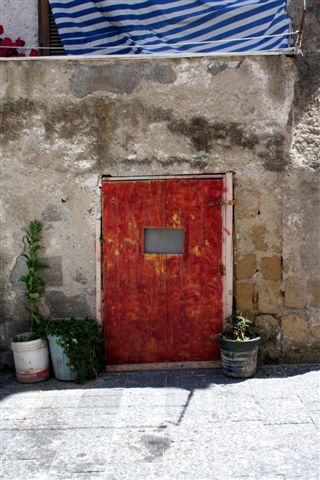
...Someone took the time to sample a multitude of colors for the door of a garage that is set into a hillside. I love that the swatches almost assume the shape of Italy on the map. I shot this on the road to Sant'Angelo

.

Do you remember the film, "The Talented Mr. Ripley"—the Anthony Minghella-directed 1999 film from the Patricia Highsmith novel? The story was set outside Naples, but some of the scenes were shot on the island. Some Internet souces say it’s Ischia Porto, but it looked like Forio to me.

Procida
I know for sure that "Il Postino"--from 1994, the story of the town postman who befriended the poet Pablo Neruda in exile--was shot on Procida, Ischia’s tiny neighbor. Like Ischia, Procida was founded by Greeks around the 8th century BC. It can be toured in an hour, though of course, that’s a typically touristic thing to say. People live their whole lives savoring every square centimeter of the place. But as a return visitor who was bringing friends there for the first time, I wanted them to get a sense of the place before we took the ferry back to Napoli.
We hired a driver. I needed someone who spoke Italian, rather than the more regional Prodcidano, a dialect unintelligible to me, as I was translating. I found Antonio, whose initial brusqueness mellowed into warmth as we drove around the island together. Here are some pictures of the island.

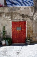
On Procida: A doorway near the Abbey of San Michele
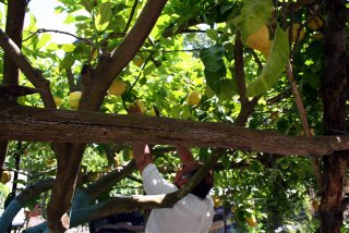

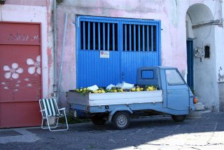
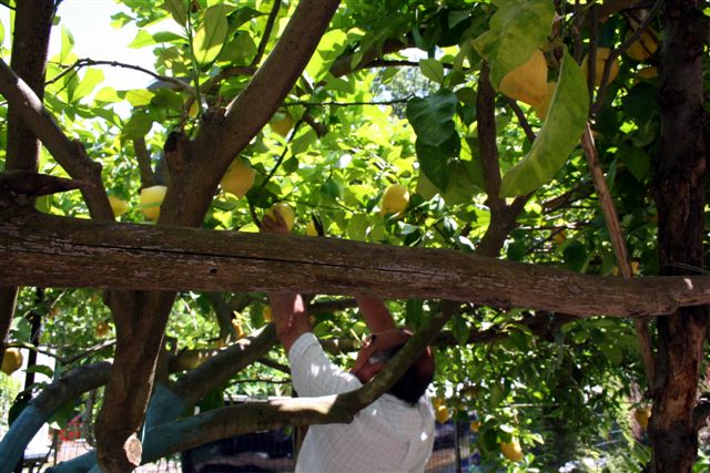
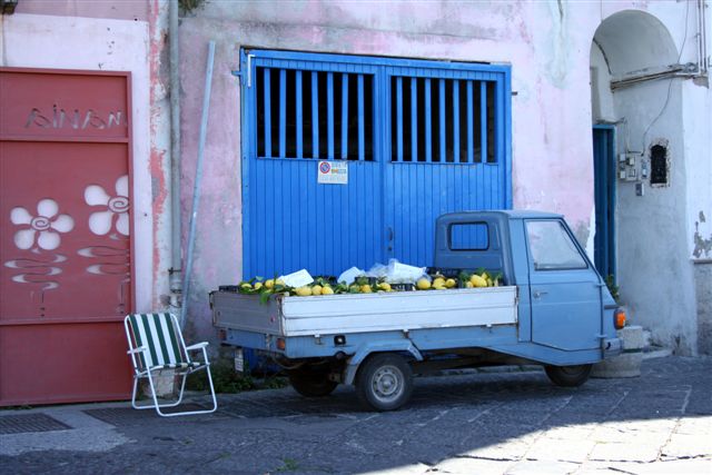
Our driver picking grapefruit-size lemons; at the port, a three-wheel truck loaded with the fruit
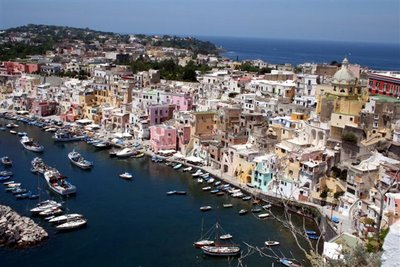
Santorini? This is a tourist shot looking down on the port of Chaiolella. The architecture appears Greek because it is--built by Greeks who inhabited the island long before it became part of the Citta di Napoli



8.04.2006

Soggiorno a Napoli

The bella and the brutta of Napoli: sublimely beautiful buildings; the traffic so heavy it takes to the sidewalk. These buildings are on Via Toledo, the main street that connects the Capodimonte Palace, high above the city, to the porto and the glorious Bay of Naples below

I ’ve been all over Italy in the past 25 years, but Naples—Napoli— is where my heart is. It’s where my DNA is, too. Everyone there looks like a cousin. Grandma Josephine (Giuseppina) was from a hill town above the city; Grandpa Antonio was from the island of Ischia (you can’t see the island from the port as you can Capri; Ischia is off to the north, a 40 minute ride by hydrofoil, but still part of the city of Napoli).Napoli itself is the personification of Yin and Yang, Italian Style. It’s big, noisy, hot, congested, dirty—and sublimely beautiful. Povery exists check by jowl with extraordinary wealth, like the renovations going on next to crumbling buildings, or the generosity of a shopkeeper (‘ssage, ‘assage, dialect for "have a taste,") in direct proportion to the taxi driver who tells you the meter’s broken and then charges you double what would have been on it.

Open city: I love how the door to the pizza display swings out onto the street

I go there in early spring when the mornings are cool and the churches remain refreshingly so all day. A classic cultural mosaic, Napoli started life as a Greek outpost, Neopolis—"new city"—several millenia ago, and over time was built up by the Romans, and in recent centuries by the Spanish who ruled it for two hundred years. The architecture reflects all of this. You can, for instance, leave the Spanish Baroque (and the motorini, the motor scooters, and the Smart Cars) of street level and descend to the remnants of a Roman street and shops, and below, that, to the stones of a Greek road.

The ubiquitous lines of laundry hanging overhead are a metaphor for Neapolitan life. Everything is out in the open: the immodestly clothespinned underwear, the shop displays dramatic as stage sets, the gelato machines pushed aggressively out into the middle of the sidewalk. It’s not unusual to see families sitting down to dinner, napkins tucked under chins, in a kitchen that’s open to the cobblestoned streets. On the streets, the motor scooter is an al fresco stationwagon holding the driver, a passenger, a couple of kids and the groceries.

More life on the street. A theater set? No. A family is assembled on the steps of a church for a photo op (how convenient for me) for a boy's First Communion. The horse and carriage is a dramatic touch, no?

Even the inside is outside. This is the Cloister of Santa Chiara, cool and quiet, despite the noisy street life of Spaccanapoli on the other side of the walls. The majolica tiles are unusual in that they depict Neopolitan life, not scenes from religious life. It's a museum now. You can see orange trees and grape vines on the grounds

Animated conversations take place on street corners, and from balcony to street level, and from motor scooter to sidewalk, and via wireless, as the talkers gesticulate wildly to one another—or to the air in front of them when a cellphone is involved. I know this sounds like a cliché, but it’s not. (When I was a kid, my parents would say, "Don’t talk with your hands." They might as well have been saying, "Don’t walk with your feet." It just can’t be done in Southern Italy or its diaspora.)

Down by the water, seagoing life is surprisingly well scheduled as ferries and hydrofoils pull in and out of the port. (Except for the sciopperi, the one-day strikes that take place just when you want to go somewhere.) In Santa Lucia, the picturesque orignal port increasingly crowded by restaurants, muscular old guys painting their boats stop to flex for a tourist—is this real life or theater? Oh, right, it’s Napoli, so real life is theater.

I've never been here when the shrine to Santa Lucia wasn't freshly painted. The fisherfolk take care of her--and she of the them, at least the faithful. "Without me you can't do a thing," says her plaque

Maybe this is where my stripes come from?

Italy is a Latin country, and south of Rome, you really feel the passion, the color, the heat. Hispanic Latins have son and salsa; Iberian Latins, flamenco and fado. Italian Latins, the Neapolitans in particular, have their songs of heartbreak and longing, and the opera of the stage and the street. The languages and expressions are different by degree, but these are cultures cut from the same passionate cloth.

Next post: The Islands in the Bay

7.31.2006

Talking About Geoform

Today I’m finally talking about Geoform, an online curatorial project coedited by Julie Karabenick, of Ann Arbor, Michigan, and Rick Barnhart, of Tenants Harbor, Maine—geometric abstractionists both—that shows the variety of geometric expression in contemporary abstract art. In my previous post, I talked about the ways several artists are connected, and I gave you links to Julie’s and Rick’s individual sites—as I’m doing here—so perhaps their work will already be familiar to you. (I am unable to download images of Rick's work from his website, so I urge you to visit the site directly: www.barnhartart.com )


Julie Karabenick: Composition 59, acrylic on canvas, 30" x 30", 2005

Geoform was launched in the spring of 2005, about 15 months ago, with a beautifully designed site and a handful of participating artists. Today 76 artists from 15 countries are on the site. The work is satisfyingly diverse in size, format, medium, approach and expression, and the site appears to grow weekly. "Rick and I spent months and months reviewing and discussing artists in order to develop our criteria for inclusion—which is to say, sufficiently abstract and sufficiently geometric," says Julie. "The boundaries are subject to some redefinition and refinement as we continue on."

I was one of the first artists on the Geoform site and the subject of an early interview with Julie, so I’ve had a chance to see Geoform grow and flourish. Given that Julie also paints and curates (scroll halfway down the page of this link to see her curatorial efforts), Geoform, with its roster of artists and a growing number of artists interviews, is impressively robust. Julie and I correspond regularly by e-mail and have become good friends, so I’m sharing some of the conversation we had recently.

"From ‘geometric’ marks made on rock faces and cave walls and on human faces and bodies, extending far back into prehistory, to geometric patterns found in textiles and adorning pottery and masks and other objects in world cultures, this type of form has attracted me," says Julie. "During the early 90s, geometric shapes began appearing in my prints amongst the more representational elements." The figurative elements began to fall away, she says, and soon she found herself working abstractly. "I’m not sure I could have given a very good account of why this was happening, but I certainly was intrigued."


Julie Karabenick: Composition 64, acrylic on canvas, 30" x 30", 2006

Julie began looking more seriously at geometric form and structure in fine art. She acknowledges the Internet as a deep well of images. "On-line wandering and searching has become my primary means of discovering artists working in geometric abstraction," she says. (That’s how she found me. She called in late winter 2005 and we talked for an hour, growing the roots of a friendship that would grow surprisingly deep given the physical distance between us.) A developmental psychologist--PhD, University of Michigan, 1981--as well as a painter, Julie approached this change in her own painting with a readings in philosophy, anthropology, psychology, linguistics, neurophysiology, and various approaches to spirituality.

"As my files of research began to fill drawers, I decided I wanted to find some way of sharing this admittedly unsystematic and idiosyncratic ‘research,’" says Julie. Finding a creative partner in Rick Barnhart was the impetus she needed, and together they launched the Geoform site.

Julie Gross, an artist on Geoform, is the subject of a recent interview. This is one of her paintings: Blue Inversion, oil on linen, 32" x 32", 2004

Gail Gregg, another artist on the site, is also the subject of an interview. Here, Kincaid, encaustic on panel, 36" x 36", 2003

Geometric abstraction is no longer an art world flavor of the month. From Op Art and Hard-edge Abstraction in the Sixties, to a resurgence of Neo Geo in the Eighties, geometric abstraction in all its variations has evolved into a menu staple. Since art now is so much about the constantly new and titillating, a site like Geoform keeps geometric abstraction visibly fresh and tasty. "We hope the project helps raise the visibility of this type of art, perhaps encouraging curators to develop exhibitions to showcase it regionally or thematically," says Julie. Continuing with the food metaphor, she adds, "I say ‘thematically’ because there are many ‘flavors’ to sample—many motivations, sources of inspiration, artistic temperaments, stylistic outcomes involved. We are also happy if Geoform contributes to networking, communication, and/or collaboration among artistic kindred spirits."

Burton Kramer: Resonant 2, acrylic on canvas, 30" x 60", 2001


7.30.2006

I Am Not An "Encaustic Artist"

Encaustic has reached critical mass. Many artists are working in the medium and showing their work. There are encaustic shows, encaustic groups, encaustic forums. These are all good things. But where does the medium end and the ghetto begin?

When I wrote my book in 2000 and had it published in 2001, I thought that within five years—which would be right about now—encaustic would cease being a novelty and find its way into the mainstream of artistic expression. That hasn't happened yet, but it will.

But here's what concerns me: Some artists who work in the medium have been defining themselves by the medium. Not, "I am a figurative painter," or "I work in geometric abstraction," or even, "I’m an abstract painter who works primarily in wax." No. Typically I hear, "I paint in encaustic." I love encaustic. But what kind of art do you make?

Is Jasper Johns an "encaustic artist?" Or is he an artist—a painter and printmaker? Does he make "encaustic art?" Or does he make paintings, some of which are executed in the medium of encaustic?

Is a painter who works in oil an "oil artist?" Is a painter who works in acrylic a "polymer artist?" (Imagine calling Agnes Martin a "graphite and acrylic artist," or Richard Serra a "steel artist.")

Maybe I’m being too touchy about this because I just got listed on an artist’s website as an "encaustic blogger." I love the way the web lets us link to one another, and I’m pleased that this artist thought enough of my blog to cite it. But….I type my blog on a computer with word-processing software. My comments appear on a cyber screen. There is no wax involved in the process. And I don’t always write about encaustic.

Let me be clear: I love encaustic. I love encaustic. I’ve been working with it for 16 years. I participate in, and go to see, "encaustic shows"—they’re a great way to see the wonderful variety of artistic expression in pigmented wax. (Though I make a point of participating in thematic shows as well.) And I admire and respect the work of many, many, many artists who work in encaustic. I just think we need to think hard about how we define ourselves and our work.

Actually, let me be clearer. You should feel free to call yourself whatever you want. But I am not an "encaustic artist." I’m a painter. Who works with wax.


7.08.2006

On the Road

The Silk Road of history was that fabled 5,000-mile trade route between China and the Mediterranean.

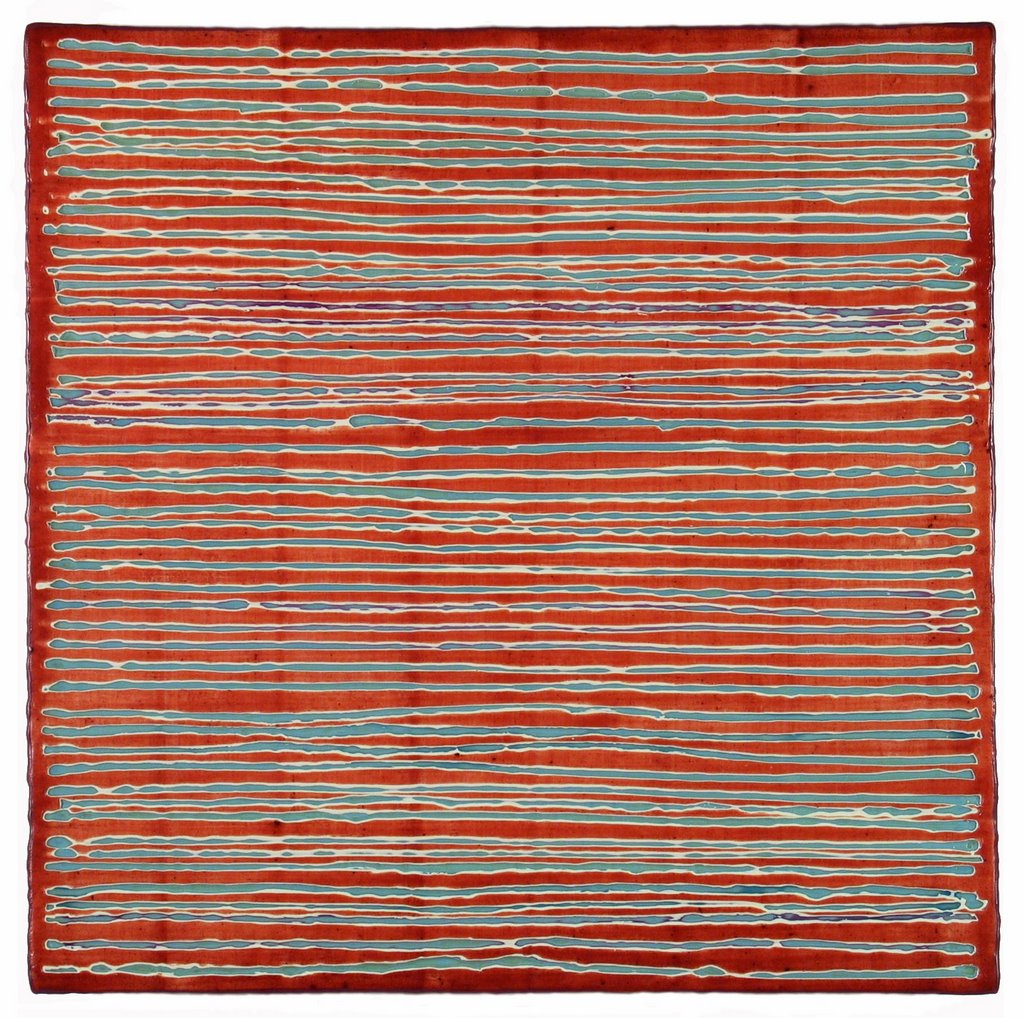
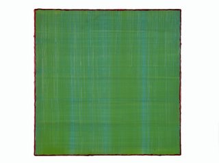
My own "Silk Road" is a new series of small and midsize paintings in which I'm focused on color and the enduring power of the grid. Up close, each apparently monochrome painting is a quiet grid, built up by differently hued layers of intentionally grainy color applied at successive right angles. I've limned each panel to heighten the intensity of its color field. The title of this series was suggested by the iridescence and texture of woven cloth; the materiality comes courtesy of my medium: encaustic (pigmented wax). The paintings are installed for exhibition in variable-size grids or in a zip along the wall, for the repetition of shape, changed by color and surface, reinforces the elements of each individual work and reflects my involvement with grid-based abstraction.

"Silk Road 43," 12 x 12", 2006


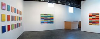
Installation wall in my studio, each work 12 x 12"

If you're in New York between now and July 21, please visit the Elizabeth Harris Gallery where five of my "Silk Road" paintings are included in Neoplastic Redux, organized by Miles Manning. Other artists in the show include Gene Davis, Pat Lipsky and Helen Miranda Wilson.

Here’s an installation shot. Thornton Willis is in the foreground; I'm on the wall in the rear. Photo courtesy of the Elizabeth Harris Gallery.

If you're cyber traveling, spin on over to the Marcia Wood Gallery in Atlanta. Here's an installation view of my recent show there. You can see more at the website if you click onto the "Exhibitions" page, then scroll down to "Past Exhibitions" and "2006".

Pure Color, my solo exhibition at Marcia Wood Gallery, April 20-May 27, 2006. From left: "Silk Road" grid, each work 12 x 12"; "Stack," 48 x 67"; "Bask," 48 x 50"; all encaustic on panel

I'll be blogging from the Silk Road for a while, so check back soon. I should be posting a couple of times a week. If you want to know more about me or my work: www.joannemattera.com

7.07.2006

In The Title Box

. 
Diamond Life 17, 2012, encaustic on panel, 22.5 x 22.5 inches

This work may be available at the DM Contemporary, New York

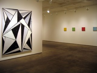
Lush Geometry at DM Contemporary, April 21-June 1, 2012. From Left: Louise P. Sloane, Joanne Mattera. Sculpture, foreground: Richard Bottwin. Photo: Richard Bottwin

7.06.2006

Posted: 11.13.11
Click image to enlarge