Pages

10.08.2012

Marketing Mondays: Exhibition Options. A Recap

.
Here’s a question asked by several

artists recently:  How, exactly, does one

curate a show in which the work .

has been juried by someone else?
.
.
Just when I think I'm running out of topics for Marketing Mondays, along comes another one. One could certainly organize a show that has been juried by another—there’s a ton of work before and after the juror steps in to make selections—but curating implies that someone had a concept, researched artists and their work, made studio visits, and then selected particular works to offer a visual narrative or considered view of a particular theme. 
.
I’ve written before about the various types of exhibitions (juried here and here, invitational, curated) but let me offer a recap.
.
Curated
We start with a quick definition from Wikipedia: In contemporary art, the title curator is given to a person who selects and often interprets works of art. In addition to selecting works, the curator often is responsible for writing labels, catalog essays, and other supporting content for the exhibition. Such curators may be permanent staff members, be "guest curators" from an affiliated organization or university, or be "freelance curators" working on a consultant basis.
.
At a museum you expect a curated show—that’s what the exhibition curators do. (Other curators manage and care for the permanent collection; some do both.) In a small museum with one curator, the credit may be understood, but in a larger venue, where there are many curators, the particular exhibition curator is acknowledged.
.
Art dealers curate all the time: gallery exhibitions, their booths at art fairs, perhaps even a collection for a particular client. It’s unusual for an art dealer to claim the title of curator, but in a venue with many employees, credit for curating a particular show may be given when a person curates who does not usually do that job.
.
Typically there is no entry fee for a curated show because there is no submission. Artists are selected via curatorial research. Museums and large commercial and academic galleries typically arrange for pick up and return of work, the costs of which they cover. Galleries should at least split the cost (you pay to ship, they pay to return) but that's not always the case, as many small galleries continue to struggle. With a pop-up or DIY exhibition, artists may be expected to share the costs. Though results are not guaranteed, an ambitious curator might seek grant funding to cover all or part of the costs of a DIY show, or an individual artist could look for professional advancement grants to help defray her/his share of the expenses.
..
Invitational
An invitational is an interesting way to spin what a dealer does when she’s curating or organizing a group show that includes artists in addition to the ones she represents. In a small museum or academic gallery, an invitational may be an essential aspect of community outreach, acknowledging local or regional artists.
.
Invitationals are not typically juried, the idea being that the artist is asked to participate, not required to submit work. So again, there's not usually an entry fee. Shipping terms vary from venue to venue.
.
Organized
This term suggests several possibilities: the effort of a person who has the concept and does the work but leaves the selection up to another—a juror, for instance; or who invites the artists but leaves the selection up to them. It might also suggest a group effort in which no one person makes all the curatorial decisions but everyone works hard to create a successful exhibition. There’s a lot of work involved in putting on an exhibition, and organized by is a good term to acknowledge it.

.
There is not typically an entry fee associated with an organized show because, again, the artists are invited as a result of the organizer's research—however if it's a DIY project, artists may be expected to share the expenses of mounting the show.
.
Juried
The juried show is typically the domain of a non-profit institution or
co-op gallery, where community is fostered by bringing artists together. A juror, usually invited and modestly paid, selects from a pool of submissions. She creates a show from the best of what comes in. Of course there’s curation involved in the process, but even with a thematic show, a juror is assembling a show from work she might not have selected on her own and, this is important, selecting work that she has likely seen only in digital reproduction. The venue personnel, whether gallery director or assistants, are the likely installers, unless the venue is large enough to be abe to hire someone specifically for the job. A juror might have ideas for placement but is not typically involved in the installation. 
.
For artists the juried show is a crapshoot—you might find yourself surrounded by fabulous work, or be so embarrassed that you don't even list in on your resume—but early in a career it can be a lifeline out of the studio and into a broader discourse. And in special situations it can be a great way to show with professional peers.
.
Juried shows often require entry fees for the artists. If you're going to plunk down $30 to even $50, make sure the project is worthwhile. Who's the organizer? Who's the juror? Where's the venue? What's the history of the show or organization? Is there a sophisticated audience for the show? Will there be a catalog or essay? Has it been advertised? Are there prizes or perks?
.
Crediting the effort
Credit the curator. Credit the organizer. Forget what grad school professors tell you about not acknowledging the curator. It's professional and respectful to credit those who select your work for a show. Identify them on your resume and in all promotional material.
.
Do you credit the jurors? On a resume, not necessarily—especially if your exhibition history is already full of juried shows. But who wouldn't want to acknowledge the museum curator or gallery directory who chose your work?  Certainly note their involvement on your promotional materials. You should expect the exhibition organizers to note them prominently on the postcard and all promotional materials as well.
.
Comments?
As always, there are plenty of blurry lines and gray areas. Your comments are welcome.
.
.
If you have enjoyed this or any other post, please consider a voluntary annual donation of $20 to support this blog. Scroll down the sidebar from the top to find the Paypal link. Thank you. And big, big thanks to all the readers who have done so already!

10.06.2012

Waxing Philosophic


I probably write less about encaustic on this blog than I do about any other medium—and if I do, I integrate in into a broader discourse—but today I have something to say.

An exhibition in book form

A Book and Exhibition
If you are in the Hudson Valley this weekend, please join me at the opening of Encaustic Works 2012 at the R&F Gallery in Kingston, New York. Encaustic Works is the name of a biennial exhibition sponsored by R&F Handmade Paints, one of the few manufacturers anywhere of encaustic paint. This year, for the first time, the exhibition is taking place not in a museum or gallery, venues where it has been held in the past, but in a book. I have a special affection for this exhibition in a book, because I was the juror, invited by the folks at R&F to select an exhibition from some 450 artist submissions. I selected 50 artists.

While the book is the exhibition, Laura Moriarty, director of the Gallery at R&F, has selected 14 artists from the book for an exhibition-within-an-exhibition, so to speak. If you are curious about what contemporary encaustic painting, sculpture and printmaking look like, come on over. You’ll get to talk with many of the artists, too.  By design, most of the artists are within driving distance, so the opening should be packed. The opening is on Saturday, October 6, from 5:00 to 7:00 p.m. 


Two views of Encaustic Works 2012

Above: Lisa Pressman and Renee Magnanti on back wall, Kevin Frank, foreground
Below: Lorrie Fredette on far wall;  Gregory Wright, Hilda Shen and Toby Sisson; these photos, Laura Moriarty


A Fork in the Road
But things are not all luminosity and waxy goodness. Encaustic painting has reached a fork in the road. Those of you who first learned about it through the flags and targets of Jasper Johns know it to be a substantial medium for abstraction, a medium which holds the track of a brushstroke or the path of a drip, a medium which functions like glue for collage (it’s what holds the newsprint to Johns’s canvas), so that paintings have muscle and heft.


Installation from Focus: Jasper Johns, Museum of Modern Art, December 2008-February 2009; left: Target with Four Faces; right: Flag, both encaustic and mixed media


If you are familiar with the work of Tony Scherman, you know encaustic to be expressively and romantically figurative, with great swipes of translucent paint applied alla prima to large canvases. If you are familiar with the sculpture of Petah Coyne, you know encaustic to have a baroque richness rife with metaphor and uncommon beauty. 

And if you saw the Lynda Benglis retrospective at the New Museum last year, you saw the work of an artist fluent in plastic mediums—latex, expanded foam, fabric, wax and metal—whose ideas about organic and sensuous accretion have remained more or less consistent among her various modes of expression.


Petah Coyne, Untitled # 1243 (The Secret Life of Words),  2007, cable, chicken wire, bolts, wax, silk flowers and other materials, at Art Basel Miami Beach in 2008 with Galerie Lelong
.
Detail below


Lynda Benglis installation view at the New Museum, February-June 2011, with  work in poured latex (foreground), and cloth, wax, urethane foam, wax, and cast bronze respectively

Lynda Benglis, Karen, 1972, wax on wood, 36 x 5 x 3 inches

Detail below


Those of you who are familiar with my work (see sidebar or click Exhibitions, a tab under the header) know encaustic to be a refulgent material that allows me to create a painting with light-infused layers—color fields and reductive geometric compositions—in which image and object are one.

There are many excellent painters and sculptors—well known and not so well known—who employ this contemporary medium, a medium with roots that extend to the Fayum portraits of Greco Roman Egypt. (If you saw Ancient Faces at the Met in 2000, you saw the first and only time a large collection of these mummy portraits, the earliest surviving paintings on a substrate other than cave walls, has been shown together.) I’ve shown and written about work in encaustic here, here, here and here. But there’s a problem: Wax is such a seductive material that it’s drawing hobbyists like bees to the hive. These are folks who describe their efforts as “waxing” instead of “painting,” as if Pledge rather than paint were the stuff at the end of a brush.  So when melty melts and drippy drips flood the art centers and juried shows, and retired engineers start calling themselves artists—actually “encaustic artists”—after a weekend workshop, the serious painters, myself included, start getting twitchy.

Of course hobbyists are active in every medium—think paint by number or Elvis on velvet—but oil has Rembrandt and Goya, Mitchell and Snyder; and acrylic, a long line of masters from Helen Frankenthaler to Agnes Martin to a host of contemporary practitioners. Unless you are familiar with the Fayums, however, you may think that encaustic begins and ends with a few well-known artists and everything else is kitsch. Indeed, I’m sparing in how much I write about encaustic on this blog because I don’t want to be associated with the craft and hobby component out there. (At the same time, I am active in the encaustic community to encourage professionalism among its practitioners and I work to raise the bar via the annual conference I run.)

Art, No Adjective
My rule of thumb is simple: Whether made with sheetrock or sequins, wood or wax, it’s the vision and voice of the artist that gives form to the medium, not the other way around. “Encaustic art,” on the other hand, is a hobby conceit, organized by those eager for visibility without the chops to get shown outside of a small circle of friends. “Encaustic art” as a term was used differently a couple of decades ago, but now if it’s adjectival, with very few exceptions it’s a subgenre. 

I’ve said enough. A few "encaustic artists" are already taking aim with tomatoes. But I’m doing my part to identify and acknowledge the contributions serious encaustic, and those who use it, offer to the discourse of contemporary art. As viewers and artists, as dealers, curators and critics, please don’t settle for less.

OK, I’ve got an opening to attend. See you there?

10.04.2012

Structure and Space

.
 Entering Mark Dagley's Structural Solutions at Minus Space


Two current shows are interesting to me for the way their geometry occupies the space they’re in: Mark Dagley’s Structural Solutions at Minus Space in DUMBO, and Sarah Oppenheimer’s D-33 at P.P.O.W. in Chelsea.
.
Dagley has placed three large geometric paintings in a relatively small space—one painting per wall. Because of the gallery setup—the viewer enters via the fourth wall—there’s a strong sense of drama with the three leads emoting all at once. The installation shouldn’t work but it does. I wonder if it's the seemingly provisional installation, which allows the viewer to stand toe to toe with the paintings (which are nonetheless larger than life)? 
.
Each painting is set on flat aluminum blocks on the floor and leaned at a slight angle against the wall, a "casual" but clearly well-thought-out strategy. Each painting embodies some aspect of geometry, both in structure and composition: a bicolor right-angle triangle, a prismatic grid, and a long rectangular painting whose diagonal stripes and keyhole cutouts suggest something out of a construction site. I don’t think the latter analogy is out of line, since Dagley’s work is all about how his paintings are put together. Here’s how he has described it: “The opticality is just the sexy part, the byproduct of the real issue at hand, which is structure.”
.
Structural Solutions is up at Minus Space through October 27, with a concurrent retrospective at Kent Place Gallery in  Summit, New Jersey.

Left: Lucifer, 2012, acrylic on triangular canvas, 134 x 115 inches; right: The Mackintosh Variations, 2012, acrylic on canvas, 104 x 120 inches 

Continuing around the gallery, Janet's Dilemma, 2012, acrylic on canvas with notched holes, 78 x 156 inches  
.

 Entering Sarah Oppenheimer's D-33 at P.P.O.W


While the viewing experience at Minus Space is chromatically blazing and almost physically encroaching,  at P.P.O.W. it's quite the opposite. The gallery door opens into what appears initially to be an empty room. But there's geometric activity at the sides of each wall in front of you, and an off-kilter doorway beckons you to enter to find out what it is. The experience is serene yet surprising, with the elegance of the geometry revealing itself only if you navigate the space.

D-33 is up at P.P.O.W. through October 13.


Entering the doorway at right brings you into an empty space which leads you into . . .

. . . a small room that offers unexpected views of and through the structure. What you're seeing above is not a painting but a look through a glass window to the geometry of the doorframe we just entered

Below: We shift our gaze from left to right to see this construction


We're going to conintue walking through the structure, but just to orient you let's take a moment to peer through the window you saw in the photo just above this one. That's the door through which we entered the gallery


We continue our tour of the structure . . .

. . .and end in a south-facing room in which the sunlight through the windows becomes part of the geometry of the installation. (A mirror in the doorway skews and enhances the disorientation.)


10.01.2012

Marketing Mondays: The "Octogenarians"


Let me start by saying that I am not in my eighties—and I won’t be for some time—but when I do get to be that age, if I am referred to as an anonymous “octogenarian” or “elderly lady” or “old woman,” or “elderly grandmother” (which would be quite the trick, since I have no children that I know of)  instead of by my own name and occupation, I will haul off with the punch and foul mouth of a juvenile delinquent. Identifying someone because they're old rather than by who they are and what they do—especially women (surprise)—is ageist and sexist. I’d rather you just call me one pissed-off bitch. (Though if I do smack someone upside the head, I know what the headline would be: "Rogue octogenarian.")
.
First there was the Beast Jesus flap. Amateur restorer Cecilia Jimenez put her paintbrush to a flaking fresco of Jesus in a Spanish church and created what is now the most publicized “restoration” outside of the Sistine Ceiling--not as good, but now just as well known. Here’s the Huffington Post’s headline from August 22:

“Elderly Woman's Hilarious Failed Attempt At Restoring A 19th Century Fresco In Borja, Spain.”
.
Yes, it was a hilarious attempt, one that I skewered here, but it would have been just as hilarious if she’d been 21 rather than 81. Chutzpah comes in all ages and all languages. Arianna Huffington, and pretty much everyone else, should have done better with the headline. and story.
 
Just out of curiosity, I Googled "spanish fresco destroyed by amateur," leaving out any mention of age. Below is a screengrab of what came up. Kudos to USA Today, headline at the very bottom of the image, which identified her as an amateur, the only real issue with regard to the restoration. Age can appear in the text of the piece as it does in any other story.
 
 
Then there was the infinitely sadder recent story, which this headline notes: “Johnny Lewis dead at 28: 'Sons of Anarchy' actor killed elderly landlady”
.
Turns out the “elderly landlady” was also 81, having lived a life almost three times as long as the Hollywood meth-head who killed her, but most headlines treated her just as expendably as her killer did.
.
There was a lovely exception to the ageist anonymization of this woman, whose name is Catherine Davis. The actor Taylor Negron wrote a tribute to his friend, whom he describes as “a writer, artist and entrepreneur. . . .a woman of astounding energy and clear-minded self creation.” She supported herself— and her community— by renting rooms in her villa to struggling actors. She the difference? 

Davis is shown here in the doorway of her Spanish-style style villa, which many struggling actors called home. Hardly the person "elderly landlady" calls to mind. I might not have taken the time to write this little editorial had both of these women not been artists, albeit amateur and/or unsung. (Davis, according to Negron, "was working on a biography of Phoebe Apperson Hearst," mother of William Randolph, at the time of her murder.)
Catherine Davis in the doorway of her home, photo from the Internet; photographer is uncredited
 
Given that most of us will not achieve New York Times above-the-fold status, or the cover of Art in America, the “elderly woman” (or “elderly man,” for that matter) may one day be how we are identified, even if—let’s hope—it’s not under either circumstance.
.
We can all do better when we write about artists, when we write about one another. If we are lucky that respect will be accorded to us one day. 

 If you have enjoyed this or any other post, please consider a voluntary annual donation of $20 to support this blog. Scroll down the sidebar from the top to find the Paypal link. Thank you. And big, big thanks to all the readers who have done so already!
 

9.27.2012

Fill 'er Up

.
Billboard wall in Chelsea 

Who could have known that this billboard wall on 21st Street in Chelsea would be a metaphor for the jumble of stuff in the galleries right now?

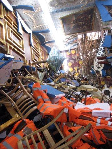
At the Barbara Gladstone Gallery, Thomas Hirschhorn, inspired by the Italian cruise ship that ran aground feet from shore, has created his version of the listing banquet hall inside the inaptly named Costa Concordia. There's no sense of urgency or disorientation here, but it is an awesome spectacle.

Thomas Hirschhorn, Concordia, Concordia, at Barbara Gladstone Gallery in Chelsea, up through October 20
 
Detail below
 

Tip of the iceberg: At the doorway of Sikkema Jenkins on 22nd Street, where Leonardo Drew's installation is visible.
 
 
There's another apocalyptic vision at Sikkema Jenkins, where Leonardo Drew reportedly took the entire summer to install this season opener, a burnt offering of detritus from nature and industry. But for all its destruction there's something Phoenix-like about Drew's enterprise, for he's cobbled together an entirely new vision out of the ashes of the old. It's up through October 12. 

Installation view of Number 161 in the large main gallery
 
Detail below

Standing at the periphery of the main gallery, with the installation snaking around behind us and into a second space, we're looking at Number 159 on the far wall
 
Detail below, where riveted metal and assemblaged wood meet
 

Katerina Marcelja, Wet Wings and Wooden Sails, at Giacobetti Paul Gallery in Dumbo
 
In the 111 Front Street Gallery building in Dumbo, Katerina Marcelja took the detritus of a house that was deconstructed for remodeling and turned it into an installation, the largest work of which is this  menacing mountain of snapped lathing. The show is up through September 30. (Truth to tell, I went to see Mark Dagley's show at Minus Space next door, and I will show you those pictures soon.)
 
Detail 
 

 A steamroller in a tight space
 
At Dodge Gallery on Rivington Street on the Lower East Side, sculptor Dave Cole has shoehorned a steamroller into the gallery's below-ground-level gallery. No he didn't drive it in. The disemboweled steamroller was taken apart and placed section by section into the tight quarters and then reassembled. The unusual thing about this steamroller is that it's now a musical instrument. See the protrusions on the drum and the metal fingers on the wooden sound box attached to the front? Yes, it's a music box. (The song? My Country 'Tis of Thee. I might have preferred Jimi Hendrix or maybe Bach, but the one who does the work gets to pick the tune.) The show is up through October 28.

Dave Cole, The Music Box, 2012, Installation view. Photo, Carly Gaebe. Photo from the gallery website
 
Stay tuned over the next few weeks. I have a lot to show you of the new season in New York. As always, I welcome an annual voluntary donation of $20 to keep this blog going. Look for the money request in red on the sidebar and the Pay Pal link just below it. Thanks.
 

9.24.2012

Marketing Mondays: "Good Art-world Citizens"

.
Visiting the Minus Space gallery in DUMBO last week, I chatted with Matthew Deleget and Rossana Martinez, the artists who founded an online platform for reductive art which became the bricks-and-mortar gallery we were standing in. Deleget mentioned that all of the artists the gallery represents “give back”  in some way, whether it be teaching, mentoring, curating, or writing.
.
.
Deleget and Martinez were too modest to mention it, but "giving back" at Minus Space starts with them. As I was on the F train heading back into Manhattan, I remembered a recent Village Voice article Christian Vivieros-Faune wrote on Chuck Close, in which he quoted the eminent artist on the importance of being a “good art-world citizen.”
.
“Close's constant civic-mindedness has resulted in his appointment to the
President's Committee on the Arts and the Humanities, as well as his recruitment to mentor struggling schools for Turnaround Arts—a recent administration-led arts-education initiative that closely echoes the artist's own oft-quoted precepts,” writes Faure.
.
While most artists will not be involved with projects that are quite as high profile as lobbying the President while photographing him, there are many who have been and continue to be good art-world citizens, which is the subject of today’s Marketing Mondays post.
.
When I think of “good art-world citizens,” I think of sculptor Nancy Azara and painter Darla Bjork who were instrumental in founding and teaching at the New York Feminist Art Institute in SoHo in the Seventies, and who continue to host intergenerational salons for women artists; of dealer Edward Winkleman who offers advice to artists on his blog; of critic Jerry Saltz who hosts an online salon for his 5000 Facebook friends, most of them artists. I think of the artist and writer Chris Ashley, who maintains Some Walls, a curatorial and writing art project open by appointment in his home in Oakland, California; Ashley mounts four to six solo exhibitions a year and writes an essay for each exhibition. 
.
I think of the late Ivan Karp, who always took the time to look at artists' work and offer an honest assessment of what he saw. (His memorial will take place in a few weeks; see sidebar right.)
..
I think of Richard Frumess, painter and paintmaker, who started a small paint company in the basement of his Brooklyn building, moved it upstate to Kingston, grew it with partners, and for 20+ years has been dispensing technical and best-practices information to artists, along with creating a workplace that hires artists and gives those artists room to create workshops and curate exhibitions in its gallery, both of which serve an international community of artists; yes, R&F Handmade Paints is a for-profit company, but it gives back much to the community which supports it. This kind of generosity is true, too, for the Golden Paint Company, which gives back in similar good spirit.
.
I think of Paul Klein, Chicago art force and eminence gris, who sends out an arm-around-your-shoulder newsletter each month reporting on the Chicago gallery scene; of Philadelphia artists Roberta Fallon and Libby Rosof who have chronicled, supported, and cheered on the Philly art scene in their terrific Artblog; of Sharon Butler who takes time out of a demanding studio practice and teaching career to report on painting in New York City and elsewhere with her Two Coats of Paint blog; of artist Austin Thomas, whose community gallery, Pocket Utopia, was the first kid on the Bushwick block and is now on the Lower East Side.
.
I think of  painter Julie Karabenick who, driven by a passion to chronicle abstract geometric art, has created an ongoing curatorial project, Geoform, which is both an international resource and a living testament to the power of geometric abstraction. I think of Jackie Battenfield who founded a gallery in Brooklyn, ran the Artists in the Marketplace in the Bronx, and  nowtravels around the country offering advice and inspiration to artists at all ages and at all professional levels.
.
I think of all the artists who donate artwork, occasionally or regularly, to the endless good causes for which they are asked (though I rail against donating). I think of the artist curators, usually unpaid, who create exhibition opportunities for their peers. I think of tenured artists who teach in schools and universities, and especially of the hardworking but poorly paid adjuncts and art center teachers who encourage and inspire.
.
"Giving back” doesn’t necessarily mean giving it away for free (though good art-world citizens are rarely rolling in dough); it simply means returning some of your hard-won experience, mentoring, generosity or energy to a community where there’s never enough to go around.
.
Feel free to toot your own horn, acknowledge another’s effort, or comment in whatever way you choose.

.
If you have enjoyed this or any other post, please consider a voluntary annual donation of $20 to support this blog. Scroll down the sidebar from the top to find the Paypal link. Thank you. And big, big thanks to all the readers who have done so already!
 

9.20.2012

Josef Albers: Painting on Paper

.
  1. Josef Albers, Color Study for White Line Square,
    oil on blotting paper with gouache, pencil and varnish; The Josef and Anni Albers Foundation, 
    inv. no. 1976.2.22 29.53 x 29.66 cm


Josef Albers painted over 2000 paintings in his Homage to the Square series between 1950 and 1976, the year he died. What is less known is that the paintings--which took only a few hours each to execute--were preceded by intense color studies in oil, or sometimes gouache, on blotting paper. 

Unlike the pristine paintings on masonite or board, the sketches are loosely painted. Most are notated in the margins, sometimes even on the paint itself, with the information of their making: the names of paint brands and colors Albers used, and daubs of related hues. Sometimes the sketches are divided, and we see how one set of hues worked in relation to another, or they reveal his attempts to find the perfect gray foil to the hues already selected. Albers chose blotting paper for his sketches so that it would absorb much of the oil, leaving intensely pigmented color on the surface.


Fifty of these sketches are the subject of a splendid exhibition at the Morgan Library, Josef Albers in America: Painting on Paper, through October 14. It's the only American venue for the show, so if you're an Albers devotee (and who isn't?) get over while the show is up. 


A catalog is available if you can't get there, but it doesn't begin to convey the intimacy of the small gallery and the color radiating from its walls. I wasn't allowed to photograph, so I can't convey it here either, but these images will give you a little taste of what's in the exhibition.


  1.   Josef Albers, Color Study for Homage to the Square, oil and graphite on blotting paper with varnish; The Josef Albers Museum Quadrat Bottrop, inv. no. 9/433 30.5 x 30.5 cm


  1. Josef Albers, Three Color Studies for Homage to the Square, oil on blotting paper; The Josef and Anni Albers Foundation, inv. no. 1976.2.192 20.9 x 47.6 cm 


Josef Albers, Color Study for Homage to the Square, oil on blotting paper; The Josef and Anni Albers Foundation, inv. no. 1976.2.336 33 x 30.4 cm


  1. Josef Albers, Study for Homage to the Square with Color Study, oil on blotting paper; The Josef Albers Museum Quadrat Bottrop, inv. no. 9/434 44.3 x 30.2 cm 

A little background: With his wife Anni (famed in her own right as a weaver of geometric tapestries developed during her time in the Bauhaus), Albers made numerous trips to Mexico between 1935 and 1955, taking in the light and the color and the geometry of the adobe houses, which were horizontally rectangular in shape and featured two vertical doors on either side of the central axis. He did a series of color studies using this motif, as well as individual paintings that relate to pottery and fabric patterns. “Mexico,” he wrote to Nina and Wassily Kandinsky in 1936, “is truly the promised land of abstract art.” 


  1. Josef Albers, Study for a Variant/ Adobe (I), ca. 1947, oil on blotting paper with pencil;  The Josef and Anni Albers Foundation, inv. no. 1976.2.270 24.1 x 30.6 cm
    All images courtesy of the Morgan Library 

The iconic nesting-square format likely derives from this geometry, though it was simply a device. “Color,” Albers said, “is the means of my idiom. It’s autonomic. I’m not paying ‘homage to the square.’ It’s only the dish I serve my craziness about color in.” 

I recommend the entree.


9.17.2012

Marketing Mondays: The Art Neighborhoods . . .

. . . In Your City
.
Today’s post was inspired by this reader email: “I'm from Saugerties [New York], although I live now in Chicago. I have watched from afar the wonderful transformation of formerly down-at-the-heels towns into vibrant art centers.”
.
The reader was talking about the towns in the Hudson Valley/Catskill area, about 100 miles North of New York City, which I have written about more than once: Hudson, Kingston and Castleton, all the way up into rural Washington County, east of Saratoga Springs. As artists and dealers pushed northward, some with country homes, others in search of more space for less money for year-round living, a thriving art region has taken hold.

Her comment led me to think about the changes we’ve seen in art real estate in New York City and elsewhere. Everyone knows about SoHo, a downtown area of Manhattan that fell into desuetude after light manufacturing fled the magnificent cast-iron buildings south of Houston Street, and was reincarnated in the late 60s and early 70s as a neighborhood of artists’ lofts and then of galleries. When the clothing and home furnishings stores barged in, around the mid-Eighties, the rents went up and artists and galleries went on to colonize elsewhere, although a handful of galleries remain.
.
Cast iron facades reflected in the window of OK Harris Works of Art on West Broadway, still going strong after 40 years. Image by Hubert J. Steed from the Internet

.
Tribeca, farther south, was the next stop. Developers who lost out on the real estate killing of SoHo almost immediately turned it into loft-condoland, attracting the big-money bohos who would make it the wealthiest zipcode in the city. The galleries came and went quickly.
.
Chelsea followed. Formerly home to taxi depots, auto garages, light manufacturing, SROs and, er, “gentlemen’s clubs,” it attracted artists and dealers with its spacious warehouse buildings and storefront spaces. With the renovation of the High Line park and new buildings, rents are on the rise and many galleries are on the move (though the area still hums with gallery activity from 19th Street to the low 30s, from Tenth Avenue to the River.)


The meeting of old and new in Chelsea: A steam-fitting company cheek by jowl with the Paul Kasmin Gallery on 28th Street


The High Line Park, a greensward on the old elevated railway, has brought a bit of the country to Chelsea--and with it, escalating prices. There are still hundreds of galleries here, but many are decamping for places with lower prices and ground-floor spaces on the Lower East Side

Below: a view of the park


Now the Lower East Side, a cobblestoned neighborhood east of SoHo, once and still home to thousands of immigrants and ethnic businesses, is undergoing a similar transformation, spurred largely by the presence of the New Museum and an ever-growing number of galleries.

99 Orchard Street in the 1930s. Image from the Tenement Museum via Trace|Work.blogspot.com, the Center for Archeology, Columbia University
.
Below: A few doors down at 55 Orchard Street, McKenzie Fine Art, formerly of Chelsea, has just opened its streamlined doors

.

In Boston, it’s the SoWa district—the area south of Washington Street in the Historic South End—which has embraced artists studios and lofts, galleries, and now restaurants. It’s Beantown’s answer to Chelsea—plus there’s parking. Of course the Newbury Street gallery area remains, smaller but vital, a small-scale 57th Street with much more charm.
.
All of this has meant huge profits for the developers from formerly unused or underutilized spaces, but that’s not the point of this post, which is Marketing Mondays. For the art world these transformations have meant more opportunity: more galleries, which in turn have offered more visibility for more artists, coupled with easy geographic access for those who view art--and equally important, access for those who would acquire the art: collectors, museum curators and commercial designers at all levels and of all types. (Yes, I know, there are still more artists than gallery opportunities, but there are more galleries than ever before, along with more co-op galleries and DIY spaces.)
.
The story repeats in Philadelphia, Atlanta, Chicago, Santa Fe, San Francisco and elsewhere.

I'm interested in hearing about the art and gallery neighborhoods in your city or region that have revitalized the area.  Please share what you know! To make this user friendly as well as geographically interesting, please note URLs that provide information about the areas you mention.