Pages

Showing posts with label Rose Olson. Show all posts

8.22.2009

What I Saw This Summer, Part 2: Exhibitions

This post features exhibitions in Boston and Maine, territory I covered in July.
.
BOSTON: At the Kingston Gallery I saw the small, deliciously hued and color-banded paintings of Rose Olson, who has a studio just a few blocks from the gallery. Both studio and gallery are in Boston's South End--the Chelsea of Boston. Click here for a previous post about Olson's work, where I talk about the yin and yang of substantial box-panels tethering those luminous veils of color


Rose Olson: Installation wall of the exhibition Ju Ju Summer 4G at Kingston Gallery, Boston

Below: Ju Ju Summer 4G, 2009, acrylic on birch, 12 x 12 x 3 inches; this image courtest of the gallery website


A few doors down at Carroll and Sons, I saw the drawings of Jacqueline Ott. The gallery houses The Boston Drawing Project, a Pierogi-style setup of flat files in a small back room, which features the work of New England-based artists. Joseph Carroll runs both the gallery and the Project. Ott is a painter who also makes meticulously drafted drawings, based on a triangular grid, using a compass and different hardnesses of graphite pencil. While they're mandala like in shape, they engage the eye actively. Click here to see a four-minute video of the artist talking about and making these drawings.


Jacqueline Ott in The Boston Drawing Project space at Carroll and Sons. Ott's drawings are installed just above the flat file. I don't have good individual pics of the work, but you can get a sense of the visual complexity of her graphite-on-paper geometry by clicking onto the aforementioned video
. . . . . . . . . .

MAINE: About 20 miles north of Portland is Brunswick, home of the legendary Icon Gallery. Run by Duane Paluska, Icon is located in a small farmhouse-turned-exhibition-space where two floors are given over to art. Here Kate Beck was having her first solo show, Whitespot: Drawings and Paintings. Beck achieves extraordinary lushness and depth from a repeated graphite line. The upper right corner of her blog features a slideshow of the exhibition, so here I'll just show you a few pics, including one of the artist with her work.


The gallery sign
Kate Beck standing in front of her work--the largest piece, and only painting, in the show


One of Beck's large graphite drawings, with a small, rich detail below

Next "What I Saw" installment: Dannielle Tegeder at Priska Juschka Fine Art; the Postcard show at A.I.R. Gallery

11.10.2008

Rose Olson: Ethereal Color

.
Installation shot: Just Color No Curves, solo exhibition by Rose Olson at Kingston Gallery, Boston

.
While Bram Bogart's massive paintings were straining the gallery walls of Jacobson Howard in New York (previous post), Rose Olson's ethereal layers of color were hovering over their appointed stations like benevolent spirits at the Kingston Gallery in Boston. Olson is well known in this city for her paintings, which consist of washes of (acrylic) color on birch-ply panels or boxes. There's a nice yin-and-yang at work here: the solidity of the support tethering those luminous veils.

I'm showing you installation shots only, because my little camera couldn't quite capture the subtleties of hue in the individual paintings nor the hushed conversation between the rectilinearity of the composition and the the organic pattern of the wood. But here in these shots, you can certainly see something of the kinship between and among the paintings--the rhythm in their sizes and spacing-- and the brilliance of the color, which manages assertiveness and reticence at the same time. Just Color No Curves was at the Kingston Gallery through November 1. You can see additonal work on the artist's website.


Above: In the main gallery, looking into Gallery 2
.
Below: left wall of the main gallery


9.25.2008

Calculated Color on Cape Cod

.
Merged image of Calculated Color at the Higgins Gallery in the Tilden Art Center of Cape Cod Community College


When artist Jane Lincoln asked me to participate in Calculated Color, the exhibition she was curating on Cape Cod, I was interested. Color, as you know, is one of the things that moves me--personally as a painter, and visually as an art viewer. When she told me the roster, I said yes. The concept plus the artists make for a strong exhibition. While the group is geographically diverse--the Bay Area and the Bay State, plus me with one foot in Manhattan and the other in Massachusetts--conceptually it is cohesive. All of us are focused on color, geometry, abstraction and a more-or-less reductive sensibility.

"Color in its many contradictory, bold, and subtle forms is the focal point of the exhibition," writes Lincoln. "Calculated Color invites you to observe what may not be visible at first glance and to embrace how color defies description."

With that invitation, let me take you around the gallery. We start at the entrance, where my work is on the left. You can't see everything from the entry point, but the sequential pictures will take you into the smaller rooms and alcoves so that you'll get to see a bit of everyone's work.

From the Entry: Ten paintings from my Uttar series, specifically those selected for their swatch-like combinations, each 12 x 12 inches, encaustic on panel. This is intuited color, its calculations springing from retinal response rather than theoretical planning
.


Jane Lincoln, four woodblock prints: Lincoln's grids explore hue, value, temperature and chroma. Each print is based on one selected color and then expanded in 36 one-inch squares. Within each print there is a pair of identical color squares. The two are positioned side by side, horizontally or vertically. The placement of the pair varies so as to invite the viewer to closely examine the differences between colors. Color interaction can make the pair surprisingly challenging to identify.

The white-line print was developed in nearby Provincetown in the early 1900s. Jane describes it on her website.
.


Nancy Simonds, gouache-on-paper paintings: Their Scully-esque blocks are juicy, bursting with beauty and visual energy as the hues rub up against one another as well as nestle into a colored field. The paint surface, which you can't see well from the image above, is sponged off selectively to reveal a visual texture that varies in density and intensity


At the end of the long, narrow gallery is a smaller exhibition space where the work of Chris Ashley and Rose Olson is installed. We'll enter there in a moment. Continuing clockwise around the main gallery are alcoves that contain the work of Susanne Ulrich, Nancy White and Mel Prest. We'll get to those, too.

From left, above: Nancy Simonds, Rose Olson, Suzanne Ulrich


Above, a peek into the smaller back gallery and Chris Ashley's digital prints. Chris creates images on the computer using HTML code, one a day. Each image is built up line by line--"not the result of software tricks," he says. The image is meant to be viewed on a monitor as pixels of light, but digital printing renders a crisp and luminous image which, in relation to the one on the screen, becomes an actual object. The installation reflects the calendar grid of the month in which the work was made

Below, the full installation


Rose Olson shares the same gallery room with Chris Ashley. Rose paints veils of color on a maple or birch ply surface using interference pigments, so the painting changes both as the light changes or as you move in relation to the painting. The wood grain, barely visible beneath the surface, challenges the strict horizontality of the image, yet the mood of the work is dialog--perhaps even contemplation--not confrontation.


Back in the main gallery, continuing clockwise around, we come to an alcove containing the collages of Suzanne Ulrich. Made of torn, cut and pasted papers, the work is both rational and romantic


Continuing clockwise in the next alcove is the sculpture of Nancy White. Nancy calls her small painted aluminum constructions "a personal conversation with the viewer," but there is also the conversation between the object and its shadow, which is an integral, and mutable, element of the work. The sculptures were difficult to photographs, so I have included an image from her website, below


Coming back around, the work of Mel Prest is contained both within an alcove and on the wall facing you as you enter the gallery. Working with a spectrum of achromatic hues, Mel uses small-scale elements in repeated geometric formation to focus your attention on the richness of the grays. The edges of the work are painted with fine parallel lines, so there's an optical energy that powers the work. A combination of natural light on one side and incandescent on the other creates a sense of disorientation--all the better to challenge your viewing

If you find yourself on Cape Cod, the exhibition is up through October 2. Be sure to pick up the small catalog, which is a gorgeous little color object on its own.

.

6.15.2008

Awash in Color: "No Chromophobia"

.
Updated 6.17.08

This post is about “No Chromophobia,” an exhibition of non-objective color on view at OK Harris Works of Art through September 6 (with a hiatus July 12 –September 1). I’m in the show, so consider this an exhibitor’s report.

.

Installation view: This is what you see when you walk into the first gallery of "No Chromophobia" at OK Harris. Geometry rules in a cool tonal palette that's more subdued here than in the other rooms. Image courtesy of the gallery

The work of the artists, from left: Cora Roth, Rella Stuart-Hunt, Yuko Shiraishi, Kazuko Inoue, Pat Lipsky

.

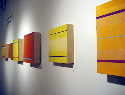
Above: First gallery, from left. Pat Lipsky, Kazuko Inoue, Rebecca Salter, Marthe Keller
.
Below: Keller, Louise P. Sloane

.

First of all, it’s an enormous show. All six exhibition spaces are filled with works from 33 primarily mid-career artists who are represented by several works each. (The gallery website features a rotating selection of installation shots, which changes weekly.)

It’s a painting show. If you left the Biennial hungry for, well, anything besides junk in the hallway, this is the antidote.

And by design, it’s a show of work primarily by women artists, so if you left “Color Chart” at MoMA wondering where the other half of the art world was, voila. But let me state flat out that it’s not a “women’s show” any more than Color Chart was a “men’s show.” Still, I like the numbers—and the work—here.

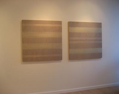
The enormous two front galleries hold the larger work, from Pat Lipsky’s dark-toned geometry to Rebecca Salter’s subtly textured monochrome to higher-key color fields by Marthe Keller and Louise P. Sloane. Sloane's more saturated palette, along with the room's strong sense of geometry, carry you into the second gallery where more highly chromatic work by Sharon Brant, Paula Overbay, Diane Ayott, Rose Olson and others dominates.

..

Above: From the first gallery, looking into the second. From left: Mary Obering, Doug Ohlson, Yuko Shiraishi

Below: In the second gallery looking back into the first. Those are Sharon Brant's paintings flanking the doorway in Gallery 2

.

.

Above: This view (image courtesy of OK Harris) will orient you around the second gallery, continued below:

.

In the second gallery. From left: Li Trincere, Joan Mellon, Diane Ayott, Mellon again, Mary Obering

.

.In the second gallery: Joanne Klein, Rose Olson, Jean Wolff, Li Trincere

There is a visual narrative in the exhibition that takes you from large and minimal to smaller and more compositionally complex, so that by the middle room (ego alert: where my own work is installed) there’s a mix of the two, moving to more compositional abstraction in the smaller back gallery. By the time you reach the large back room, size—small—is the overriding element, with a range of visual expression in evidence.

.

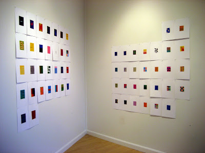
Third Gallery: I know this room. From left: a grid of nine of my Silk Road paintings, each 12 x 12 inches, encaustic on panel (I showed earlier work from this series in a small solo show at the gallery last year); Uttar 238, encaustic on panel, 36 x 36 inches; an assembled work on paper by Siri Berg

(A large, fluid composition by Margaret Neill, also in this room, is not shown here, but it's on the gallery homepage, take a look )

Below: My painting, Berg's work, and an installation by Cathleen Daley

.

.

.

On the wall to the right of Daley's work: fluid geometries by Julie Gross on either side of a poured color field by Kate Beck.

.

Steven Alexander, a painter whose work could easily have been at home in this show, wrote cogently about it, noting: “There is a conspicuous absence of irony—these artists are engaged in painting not as pastiche, but as a deeply intelligent exploration of visual and tactile properties. In addition to the focus on color, the show is unified and driven by reductive form, and what could be described as succinct construction— delicate balancing of the analytical and the sensuous— surfaces and objects that are beautifully and specifically crafted, infused with sagacious knowledge of the medium and the language, with absolutely no fluff: direct painting, deceptive in its simplicity.”

.

.

On the long wall in the back room: Paula Overbay, two small vertical works by Rose Olson, two by Soonae Tark, one of my grids, Doug Ohlson, another by Overbay.
(The installation in the back room has changed somethat since I shot this; check the gallery homepage, and in the rotating images you'll see that it's now Overbay, two by Olson, me, and another Olson)
.

The size of this show alone would make it impressive, but the selection is beautifully curated and installed. Viewing this show, I have been introduced to the work of artists whose work is new to me, just as I have had the chance to see new work by artists whose work is familiar. Happily, we are awash in shows about color right now--what little miracle seeded the ether to compel so many gallerists to focus on hue at the same time?--and I am honored to be part of this one.

The show was curated and designed by Richard Witter, the gallery’s long-time installer, and managed by Suzanne Kreps, the gallery manager. The two knew it would be an abstraction show, but the parameters shifted this way and that as they made studio visits and tossed around ideas. The focus on non-objective color sharpened slowly--and independently of all the other color-themed exhibitions.

The idea took a more concrete form a year ago January in the "cold and bleak" dead of winter, recalls Witter: "I needed a shot of Jules Olitski." Instead he purchased two little brilliantly hued gouache abstractions at a small gallery in Chelsea, and that started him thinking about color as subject, as object.

Another parameter was materials. "I knew I wanted traditional tools and supports--the brush, canvas, panels, paint, artists colors," he says. And another: a reductive sensibility. "I wanted [the show] to be a portrait of color." But get close and look at those surfaces--tactile, sensuous, sublime. The art world may be growing younger by the minute, but paint handling like this develops over time.

If the Chelsea sirens have pulled you away from SoHo of late, let the chromatic call of this show bring you back downtown.

.


.

5.28.2008

Awash in Color: Roy G. Biv and Friends


Philipp Otto Runge's Farbenkugel

.

I came across this nice post about color wheels and globes in Steven La Rose's blog. He showed a great image and provided a link to a German-language site about historical color systems which I followed, thinking I'd pull a different image for this post. Well, Steven selected the best one. And I'm not going to settle for second best, so I've pulled the same one. I love how the artist conceived the color wheel as a globe, with the true colors at the equator moving toward tints and tones at the poles.


Here are a few others images:


Two color pyramids: Tobias Mayer's Farbendreieck, above

Johann Henrich Lambert's Farbenpyramide, below, tints you dimensionally toward white as the pyramid reaches its apex


.

Wilhelm von Bezold's Farbentafel is more conventional, but still quite lovely

.

While we're talking Roy G. Biv, let me show you images of several contemporary artists for whom color is the primary element: Steven Alexander from Pensylvania, Kate Beck from Maine, and Rose Olson from Massachusetts. Consummate colorists all, whatever theory they learned was absorbed long ago, and what emerges now is its pure intuitive application. (See more on their own websites and blogs, accessed by the live link on their names.)


Steven Alexander, Slave To Love, 2007, acrylic on canvas, 72 x 54 inches

.

.

Kate Beck, Canyon. Red, oil on canvas, 46 x 46 inches

..


Rose Olson, Falling Sky, 2005, acrylic on bird's eye maple plywood, 35 x 22 inches


. .

What, and you thought I wouldn't include my own work here? Roy G. Biv is a close buddy of mine, too. These are two new small paintings from "Silk Road," an ongoing series of small grid-based color fields. I wrote about "Silk Road" in my first post for this blog. The work has developed incrementally over time, but my thoughts about it have not. It's always about hue.


Joanne Mattera, Silk Road 106, above, and Silk Road 103, below; both 2008, encaustic on panel, 12 x 12 inches


.