Pages

2.14.2008

El Anatsui at Jack Shainman


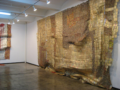
Fading Scroll, 2007, aluminum and copper wire, 88 x 472 inches

I have given up trying to cover gallery shows while they’re still up. That’s the job of a paid journalist. My reportage is typically presented after the fact, and until my twin clones are perfected, that’s probably the way it will remain.

So here we are at the Jack Shainman Gallery on 20th Street at the end of January. The show is El Anatsui’s "Zebra Crossing." God, I love this work: large, fluid expanses that hang slightly away from the wall, occasionally bulging or sagging as they yield their great weight to gravity.


Detail below


Zebra Crossing III, 2007, aluminum and copper wire, 61 x 107 inches

Detail below


The work embodies some lovely dualities. There’s an underlying geometry to the structure. Strips of metal—the aluminum wrapping from the neck of liquor bottles—are pierced and held together with twisted wire, row-on-row, but the overall effect is one of fluidity and organic growth. The patterns are textile-like in their structure, like Ghanian kente cloth, but sculptural in their presence. The work is made of junk, but the light shimmers sublimely across the surface. And of course there’s the metaphor of transcendence. It took the labels from a damn lot of devil water to make this celestially beautiful work.


Area B, 2007, aluminum and copper wire, 155 x 236 inches


You can call this work sculpture, tapestry or painting, and any description would be correct.

El Anatsui is a professor of sculpture at the University of Nigeria, so perhaps sculpture is the word he would use. But the relative flatness of the surface suggests painting. Think, for instance, of the gilding and drape of Klimt. And the structure does suggest tapestry. Are you familiar with the work of Colombian-born artist Olga de Amaral, whose large scale tapestries are painted and gilded? See both below.


.

.

,

.

Above, Klimt: Portrait of Adele Bloch-Bauer I, 1907, oil on canvas with gold and silver gilding, now at the Neue Gallery, New York City; The Kiss

Below: Olga de Amaral, Cesta Lunar, fiber, gold leaf, acrylic


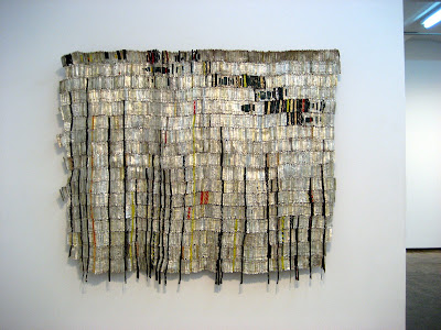
More El Anatsui: Takari in Black, 2007, aluminum and copper wire, 60 x 76 inches. This one is my favorite. I particularly like the coolness of the silvery hue, and the organic geometry of the composition.

Detail below


In case you’re interested, the prices ranged from $250,000 for the smaller works, such as the one above, to $500,000 for the big one that opened the post And every single one on the gallery list had a red dot. A sante!

2.09.2008

On the Geometric Trail: Part Five

On the Geometric Trail, in Chelsea

On the Geometric Trail, Part Two: SoHo

On the Geometric Trail, Part Three: Isensee


"Geometric Abstraction" at McKenzie Fine Art
Through February 9


Don Voisine: Poised, 2007, oil on wood, 20 x 20 inches

Valerie McKenzie always puts on a good show. This group exhibition brings together gallery and invited artists to examine the multiplicity of sources and expressions of geometric art. Artists in the show are Chris Gallagher, whose gently curving stripes suggest the celestial, like rings around Saturn; Kim MacConnell, with saturated abstractions reminiscent of Matisse and Picasso; and Shari Mendelson, whose chandelier-like sculptures play with light and shadow. You can see their work on the gallery website.

Here I'm homing in on the three whose geometry resonated most strongly for me: Don Voisine, whose work opens this post; Jennifer Riley, whose paintings have been turning up everywhere lately (including at McKenzie Fine Art's booth at Art Miami and OH&T's booth at Aqua Wynwood); and Ann Pibal, whose small-scale paintings are surprisingly poetic for their stark linearity.


Jennifer Riley: This installation shot looks into the office from the gallery. Foreground, Remedy for Blunt Footing, 2007, oil on canvas, 54 x 40 inches; office: Into the Maelstrom, 2007, oil on canvas, 44 x 60 inches

Riley's work suggests landscapes and topographies--mountains, rolling hills--but in a geometric style that references computerized maps. The deep space offered to the viewer is all the more compelling for the flatness of the surface. The push/pull of these elements, with the addition of gorgeous color, makes the work irresistible.

Don Voisine's geometry is much more austere: reductive and smack up against the picture plane. But up close his austerity is softened by surprisingly gentle surfaces--one soft, velvety black; another not quite shiny but not quite matte; yet another with the light shimmer of unexpected brushstrokes. Indeed, the picture plane opens more deeply than a first look would suggest. You need to spend time with this work. I'd call it "tender constructivism."

Don Voisine: Above, an installation in the office looking into the gallery at the painting shown below. Below, Delayed Green, 2007, oil on wood, 32 x 63 inches


Ann Pibal: Above, TRPSH, 2007, acrylic on aluminum, 12 3/4 x 18 1/2 inches; below, B-Line (v.2), 2007, acrylic on aluminum, 13 x 19 1/4 inches

Pibal's paintings, unique in their small scale and lovely color, nevertheless allow me to make some visual connections within geometric abstraction: to Miriam Schapiro's famous Ox painting, currently part of the "Wack" show (opening February 17 at PS 1) to Frank Stella's early geometries, and to Warren Isensee's Body and Soul, which I posted recently. You'd think there's only so much you can do with the same shapes and angles, but the connections, the variations, the subtleties, all filtered through the eye and hand of the artist, are endlessly new. Pibal's work reminds me of all that.

2.08.2008

The Geometry of Finance

A fellow named George has a money blog called Future Modern Finance. I found it because he posts on Ed Winkleman's blog, and Ed attracts a variety of interesting people with blogs, and opinions, that encompass not only art but politics and finance--you know, the other things that go on while we're in our studios.

This chart represent some of the splendid visuals I found at George's blog. I realize there's a financial narrative here (this one is a week of trading on Sotheby's stock), but I am just digging the beauty of the geometry.

2.06.2008

On the Geometric Trail: Part Four

.
.
.
..
Two of a Kind
.
Sol LeWitt in "Deconstructed Geometry" at Vivian Horan Fine Art
.
Ted Larsen, "Constructed Objects," at OK Harris


Sol LeWitt: Wall Drawing #604A-Cubic Rectangle with Color Ink Washes Superimposed, 1989

This work was the centerpiece of "Deconstructed Geometry," which ran officially until January 17 but was still up when I stopped in at the end of the month.


Ted Larsen: Chicklets, 2007, 6 x 6 x 6 inches

This solo show is at OK Harris through February 9th

OK, so I'm stating the obvious, but here's what I love about this pairing of Sol LeWitt and Ted Larsen: big versus little, flat versus dimensional, concept versus object, saturated versus pale, light versus shadow, uptown versus downtown. These kinds of connections sometimes occur as I'm viewing work, other times as I'm viewing the images after the fact. In this instance, geometry was the thread connecting a number of shows I've seen and posted about this winter, but it was not until I sat down to edit these particular images did this pairing fall into place. I'd call it the conceptual version of the kids' toy that requires you to fit a shaped block into the correspondingly shaped hole--even though none of the shapes is quite exactly the same.

2.02.2008

On the Geometric Trail: Part Three

On the Geometric Trail, in Chelsea
On the Geometric Trail, Part Two: SoHo


We’re back on the Geometric Trail. (Previous posts can be linked, above.) This time we’re visiting Danese Gallery, where Warren Isensee has a show up until the 9th of this month.


On the far wall, Body and Soul, 2007, oil on canvas, 78 x 120 inches. Foreshortened at left, Bipolar Express. We'll swing around to a full view of that painting.


I’m not sure there’s a more perfect space for this work than Danese's skylighted aerie. The high ceilings and broad loft expanse create a welcoming environment for paintings that resonate so visually they seem to radiate off the walls and into the the room.

Isensee employs rectilinear shapes that he limns and relimns to create forms within forms. There’s both a textile sensibility (like a Navajo chief blanket) and an architectural structure to the work (columned temples, perhaps) that come together to create intimacy and grandeur at the same time. They’d be hallucinogenic except that the palette is grounded in saturated earthen hues—like Fiestaware without the kitsch. On second thought, forget trippy. Those celadons and ochres, sienas and corals are rubbing up against one another to the point of retinal orgasm. Ahem, chromatic fervor.

.
Let's continue our spin around the large main gallery:


Body and Soul, again, leading to . . .


. . . Scenic Overlook, 2007, oil on canvas, 65 x 94 inches. In the small gallery, a peek at High Beam.
You can see all of these works on the Danese Gallery website
.

Scenic Overlook in the foreground with New Construction, 2007 oil on canvas, 60 x 60 inches, on the far wall. Just to the right of New Construction is . . .

. . . a wall of framed colored pencil drawings. They're startling, because the are the line-by-line, color-by-color starting point for many of these big paintings. You can see the drawings for Body and Soul and New Construction second and third from left


This is not the best picture of a very fine painting (you can see the color much better on the gallery website), but I wanted to take you back to the starting point of our tour, where this painting was shown in greatly foreshortened perspective. It's Bipolar Express, 2007, oil on canvas, 48 x 72 inches

Part of the visual excitement of Isensee's painting comes as much from the quality of the line as from the juxtaposition of the colors. It looks as if he paints the stripes with a flat brush, sans tape, so the ever-so-slight line variations within each stripe combine to generate many more visual watts than hue or color placement alone could do.

Next time: Ted Larsen's small dimensional geometries at OK Harris in SoHo, and Sol Lewitt's wall drawing uptown at Vivian Horan Fine Art; then back to Chelsea for "Geometric Abstraction," a group show at McKenzie Fine Art.

1.26.2008

A Long Marriage

I originally published this post in August 2006 as A Brush with Destiny, but I've brought it back under a new title. I'll have a new post in a few days.
.
.
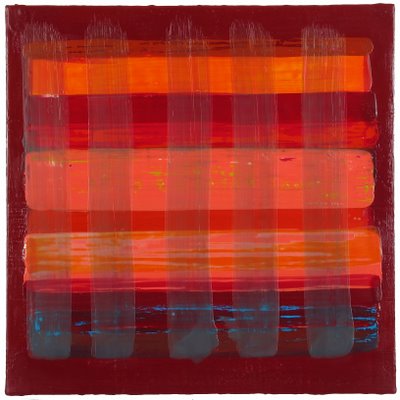
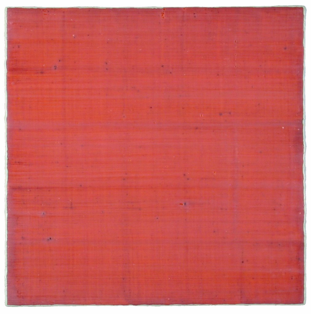
Uttar 231, encaustic on panel, 18 x 18 inches, 2004

.

Art and I have been together for almost 35 years. Until recently I was the one who carried the financial responsibility in the relationship, working full time to sustain the two of us. Art was emotionally supportive most of the time, but I’ll be honest, a financial sponge. Virtually my entire paycheck—a good one, because I worked as a senior editor at a high-profile women’s magazine—went into maintaining the relationship. Give, give, give. That was me. When I got a raise, where did the extra money go? Art. Those jokes about "ball and chain" were no joke to me. But I was a woman enthralled.

I was still in my Teens when the marriage began. I couldn’t have known it would develop so lopsidedly. Art was generous at the beginning, arousing in me feelings I’d never before experienced. I learned to see as if I were seeing for the first time, to savor every nuance of color and shape, line and tone. But after the honeymoon we settled into a pattern that would become all too familiar: I gave. Art took. Love, in my case, was not just visually impaired, it was sitting blindfolded in a dark room. I worked assiduously to keep the relationship going. If there was an opportunity to make it better, I took it. I learned to ignore the indignities while reveling in the generosities. I also sought out those who were in similar relationships—an informal AA for overcompensating partners—and we made many visits to galleries and museums.

Things changed in 1998 when my job ended. Instead of looking for another nine-to-five, I took on freelance projects to pay the bills. Art, to my profound surprise and delight, picked up the slack and over the next few years became the primary breadwinner. Art has been supporting the two of us ever since. I’m on cloud nine. This, finally, is the relationship I’d hoped for.

Before you brand me as a feminist failure, trapped with an alternately withholding and rewarding partner, let me tell you this: Art is not a man. Or a woman. Had it been either, I would have left long ago, I assure you. I’m a painter, and art—lower-case a—has been my primary relationship all these years. After a day of working behind a desk, I went to my studio to paint. Whatever transpired from nine to five, I could count on an evening of intense passion—sensual satisfaction, bitter struggle or utter bliss. Then I went home, sometimes to a flesh-and-blood lover, but always with painting on my mind.
Back when I was in art school, a professor earnestly informed me that if I wanted to be taken seriously, I would have to "choose between being a woman and being an artist." He was onto something in terms of duality, but he had the specifics all wrong, and not just because his comment was so irredeemably

Silk Road 68, encaustic on panel, 12 x 12 inches, 2006

sexist. Creative jobs intertwine art and life. The idea is not to choose between the elements but to come to terms with the nature of the twist. I call my union with art a marriage only partly in irony because, for better or worse, it is the longest-running relationship of my life. Other artists with varying degrees of tongue in cheek, have described their art liaisons as "the other person in my marriage," "living with devil," and "a jones, plain and simple." Rarely is it simply a career.

The idea of art as an addiction, a jones, is not so far fetched, by the way. Sometimes when I’m painting and the endorphins are firing, there’s no "art," no "me." There’s just brush and brain in a euphoric vortex of energy, an ectoplasmic blob at one with the universe. It’s as good as sex. And I’ll do anything short of armed robbery to ensure that I have the means to experience it as often as I can. Do accountants have this kind of relationship to their careers? Do dentists?

Whatever you call it, each artist’s relationship to art is a unique combination of give and take, pain and pleasure, or any number of other antithetical concepts jostling for supremacy. Some of these emotional clashes are generated by the creative act itself. Unlike Sunday painting, which I’m told is a relaxing and enjoyable hobby, when it’s your life’s work, every brush stroke is charged not only with paint but with esthetic decisions, intuitive flow running smack up against intractable deadlines for the next show.

There’s also that tantalizing promise of a livelihood repeatedly extended and withdrawn. Working 80 hours a week without a steady income is not satisfying, no matter how ecstatic the work itself, so every little success—a big sale, an interested gallery, critical attention—sends you soaring until the trajectory of the arc sends you crashing back down.

The good news is that art means money these days. With the recent increase in the number of fairs, galleries, and collectors big and small, there are more emerging and mid-career artists than ever before able to sustain themselves with the sale of their work. I am one of them.

Art and I celebrate our 35th anniversary this year. It’s still an open marriage as flesh-and-blood lovers come and go, but we will grow old together. The gift to mark 35 years together is coral. Please, no presents. I mention it only because I often use coral, the color, in my painting. Coral is a lovely mix of cadmium red light with a touch of spectrum yellow, and just enough titanium white to soften it to a blushing, roseate hue.
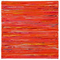
Vicolo 4, encaustic on panel, 12 x 12 inches, 2004


1.21.2008

Morris Louis at Paul Kasmin Gallery

See addendum at bottom of post

Ah, seeing these paintings at the Paul Kasmin Gallery (through January 19) made me feel like I was back in art school when everyone was stain painting and Morris Louis's arc was ascending. I didn't take notes, just pictures.

I've seen a lot of Louis paintings but nothing remotely like this one. Who needs a fireplace if you've got this on your wall? You could almost feel the heat. Made me think of those beautiful Siennese paintings depicting saints at the stake. Hellish. And heavenly.

Here's a detail. I love the rivulets of color. Look how the pigment migrated away from the edges in some places and to the edges in others.

In this painting the graphic elements are reversed, like apostrophes. And then the polished floor reflects and reverses the whole thing.

This is one of Louis's Veils. Up close (below) you can see just how much color it took to get those smoky hues. Looking at the painting for a while, I thought of Rodin's The Three Shades, a trio of nude male figures, bodies drawn together with their shoulders forming a strong horizontal line.

Time has not been kind to this painting. See how the canvas has sagged? And I was surprised to see the "starving artist" framing on this and the other paintings--lattice strips nailed all around. I asked the fellow behind the desk about it, but he didn't have an answer. I suppose it's to maintain the integrity of the work as it was originally shown.

.

Addendum (2.4.08): A painter friend e-mailed with this comment: "There are Morris Louis paintings that weren't supposed to be seen. In grad school I used to work at the Lawrence Rubin Gallery which showed all the Clement Greenberg people, Louis included, and there was always this idea: "Oh don't look at the 'failed ones'." Like the ones you highlight here. Time changes our eyes and our take on things so much, doesn't it?"

1.18.2008

The Business of Art

Back when I was in art school, talking about the business side of art would have gotten you branded as a careerist, a sellout. This kind of thinking has persisted in—and, frankly, hindered the careers of— many midcareer artists who still believe that financial struggle keeps you closer to integrity, and that selling well means selling out. Ha! Garrets don’t bring you closer to heaven, they just keep you cloistered in poverty a few stories above street level.

Sellout
Deborah Fisher’s brand-new blog, Sellout, addresses these ideas. Conceived as being by artists for artists, it encourages dialogue about every practical aspect of being a visual artist. Recent topics include suggestions on finding a way into the art world; the realities of who you know; news on a new book, The Artists’ Career Guide: Making a Living Doing What You Love; and a digital/cyber Q&A. It is more than a professional advice aggregator and hot-tip provider, says Fisher. " We want any information we provide to be fleshed out as anecdote or called out as bullshit. We depend on your insight, and welcome your ideas, comments and emails." (Disclaimer: Fisher has mentioned Art Bloggers @ , a project I do with Sharon Butler, whose Two Coats of Paint I have written about previously, and I’ve already put in my two cents on a few posts.)
Fisher is a sculptor and writer.

.
How’s My Dealing?
Also back in art school, when I was still dating men, I used to say, "Wouldn’t it be great if there were a National Asshole Directory? You could ask about a guy, and if his name showed up on the A-list, so to speak, you could save yourself the trouble and not get involved."
Now comes How’s My Dealing, a site for New York Galleries that does essentially the same thing for a particular slice of the art world.

Alas, there’s a lot of opportunity here for anonymous dealer bashing, despite the moderator’s entreaty for "Facts and first-hand accounts wanted, not opinions." The moderator, a smart, sincere artist posting anonymously as Buck Naked, has his/her work cut out for him/her. I’m not entirely comfortable recommending this blog, but it’s a great idea at the right time—hey, wouldn’t you want to know who pays on time and who doesn’t?—and if everyone uses it in an informative way, big IF, it could work. Take a look and make your own decision.

.
Edward Winkleman
Yes, I’ve noted Ed's blog before, but his business-of-art posts—he’s a respected Chelsea dealer—get scores, sometimes hundreds of responses. I teach here and there on the topic of building and sustaining a career in art, and I often used his posts about the art business as teaching tools.

Some interesting items from the archives: Gallery Contracts and Not a Cheap Affair (what it costs a dealer to participate in an art fair)--you need to scroll down the opened post for these-- and The Logic Behind the 50/50 Split . Spend some time clicking and linking in those archives; there's a graduate course worth of MFA advice there.

.
What Blogs Give you the Art Info You Need?
Consider this a forum to post your suggestions and commentary.

1.13.2008

On the Geometric Trail, Part Two: SoHo


Kay WalkingStick: Cataloochee, 2007, gold leaf, oil and wood, diptych; 24 x 48 inches

The geometric trail continues below Houston Street. I get around each month--uptown, Chelsea, downtown, the museums--and the amount of geometry I saw in December was far beyond what I normally see in a given month. And with Warren Isensee's show just opened at Danese, I'll have more geometry to report on later this month.

Here's some of what I saw and liked in SoHo in December: .

.

Kay WalkingStick: New Paintings
at the June Kelly Gallery

You might call WalkingStick a quasi abstractionist who is semi geometric. The larger picture is that she’s a landscape painter who introduces abstract elements into her work, typically via a diptych format that allows her to integrate the two disparate elements so that they are no longer disparate at all. The geometry in her new work is derived, I think, from Native American weave patterns (she is a member of the Cherokee Nation).

The installation shots are mine; the individual works are from the gallery's website. You can see more exhibition images at the gallery website and more on Kay's website.


At the June Kelly Gallery, above and below: opposite views of Kay WalkingStick's show


Above: Remember the Bitterroots, 2007, oil on wood panel, diptych, 36 x 72 inches; below: The Road to Santa Fe, 2007, oil on wood panel, diptych, 24 x 48 inches

.

Machine Learning
at The Painting Center

Matthew Deleget, a reductivist painter, put together a sharp show of four contemporary artists working in geometric abstraction. And sharp is the operative word here, as the paintings by Henry Brown, Terry Haggerty, Gilbert Hsaio and Douglas Melini are hard edge.

The title, Deleget writes in his catalog essay, comes from the field of artificial intelligence in the way computers are programmed with algorithms to allow them to recognize patterns within the volumes of cyber data they process (like the Google search engine, for instance) so that they continue to make new associations based on what they have done in the past. I didn’t get the connection between the artificial intelligence of the premise and the visual intelligence of the work itself, but I thought it was a smart show.


Two views of Machine Learning at the Painting Center

Above: paintings by Terry Haggerty, Gilbert Hsiao and Henry Brown; below: Brown again, two by Douglas Melini, and another by Haggerty


If you’re in Houston March 8 to May 3, you can catch the exhibition as it travels to Gallery Sonja Roesch. There’s more information on the Painting Center website and on Minus Space, the online curatorial project Deleget maintains with his partner and co-editor, with Rossana Martinez.

Below: Gilbert Hsiao, Encounter, 2006, acrylic on wood panel, 30 inches diameter


Impromptu Geometry
Sometimes the city is a gallery. I saw this geometric assemblage in an old garden lot at the corner of Houston and Elizabeth Streets.

1.08.2008

On the Geometric Trail in Chelsea

There was a wealth of geometric expression in Manhattan last month. I photographed some of it. Then I went to Miami for the fairs and spent the subsequent two weeks blogging about them. I was prepared to let this New York report go--one has only so much time, after all--but in reviewing the images, I realized the work was too interesting to ignore. I made time. If you don’t go to New York regularly, I suppose it doesn’t make all that much difference when you see these shows en blog; and if you did see the shows, well think of this post as a bit of 2007 déjà vu all over again.

.

.
Bridget Riley: Recent Paintings and Gouaches
at Pace Wildenstein
.
Of course you know Riley’s work. She shot to fame in the 60s with eye-blazingly, undulatingly graphic paintings that practically created the genre of Op Art. She’s mellowed. The colors are Monet-esque and the geometry is larger, more sinuous than searing. As you would expect at this gallery, the work was big--but it was an invitation to see, not a challenge. A catalog is available. Click gallery website for more info.
.
Above: The central gallery at Pace Wildenstein. The work on the right is painted directly onto the wall. The painting visible through the doorway to the far gallery orients you to the installation below
.

.
.
.
Gail Gregg: Recent Paintings
at Luise Ross
.

Gregg has taken the lowly packing carton and turned it into geometric abstraction. Her symmetric shapes, reminiscent of totemic images, are from flayed carboard boxes, carton dividers, cup holders—the stuff of our throwaway culture—all coated with wax. Some works hang as relief sculptures; others are laid onto a wax ground. Technically these latter are more assemblage than painting, but painting embraces everything these days, and Gregg is a painter with a great sense of compostion and color.

You can see more at the gallery's website and at www.gailgregg.com

Installation view of Gail Gregg's show at Luise Ross

Below, a work from the show

.
.
Polished and Pressed: Bill Thompson and Peter Weber
at Thatcher Projects
.
First I liked the title, with its suggestion of neatness and order. Then I liked the work: relief sculptures that played shiny against matte, rounded edges against sharp, crease against smooth. Thompson has the polished work: geometric wall sculptures carved from urethane, many of which glisten with layers of, I’m guessing, automotive-type paint. Weber has the pressed work: felt objects that have been folded and formed into geometric order, like weave patterns under a microscope. See more at the gallery's website.
.
.
.
.
Polished and Pressed at Thatcher Projects: Bill Thompson, above, and Peter Weber, below
.

.

.

The Geometry of Seeing: Elaine Lustig Cohen
at Pavel Zoubok Gallery

Although I knew of Cohen’s work, I hadn’t realized the breadth of it. Thanks to the show at Pavel Zoubok and the impressive catalog with it, I saw a range of Cohen's work in this 40-year retrospective. Painter, collagist, sculptor and graphic designer, she has worked within a hard-edge idiom that has traversed fluidly within her various modes of expression. See more on the gallery's website.

A second part of this exhibition was held at the Julie Saul Gallery. I didn't get there, but you can visit the website to see more work.

The Geometry of Seeing: Elaine Lustic Cohen at Pavel Zoubok Gallery. This view looks into the gallery from the entry

Below, a view behind the desk

.

Alberto Burri at Mitchell-Innes and Nash through January 19

When you hear arte povera, you think Merz or Kounellis. Burri? Who knew? The exhibition is a 40-year-plus survey of the artist, who died in 1996. The work is varied but the constants are the materials--commonplace stuff like plastic, Celotex wallboard, burlap, clay--and a geometric sensibility that threads its way through the material and the years. Not surprisingly, Rauschenberg cited Burri as an influence. Read more and see additional images at the gallery website.


Above: Alberto Burri installation view

Below: Oil and gold leaf on Celotex--a little ricca with the povera


Next post: The geometric trail continues below Houston